Versions Compared
| Version | Old Version 110 | New Version Current |
|---|---|---|
| Changes made by | ||
| Saved on |
Key
- This line was added.
- This line was removed.
- Formatting was changed.
Welcome to Loree 2.0
Are you ready to Explore the benefits of Loree?
INTUITIVE Instinctual and easy to use toolset that supports academic workflows and delivers consistent course designs across users. | EFFICIENT Boosts academic input and decreases effort, slashing build time and costs. |
Loree 2.0 On Course Navigation
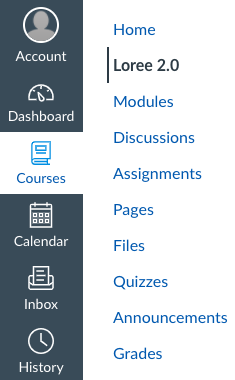
Here we go! The powerful Canvas content editor tool is now on your Canvas Course Navigation. After a successful configuration of Loree, it can be accessed on all Canvas Course Navigations. On the left side navigation bar, you can find out the Loree and by clicking on that it will open the Loree tool.
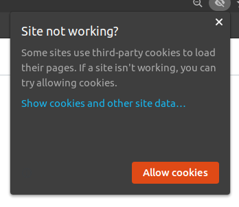
Enable Cookies:
To access Loree inside Canvas LMS in the particular browser we have to allow the browser cookies to launch Loree LTI, without allowing the cookies Loree can’t be launched.
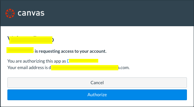
OAuth Verification
In order to use Loree product as an External tool from Canvas, the user must accept the Canvas authorization. So that they can easily access canvas-integrated external applications.
Filter Content Types
Loree has its own Navigation bar on top. It allows the users to select (or) Filter the course contents type either Modules, Pages, Assignments or Discussions. The list will be shown in the dropdown.
At a time, you can select only one option.
The main purpose of having the Nav-dropdown is to access every editable course content within Loree.

The following screen represents the view of the Loree tool. By clicking the Canvas course Hamburger icon, it will collapse the side navigation and Loree shows in Full-width.

Support
Loree provides instructions on how the Loree features work and what is the purpose of having them in the Loree tool. Also, you can get the Frequently Asked Questions by various users and their answers.
In order to access the FAQ and User Guide pages, you have to select the “Support” option from the top bar. On clicking the support icon, the user is redirected to the Loree design page in a new tab.

The user can view the following options:
Getting started
User Interface
Feature and Functionality
Update and Release Notes
Contact and Support
You can raise feedback to Loree by using contact and support on Loree Design official website.
The user can also view and explore about SoaringEd by clicking on the Go to SoaringEd link.
On clicking on the Go to Customer Portal link user is naviages to Loree login page. User can login with valid credentials and view the soaringEd support page, Where users can rise the support tickets.
Course Modules as Loree Modules
Loree has integrated within Canvas to edit the Course contents. Earlier, if you want to edit a page - You have to open the page on Canvas Rich Text Editor and you have to select Loree to edit that particular page’s contents.
In order to fetch all the Canvas course modules in Modules, users have to choose the option “Modules“ from the top navigation bar dropdown list.
Loree Modules imports the course Pages from Module items into a single list. It allows the users to choose any Pages from Canvas Modules and simply clicking the “Edit“ icon will open the Loree Editor.
Loree Modules allows the users to Duplicate, Edit, or remove the items from the Canvas modules.
Create Modules
Loree provides the option to create new modules for Canvas courses. If you want to Create new Modules, you Don’t have to go back to Canvas for the Creation. JUST you have to open the Loree Modules list. There you can see the icon “+ Module” on the top right of the list. Click on the icon will open the new modal.
Modal contains the text field, date picker, and button for creating modules.
When the user clicks on the “+Module” icon, it opens the modal which is represented in the below image:
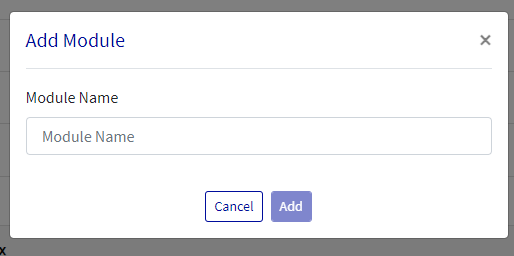
From the above, you have to enter the valid module name and the locking time. It shouldn’t be a Null value.
Newly created modules will be added at the bottom of the list.
Edit Modules
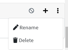
Loree allows users to Edit their existing Modules. By clicking on “Edit” from the Modules, the toggle menu will open the new Modal. Users can rename or delete it.
Delete Modules
Now, you can delete Canvas modules by using the Loree Modules list. When you choose “Delete” from the menu, it will ask “Are you sure you want to delete this module?”. Click on “Delete” will delete the module. Click on “Cancel” will discard the process.
Published / Unpublished Modules
The Published/ Un-published icons will allow users to publish or un-publish Canvas Modules. When the Module is Published, then it shows “Published“ with the icon of (Green Circle with Tick - shown below):

The same for Unpublished content will show “Not Published“ with the icon of (Unpublished grey circle):

Hovering the mouse on these buttons will display the tooltip either “Click to Publish” or “Click to Unpublish”.
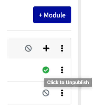
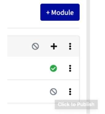
An item can be Published when it’s in an Un-publish state, same as Published content only can Un-Publish.
Add Module Items
As a Canvas user, you can add or remove items within Canvas Modules. Now, Loree allows the users to add Canvas shell pages as a Module item within Loree Modules List. In the Loree Modules list, you can find out the “+” icon next to the Modules toggle menu. Clicking on the “+” icon will open the below modal. Where you can see the list of all Canvas Shell pages on the course.

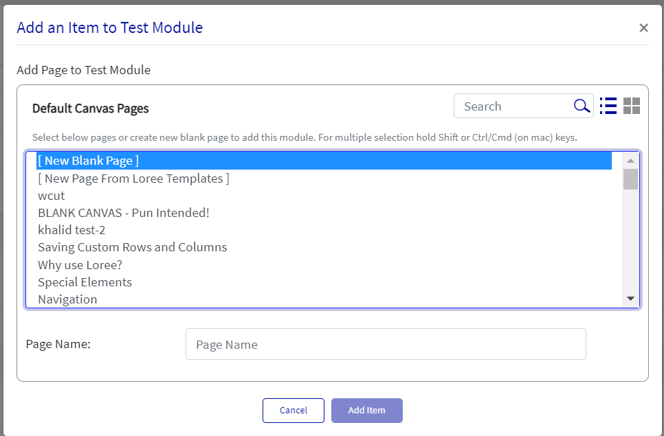
You can type and enter the values in the search field to filter the page list.
Create a new page from Add Module items:
This feature allows the users to create a new page on the Canvas course by using Add items on the Modules view.
In that modal, you can see the list option as “[Create new blank page]”. In order to create a new page from this section, you need to select this option from the list to enable it. When only this option is enabled from the list, you can see the new input field named “Page Name” in the same window.
You can give any name which is up to 255 characters and click on “Add item” to create and add the newly created page into the respective module.
From the list, Loree allows the users to add existing pages as multiple selections. When the user selects existing pages along with “Create new page”, this won’t allow the user to create a new page.

Loree allows the users to select one or more pages from the list to add as a Module item.
(Note: For selecting pages from the list, just a simple click is enough. In case of Un-selection, click the selected page again from the list)
From the above modal, you can choose either “Cancel” to discard the process or click on “Add item” to add the selected pages from the list.
Loree Template Pages
The Loree will allow the user to create a page with the existing templates they have under ‘My Templates’, ‘Global Templates', and 'Share Template’. Users can create a page with the template by clicking on the Modules list addition.
Click on the '+' icon to get the new page from the template feature,

Click the ‘New Page from Template’ option and click ‘Next’,
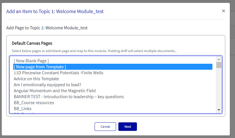
We have a ‘List view’ and ‘Grid view’ by clicking on the highlighted icons,
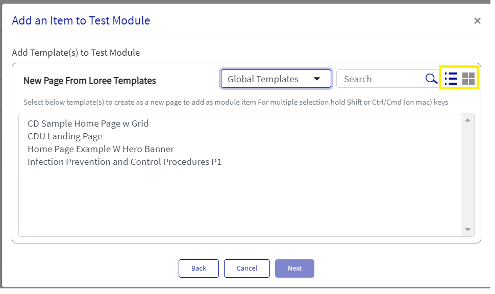
We can filter based on template types like My templates, Global, and shared templates by the highlighted area here,
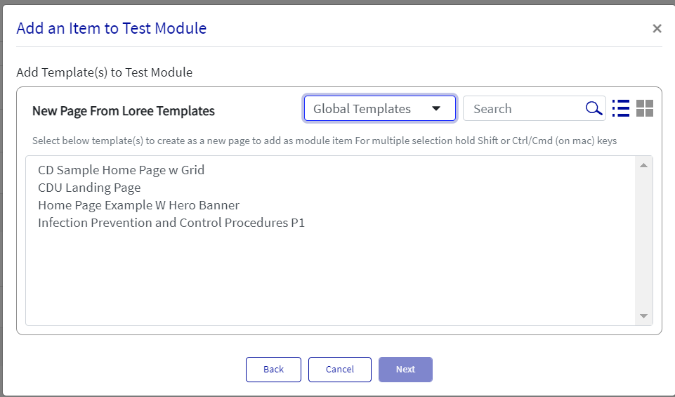
Select any template and click Next,
Type the new page name and click 'Add Item',
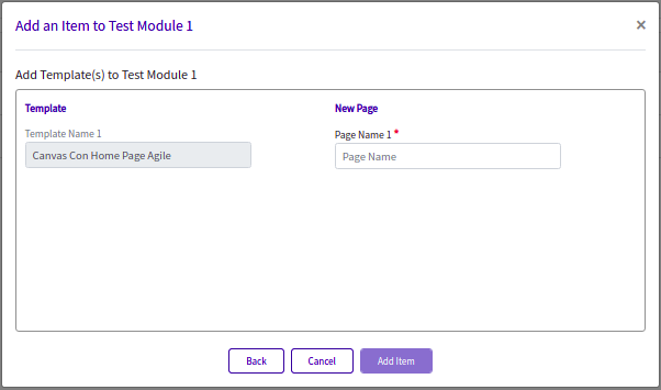
The Item will be added to the Modules list of Loree,

The added page inside the Loree editor,
Course Pages List
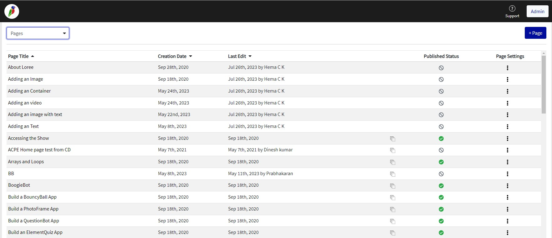
First, you have to select “Pages“ from the Loree top navigation dropdown. It will fetch all the pages from the Canvas course list. Each page list has an option for Edit, Duplicate, Delete, Publish, and Un-publish.
Also, it displays the date the page was created and the date when it was last modified. It helps the users to identify the contents. The page list is in alphabetical order and we can click on the Pate Title, Creation date, and Last Edit options to view in ascending or descending order.
Assignments List
By selecting “Assignments“ from the Loree top navigation dropdown, it will fetch all the Assignments list from the Canvas course list. Each Assignment list has an option for Edit, Delete, Publish, and Un-publish.

Discussion List
Selecting “Discussions“ from the Loree top navigation dropdown will fetch all the Discussions lists from the Canvas course list. Each Discussions list has an option for Edit, Publish, and Un-publish.
Also, it displays the date of Discussion when it was created. It helps the users to identify the contents. Each Assignment is differentiated by using the Group name.
The discussions list has been differentiated as same as Canvas like Pinned Discussions and Discussions group.

Hiding Side Menu
Once selecting Loree 2.0 from the left side menu and the page has loaded its content. It now allows you to collapse the side menu to enable full-width viewing of Loree 2.0.
Clicking the menu button defined by the three horizontal lines (left of the CanvasCon heading) allows users to hide the side menu while working with Loree 2.0.

Edit the Course Content
Loree allows users to edit and design their course content. Following are the types of content which allow the users to Edit the content:
Pages
Assignments
Discussions
To edit the course content, you have to click on Pages/Assignments/Module name. It will open the Loree Editor, where you can design your course contents and you can save them.
Rename the Course shell Pages
Loree allows the users to “Rename“ their course shell pages. In order to do that, the user must have permission from Canvas to add/edit/delete the page. Pages can be listed on both the Pages list and the Modules list.
To Rename the course pages, you have to select the “Rename“ on-page list of which you want to rename. It will open a new modal on the same page and you can provide the new name for the relevant page. After clicking on the “Rename“ button the modal will update the same on the Canvas page.
Create a new Canvas shell Page
This feature is enabled for all the users of Loree. Now after you can create a new page within the Loree tool itself. In order to create a new page, the user must have permission to add/edit/delete a page from Canvas.
Create Page option available on Pages list only. Clicking “+ Page“ on the page list will open the modal. Where the user must enter the page title and then click on “Create“. It will create a new page in the Course shell page.
Delete/Remove the Course contents within Loree
The users can now delete their course contents within the Loree tool itself. Following are the types of content which allow the users to Delete the content:
Pages
Assignments
Discussions
For Delete the course content, you have to select the “Delete“ option from the toggle menu on each content. After clicking on Delete, it will automatically create the Copy of the content. By default, the status of Copied content will be Unpublished.

IMPORTANT:
When an item is removed from the Modules view, it will be removed from the respective module and not deleted on the source page.
Ex: If you remove any page from Loree Modules, that will be removed only from Canvas Modules and not deleted in the Pages list.
But when a user deletes the page from the page list, will be permanently deleted in both Pages and Modules view.
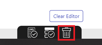
If we delete any template/row/element permanently we will get an alert message before it is deleted permanently.
Duplicate the Course contents
The users can now Duplicate their course contents within the Loree tool itself. Following are the types of content which allow the users to Duplicate the content:
Pages

For Duplicate the course content, you have to select the “Duplicate“ option from the toggle menu on each content. After clicking on that will ask the Confirmation. Once you select “YES”, it will delete from the course and an alert will be displayed. Clicking “Cancel” will discard.
Publish / Unpublished the Course contents
The users can now Publish / Unpublish their course contents within the Loree tool itself. Following are the types of content which allow the users to Publish or Unpublish the content:
Pages
Assignments
Discussions

By clicking on this icon, it allows you to “Click to publish”. Hovering the mouse on these buttons will display the tool tip “Click to Publish”.
 Image Removed
 Image Added
An item can be Published when it’s in an Un-publish state, same as Published content only can Un-Publish. Loree doesn't have the option to Unpublish the course front pages. Why because the Front-page must be Published on Canvas.
H5P
Loree 2.0 introduces H5P interactives inside the Loree editor in which you may create different interactives provided by the H5P WordPress provider. Some of the features like Hotspots, Multiple-choice questions, Accordion, etc by the H5P provider. Inside the Loree editor, you can create a new H5P interactive, Edit the existing one, or delete the existing one.
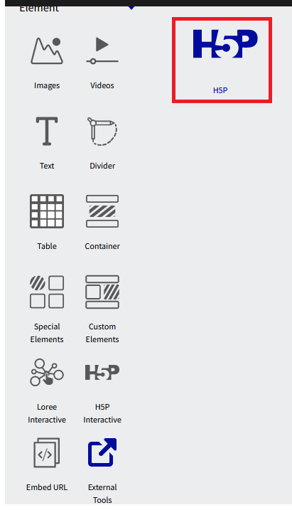
H5P under Elements in Loree editor,

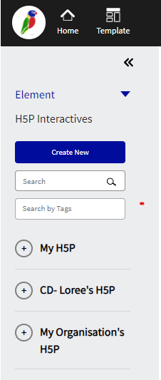
Once H5P is clicked, will Load the H5P block

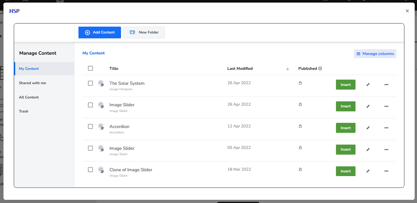
It will fetch the existing H5P interactive based on user-created action to create new H5P,
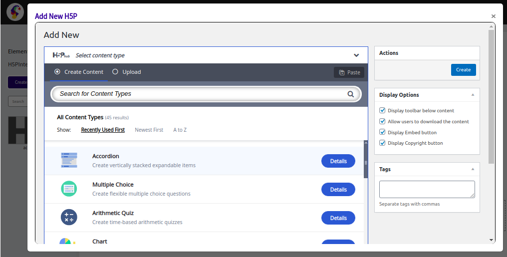
Once click 'Create New Interactives', the below pop-up will appear for creating the desired interactive under the H5P provider,
You can also Edit the existing H5P block, by clicking 3 dots in the block
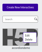
By clicking Edit, an alert asks for confirmation
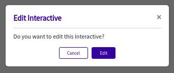
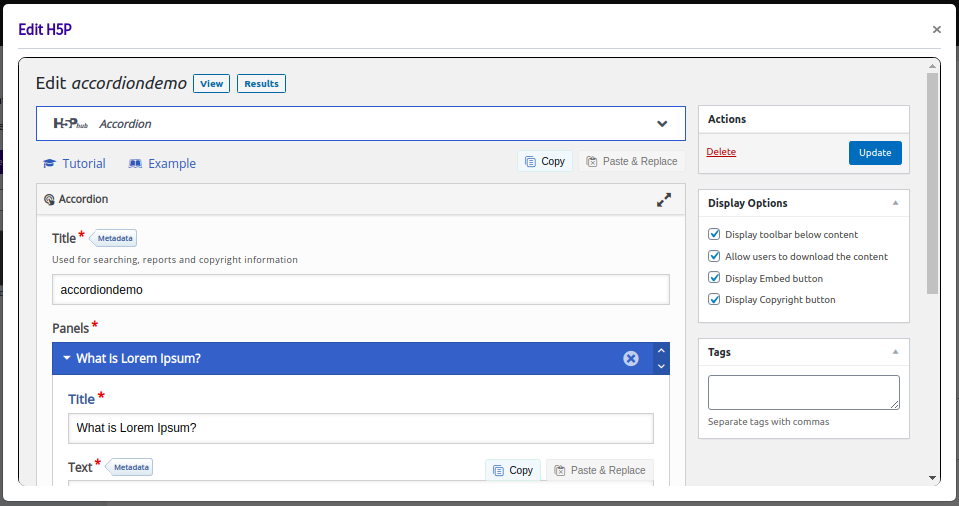
By clicking the Edit button in the above alert box, It will fetch and opens the H5P interactive with content,
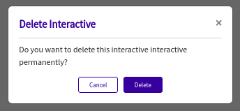
Click ‘Delete’ in the block will pop up the below alert box to confirm before deleting,
IMPORTANT NOTE:
All the H5P interactives should enable the “Display Embed button” to get the embed URL for the H5P interactive Iframe like in the below image.
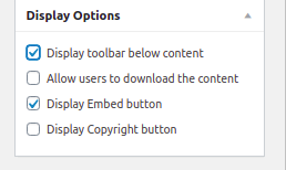
If the organization doesn’t want to show the Embed button in the H5P interactives, please disable the “Display toolbar below content” and enable the “Display Embed button”
Accessibility Checker
The Accessibility Checker option is provided inside Loree Editor to check if there are any accessibility issues on the page, once the page is created. It checks the HTML and highlights the elements with the error and description.
Now, we can see that the Accessibility checker option displays the total number of accessibility issues like a notification on the accessibility icon when we click on the save to LMS option. Click on the Check Accessibility button in the top right corner it will show the list of improvements that need to be done for the template. This allows the user to go through all the discovered issues and fix them without leaving the accessibility checker and it also provides some quick fixes in the accessibility tray itself.
The accessibility checker tray will be responsive based on the device of the user. For large resolution screens like Desktop and Laptops, the Accessibility checker will open on the right side section of the screen, and for small screen resolutions like Tablet, Mobile, the Accessibility checker will be at the bottom of the editor and will also have a separate scroll bar in the checker.
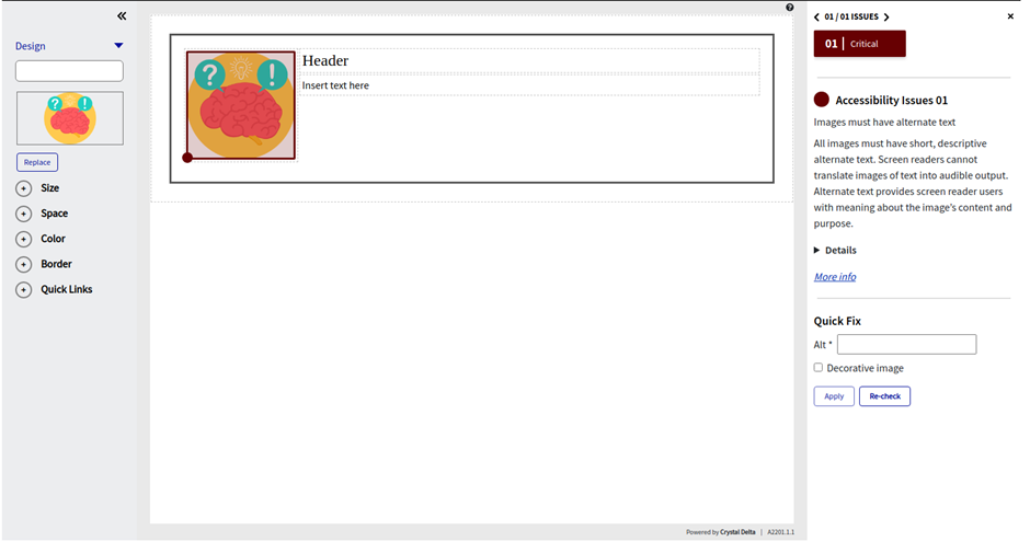
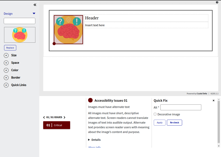
The new accessibility checker does have the privilege to switch between the number of issues in the editor. The accessibility checker tray itself provides an arrow key to navigate among the issues and it will also show the user the severity of the accessibility issue for the particular elements. The severity will be based on Critical, Serious, Moderate, and Minor issues and will also have the details of the issues and an option to fix them as a quick fix in the checker itself. We can also click on the colored dot in the editor to move to that particular issue. Once the issue is fixed the severity color tagged in the editor will be removed. We can update the quick fix and click on the apply button to make the required changes. There is also a re-check button on the checker to check for the issues again without going back to the editor.

When you are working on a particular issue it will be shown in a colored box based on the severity of the Loree editor as marked below:
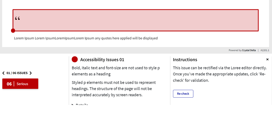
If there are any issues that cannot be fixed as a quick fix in the accessibility checker, those issues can be fixed in the Loree editor directly and the instructions to fix the issue will be provided in the accessibility checker tray.
If the page content has no accessibility issues, it will show the below message:
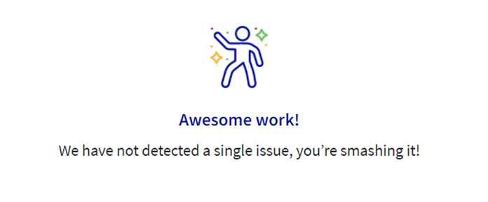
If the user fixes all the accessibility checker issues on the page, then the first issue will have the below message on the accessibility checker tray:

Viewing Components
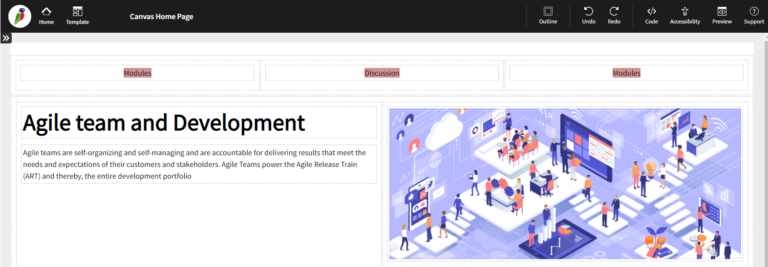
Loree 2.0 allows users to view the various outlines of each section, component row, or column on the screen.
For example, in the image below, the various components on the page are individually identifiable, delineated by a dotted line boundary. This function is able to be toggled on and off by clicking the “Outline” button in the top black menu bar.
Preview
This feature provides a live preview of the pagebeing designed.
Clicking on the preview option opens the modal in preview mode.

Device Selection
It allows the user to select the orientation of the page being designed based on the target device on which the page is intended to be viewed. A modal will appear with the three predefined screen sizes in the middle-upper section of the screen:
Desktop
Tablet
Mobile

View Code
The View Code option is for advanced users; This feature enables users to view the underlying HTML and CSS code for the course pages. The “View Code” selection can be made in the top menu bar, as shown below:

Upon selection on the Toolbar, a new window will pop up (modal), displaying the HTML/CSS content of the page.
At the bottom of the view code window, an option to export the code in compressed form is available (‘Export to ZIP’). This file is saved in the download folder of the web browser.
This functionality is provided in order to allow the user to make design modifications directly to the HTML / CSS code in their preferred editor.
Once a user clicks on “Code” the below screengrab will appear:
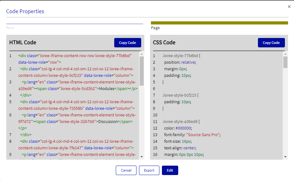
Loree 2.0 allows the user to view the code for either the entire page, row, column, or element. This enables the user to specifically and easily target areas of the entire page or section.
Edit Code
The edit code feature allows the user to update HTML and CSS content within a selected component (also referred to as a block) or for the entire page content on the editor.

If the user clicks on Edit Code with no selected contents, it will fetch the whole editor page content and if a particular block is selected then, it will fetch the particular block’s HTML and CSS properties.
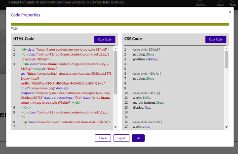
Once the Edit code is clicked (Code, in between Redo and Accessibility checker options) based on the Feature list in the admin dashboard feature configuration, the editor block will be fetched and you can copy only the HTML or CSS property just by clicking the Copy Code button on the top right corners

or click the Edit button to edit the HTML and CSS content:

Once the desired edition is completed, click Update to save the edited content to the Loree editor or click the Don’t update button if you changed your mind about updating the content.
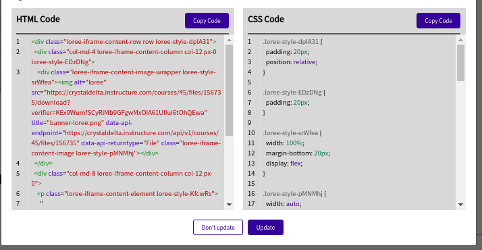
Loree edit code also gives you a special option of Exporting your page content by just clicking the Export button at the bottom of the Code modal.

Creating a page
Adding a Row
Loree 2.0 now gives the user the ability to customize the structure of the page based on rows and columns. Adding a row, allows you to determine the size of each column and the content.

Pre-determined column sizes are provided based on what has been generally used. We have provided six options as shown below.
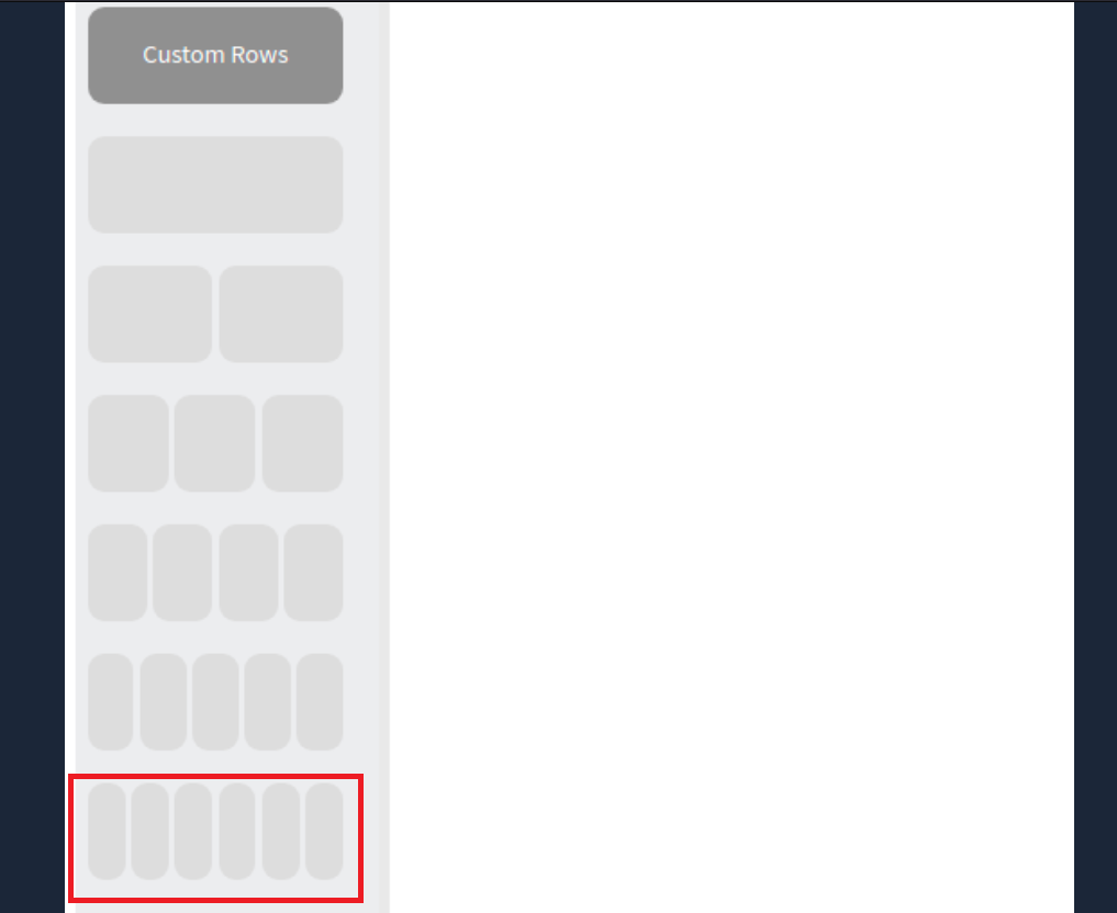
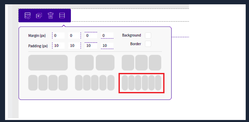
Once a selection has been made, a secondary menu will appear which allows the user to determine the size of the columns based on percentage. (For example, 50 / 50 will split the column sizes equally)
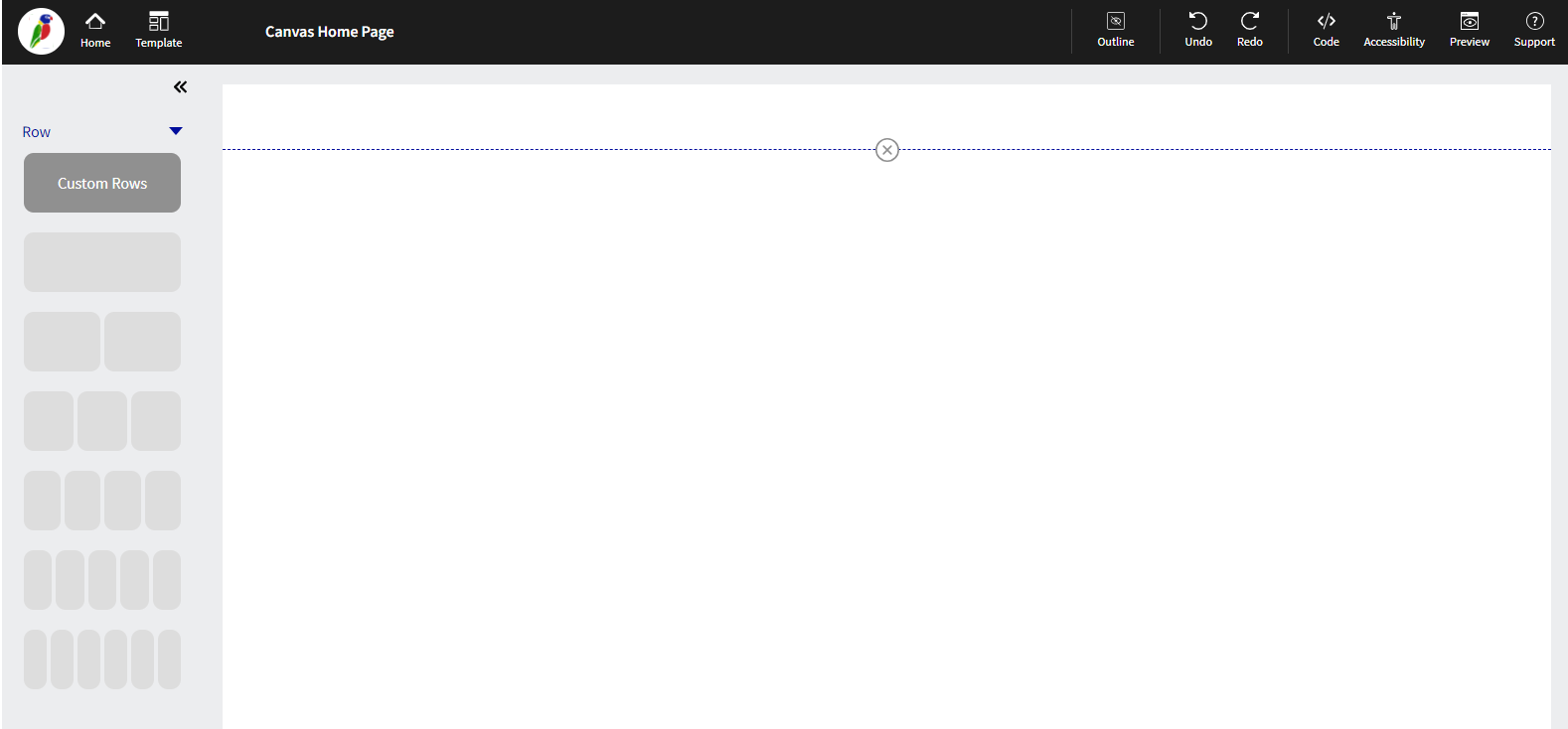
Custom Rows
Loree 2.0 allows users to design, create and share custom rows for their own use or for the whole organization.
Once a row has been designed, the user is able to save the row (please see below under “Editing a Row” for further instructions on saving a row) and use the custom row in the future.
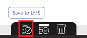

Once saved, the user is able to add a new row, and simply click on “Custom Row”, as per the below screengrab:

The user will then be presented with a new left-hand side menu, which is as below screengrab. This allows the user to either search for the custom row, select a category by which the custom row was saved, or find a custom row based on either Global, My, or Shared Rows.
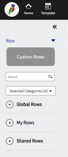
Global Rows
Global rows are rows that have been approved by the admin of Loree version 2.0 for global distribution. This enables all users of Loree from an entire organization to access the custom rows that have been made. Only the admin is able to declare whether or not a custom row is distributed globally.
My Rows
My Rows are rows that have been created by the user and can only be seen by the user who created the row. When saving a custom row, this will always show in the My Rows section.
Shared Rows
Shared rows are rows that have been shared with various departments within an organization. The admin can declare that only certain departments from an organization have access to a custom row. For example, a school may only want a custom row to be seen by the Science and Math department, therefore only making the particular custom row in question available for Science and Math departments Loree users.
Editing a Row
Once a row has been created, the user is now able to edit the row by either clicking on the row area or by clicking the row menu, as shown below (The small blue menu icon, upper left corner of the row)

Once selected, the menu will provide the user with four options, including:
Save Row
Duplicate
Delete
Edit Row
Row move up or down

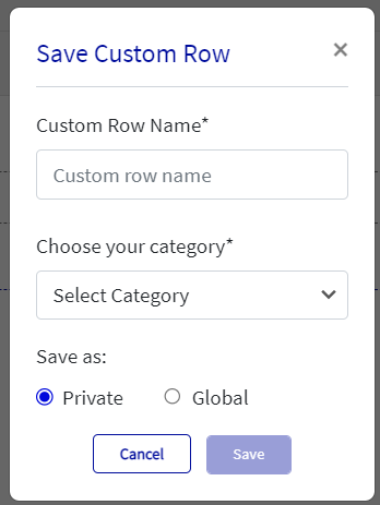
Save Row
Once selected, a pop-up (modal) will appear, which allows the user to save the row as Private or Global for use at a later time; this gives the user the ability to both name the row and classifies it under a category. Only the particular user has created the row. If the Row is created using the Global option it will be available for all the users to use.
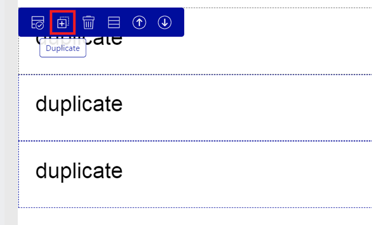
Duplicate
Users are able to copy the entire row by selecting the duplicate option. This allows for quick and easy “copy and paste” of the entire row and its content. *Particularly useful if the content is very repetitive.
Edit Row
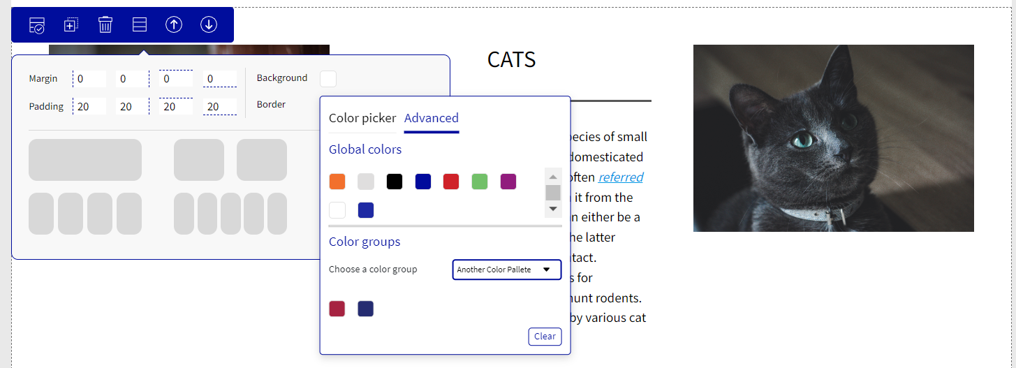
The user is given the ability to change Margins, Padding, Background, and or change the row layout by selecting the fourth menu option.
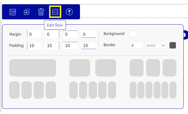
Margin & Padding
All margins and Padding are defined by pixels and are preset as margin: 0px and Padding: 10px.
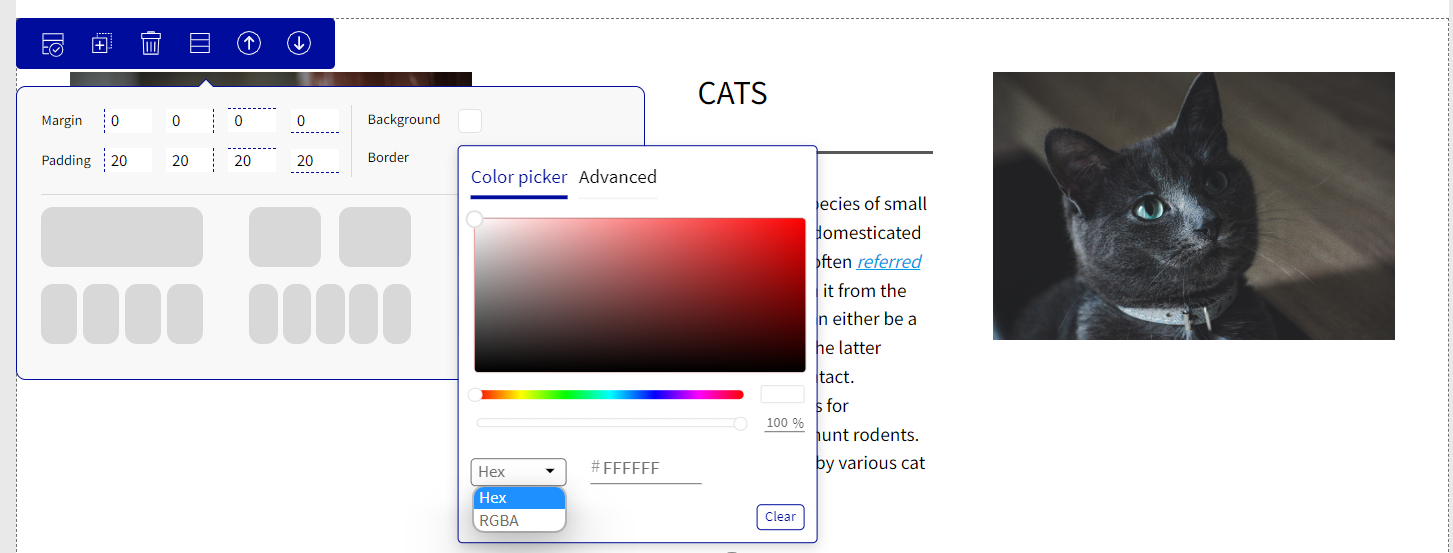
Background Color
Background allows the user to select a color for the particular row selected. The user can choose the background color through a color scaling tool using their mouse, or if a particular color is known the user can either update the background color by the HEX code or by the RGBA code. The user can also choose colors from the Global colors or pre-defined Color groups by selecting the Advanced option. Once we have selected a color it is automatically saved. If the user wants to remove the background color he can click on the clear option or he can also undo the changes using undo option on the top menu.
Row Move Up or Down
Rows are able to be moved either up or down depending on where you would like them positioned on the page. The option to move the rows or columns will appear once the user has made 2 or more rows, columns, or elements. Please refer to the below screengrab where you will notice the additional arrows at the far right of the blue menu.

By simply clicking on these arrows the entire row, column or element will move position.
Columns Options
Loree 2.0 allows users to easily add content (elements) to each particular column that has been made on the page. Once a user clicks on a column the “plus” button will appear, which opens up a side menu, as shown below:

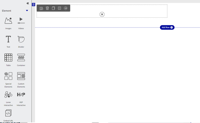
Each element is able to be individually customized based on individual preferences and also allows for custom elements to be made and placed into the columns.
Images
As a Loree 2.0 user, selecting the images option will now give you multiple pre-defined options, which easily add images, images with text, or both in combination. Selecting one of the options below will add the content to the particular column that has been selected.
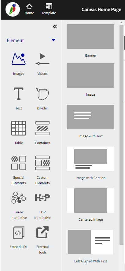
Once one of the above has been selected, a pop-up (modal) will appear that will prompt you to either choose an image that has been previously uploaded or to upload a new image/link to an image.
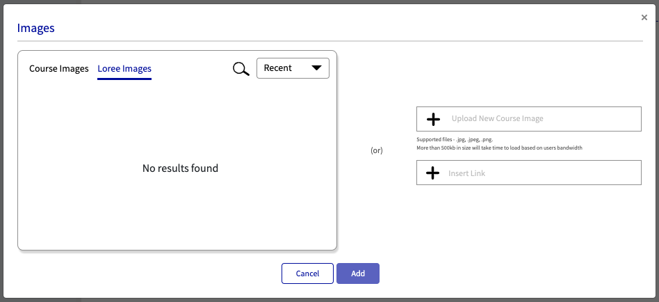
Adding image
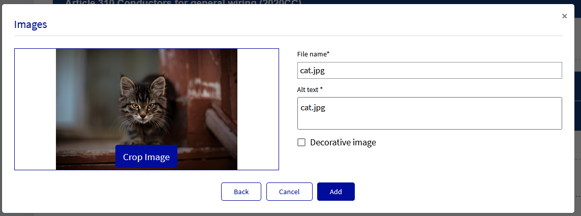
While adding an image it is mandatory to update the file name and the Alt text, while adding an image if we don't update any word or only update space in the Alt text box, add image button will be disabled. So now it will be mandatory to update some text in the alt text box or click Decorative Image to add an image.
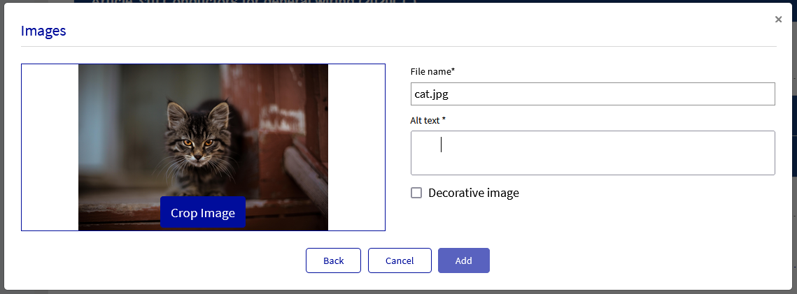
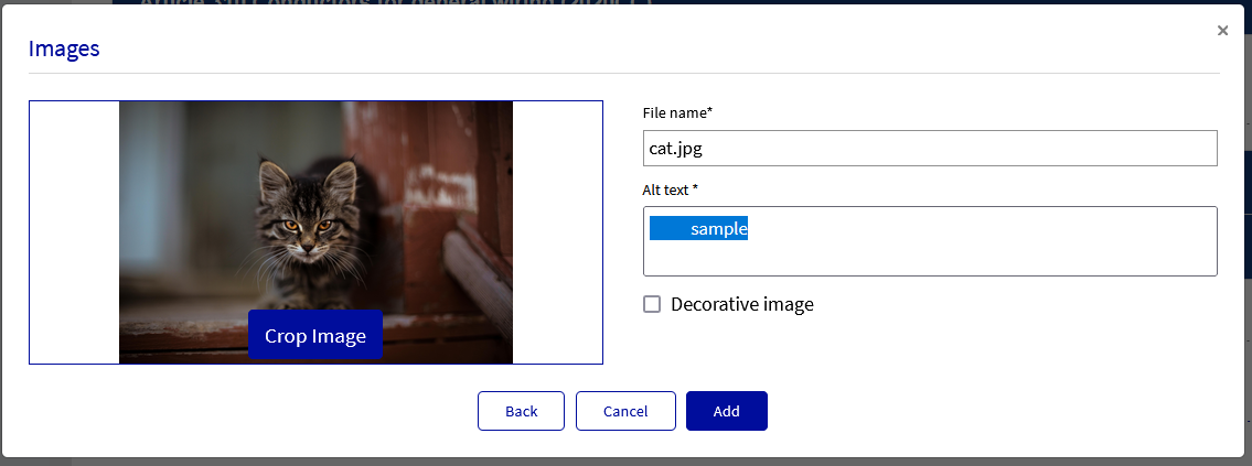
Image crop
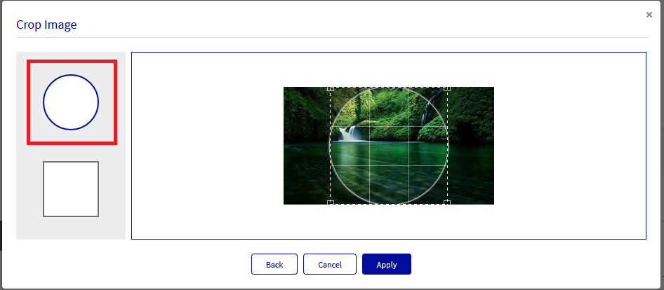
The loree editor now provides the option of making the user's own shapes like a circle or square of the image while applying to the page while designing it. It will be the same way by uploading the images, a little step is before adding to the editor, the image will have a Crop Image button on the image itself. By clicking on the Crop image, the user can update the shape of the image. For the image crop, a set of CSS properties has to be added in the Canvas themes to get the image crop reflected in Canvas too.
When we click on the Crop image, while hovering and selecting the crop options (like circle or square) it will highlight in Loree blue like other elements in Loree until the selection is removed.
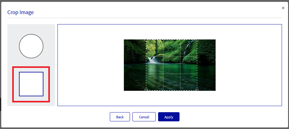
The image crop is not possible for banner images as the banner image have some other enhancements on the upcoming releases.
Note: The Crop Image option will only be available for images that are available for upload or in the course images. Some of the external images can’t be uploaded, therefore restricting this Crop Image option for users.
Restrict Image Duplication
When we save a page to LMS, it will compare the image file with the name and extension first.
If the name and extension are different in S3 and course files, then the file will be uploaded to the LMS course files.
If the file name and extension are the same in S3 and course files, then the file will be hashed to compare the images.
If the images are different after hashing, then the image file will be uploaded.
If the images are the same after hashing, then the image file will be restricted to upload.
The S3 images on the page while we Save to LMS will only be compared with the above steps and no images will be saved again in the LMS.
Note: While checking the image name for duplication, the spaces are filled with %20, and we will remove %20 while comparing the file name while duplication, therefore, if the File name itself has %20, that will be removed while comparing, in that case, the file with %20 and without %20 might get duplicated since we will remove %20 while comparing.
Embed Icons on Loree Editor
We are now providing the feature to add icons while creating the templates. The icons are accessible on the images element inside the editor and are not applicable for banners and images with text elements. Special Elements will also have Icon access. I,e when the user accesses the special element option inside the editor, they will be able to access the icons. Upon clicking on the Icons inside the element, it will list the icons based on the tag name.
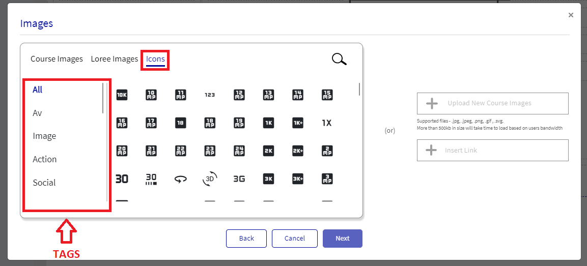
All the Icons will be in SVG format. Icon Library will have a search filter that can be used to search desired icons.
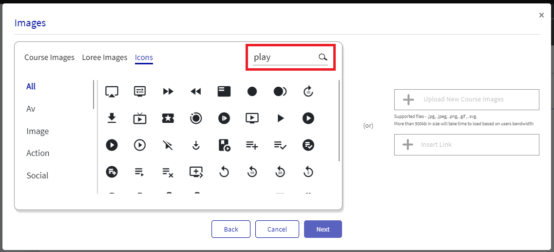
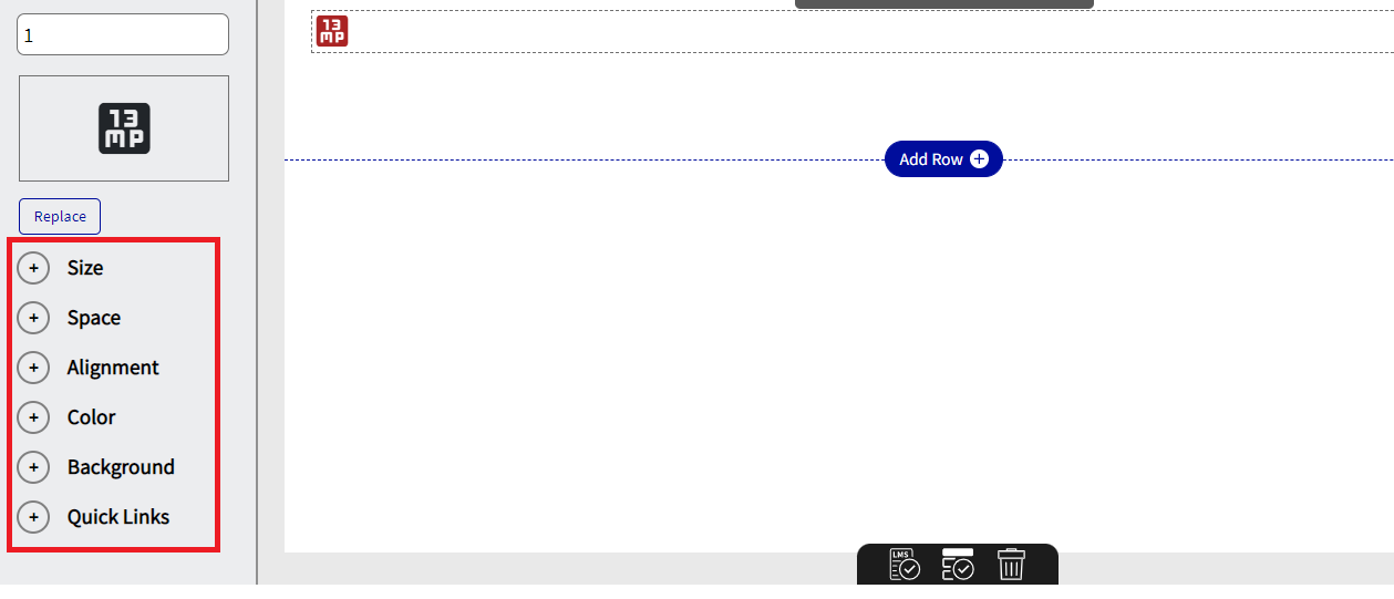
When we use tags or search filters all the icons will reflect within five seconds. We can update Size, Space, Alignment, Color, Background, and Quick Links to the Icons. We have to update the CSS in order to view Icons on the LMS.
Videos
Videos are easily uploaded to the page, and similar to images, Loree 2.0 allows users to choose from predefined layouts to assist in completing the page. See below for a screenshot of the layout, and options:
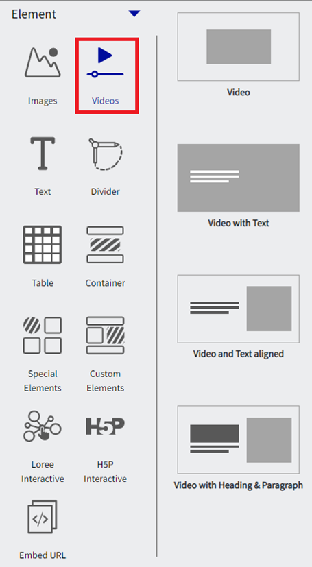
Once one of the above has been selected, a pop-up (modal) will appear that will prompt you to either choose a video that has been previously uploaded or insert a link to a video (YouTube, Vimeo, or other). We also have the option to upload a video directly from our canvas studio account using the Studio option.
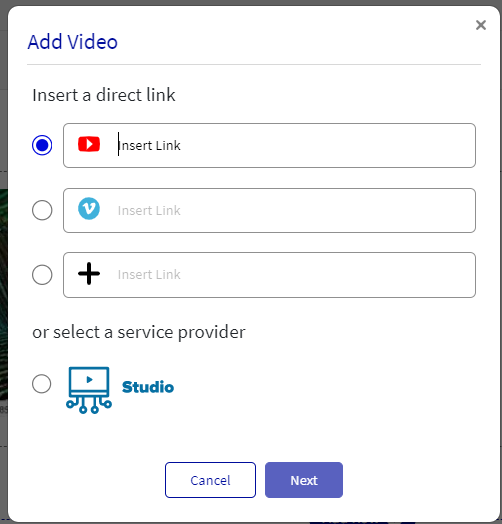
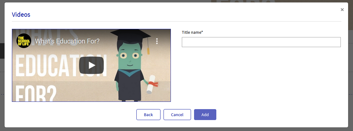
After updating the link click add, to add a Video you have to provide the Title name for the Video.
Selecting the video will give you four options as detailed below:
Video
Video with Text
Video and Text aligned
Video with Heading and Paragraph
Video
Once one of the Videos is selected, a pop-up (modal) will appear that will prompt you to either choose a video that has been previously uploaded or to upload a new video/link of a video (YouTube, Vimeo, or other). We also have the option to upload a video directly from our canvas studio account using the Studio option.

Video with Text
Once one of the Videos with Text is selected, a pop-up (modal) will appear that will prompt you to either choose a video that has been previously uploaded or to upload a new video/link of a video (YouTube, Vimeo, or other). Use this option to upload a video with Text on it.
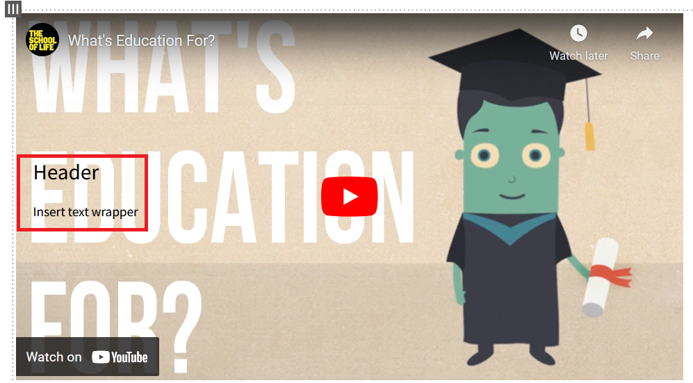
Video and Text aligned
Once one of the Videos with Text aligned is selected, a pop-up (modal) will appear that will prompt you to either choose a video that has been previously uploaded or to upload a new video/link of a video (YouTube, Vimeo, or other). Use this option to upload a video with Text aligned parallel to it.

Video with Heading and Paragraph
Once one of the Videos with Heading and Paragraph is selected, a pop-up (modal) will appear that will prompt you to either choose a video that has been previously uploaded or to upload a new video/link of a video (YouTube, Vimeo, or other). Use this option to upload a video with a Heading and Paragraph text parallel to it.

Text
This element can be used to add text to the page. Selecting the text will give you four options as detailed below:
Header
Paragraph
Heading with paragraph
QuoteBlock
Source Format
Header
The header option allows the user to add a test header to their content.
Paragraph
The paragraph option allows the user to add a paragraph of text to their content
Heading with paragraph
The heading and Paragraph option allows the user to add a header and a paragraph to their content.
QuoteBlock
The Quote Block option allows the user to update the quote with the writer's name.
Source Format
Source format allows the user to copy text or content from another web page source and paste it into Loree. while keeping all the original staying and content the same. This allows the user to easily copy and paste content from various sources without having to manually adjust the styling each and every time if preferred.
Once the user has made the selection, further design options are available, see below:
By clicking the particular column, (similar to selecting a row), it will give you options in the grey menu bar directly above the chosen column. The six options are:
Duplicate
Delete
Copy
Language
Move Bottom
Move up

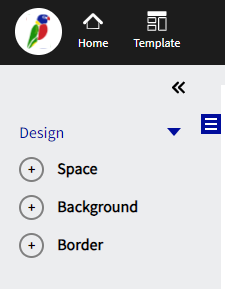
Further to the above, the side menu (left) will appear, with design options including:
Space
Background
Border
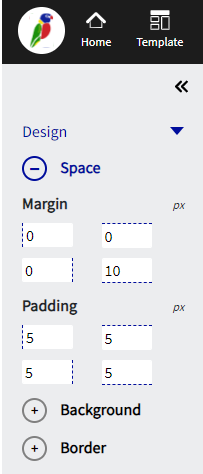
Space
Margin pertains to the area directly outside of the column. Adding a margin to either the top, bottom left or right will change the border dimensions of the column. All margins are adjustable using pixels as a standard of measure.
Padding pertains to the area directly inside the column. Adding padding to either to top, bottom left or right will move the content within the border of the column. All padding is adjustable using pixels as a standard of measure.
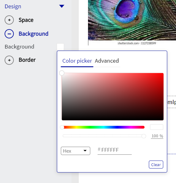
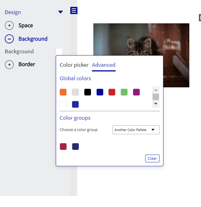
Background
The background option allows the user to change the color of the entire column. Users have the ability to either choose from a color scaling tool or input a specific Hex code or input the specific RGBA code for a color to be applied. Users can also choose the colors from the Global color Palette or from the predefined color groups.
Border
This design element enables users to add a border to the column selected. Its features include changing the color, width, and styling. Width sizes are adjustable using pixels as a standard of measure.
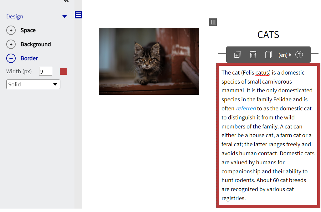
Text - Control Menu
Much like many conventional text writers, Loree 2.0 gives users the ability to change the text based on various text editing options, these include:
Style
Bold
Italic
Font
Size
Line Height
Text Color
Background Color
Border Color
Unordered List
Ordered List
Word Options
Alignment
Insert Link
Clear Format
Note: Unordered list and Ordered list options will not have style options as shown on the screenshot below:

All other options will have a Style option as shown below:

To access the text editing feature, double-click the word or paragraph that you would like to edit.
Divider
The divider features allow users to clearly divided pages with either a line or spacing. The line and spacing options are customizable depending on what particular style you desire. The two screenshots below highlight the divider feature option and the two options of “Line” and “Space”.
-20230726-185904.png?version=1&modificationDate=1690398011740&cacheVersion=1&api=v2)
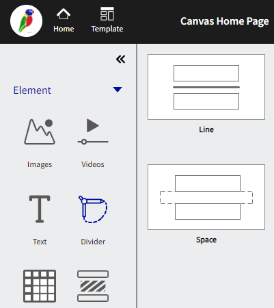
Line Divider
Selecting a line will present a clear horizontal line, dividing the page or content. Once the line has been selected, a design menu will appear on the “left-hand side” of the screen, presenting 5 different customizations for the line.

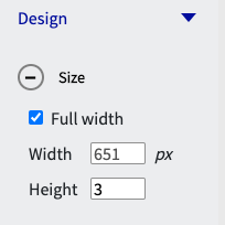
Size
The size options allow the user to adjust the width and height of the line that spans across the page. By default, the line is the full width of the screen. This option is able to be toggled on and off via the checkbox and both the width and height are able to be adjusted to the user's desired size.
Space
Margin pertains to the area directly outside of the row. Adding a margin to either the top, bottom left or right will change the border dimensions of the row. All margins are adjustable using pixels as a standard of measure.
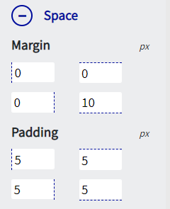
Padding pertains to the area directly inside the row. Adding padding to either to top, bottom left or right will move the content within the border of the row. All padding is adjustable using pixels as a standard of measure.
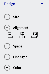
Alignment
Alignment can assist the user in determining where the position of the line in relation to the page. Alignment has three options which are, left align, centre align and right align.
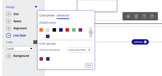
Line Style
The line style option allows the user to change the color of the line with either the color scaling tool or if the color is known the user can update the specific HEX code or the specific RGBA code. Users can also choose the colors from the Global color Palette or from the predefined color groups.

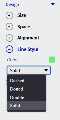
There are also, 4 options of style that are able to be applied to the line, which is detailed in the screengrab below:
Background
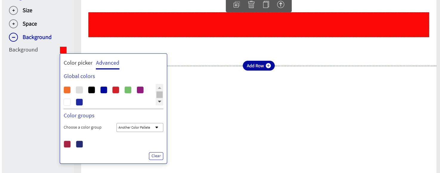
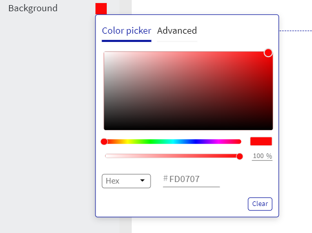
The last feature of Background enables the user to change the color of the entire row background (not the color of the line). As per the below screen grab, the color red, or HEX code #F30606 was selected and applied to the row. Or RGBA code 243, 6, 6, 255 was selected and applied to the row. Users can also choose the colors from the Global color Palette or from the predefined color groups.
Space Divider
Selecting a line will present a clear horizontal line, dividing the page or content. Once the space divider has been selected, a design menu will appear on the “left-hand side” of the screen, presenting 3 different customizations for the line.

Size
The size options allow the user to adjust the width and height of the line that spans across the page. By default, the line is the full width of the screen. This option is able to be toggled on and off via the checkbox and both the width and height are able to be adjusted to the user's desired size.

Space
Margin pertains to the area directly outside of the row. Adding a margin to either the top, bottom left or right will change the border dimensions of the row. All margins are adjustable using pixels as a standard of measure.
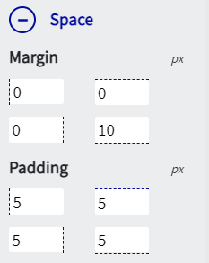
Padding pertains to the area directly inside the row. Adding padding to either to top, bottom left or right will move the content within the border of the row. All padding is adjustable using pixels as a standard of measure.
Background
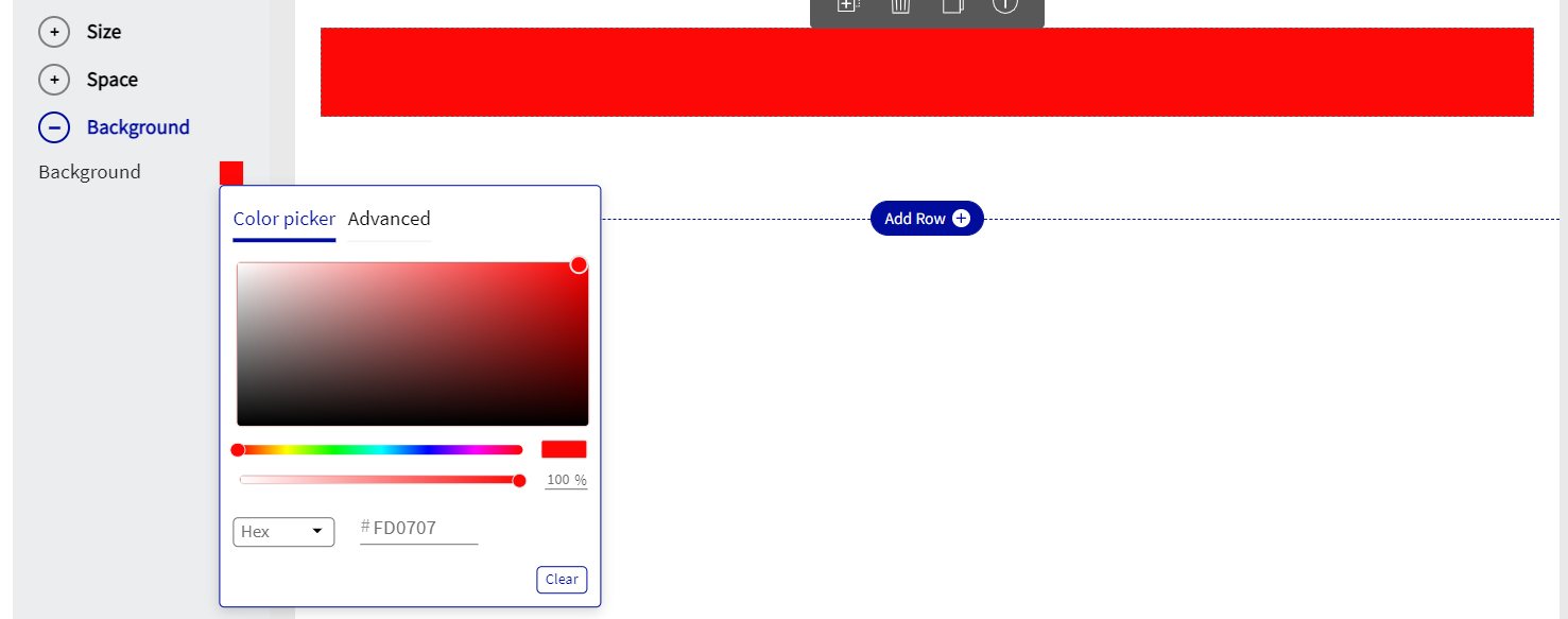
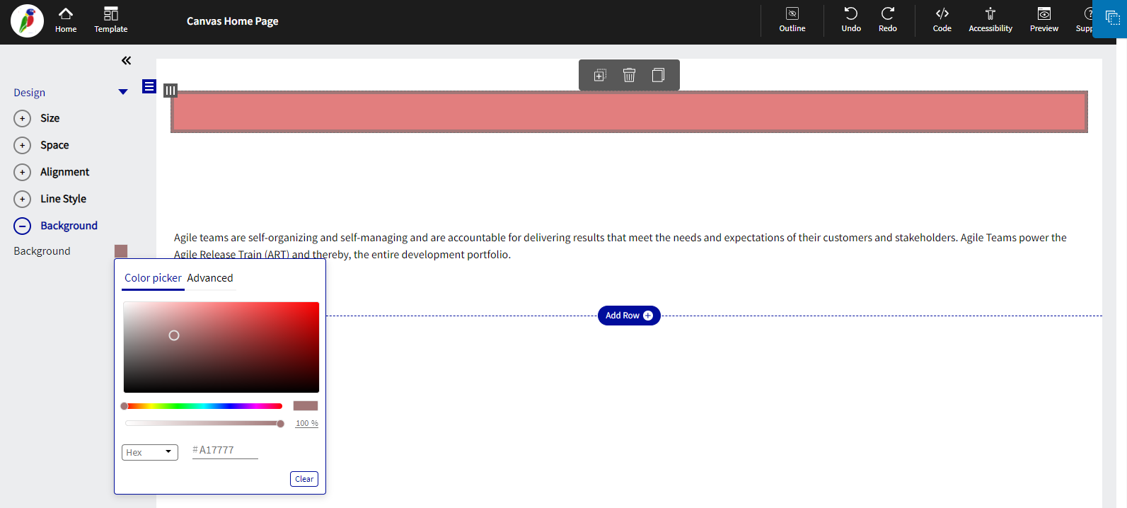
The last feature of color enables the user to change the color of the entire divider.As per the below screen grab, the color red, or HEX code #FD0707 was selected and applied to the divider. Or the RGBA code 253, 7, 7, 255 was selected and applied to the divider. Users can also choose the colors from the Global color Palette or from the predefined color groups.
Table
The table feature allows
the user to easily create and add a table to the page. There are 4 pre-defined styles of tables that are as shown below:
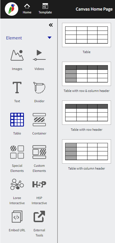
Once selecting the table from the “left-hand menu”, the menu will auto-populate onto the page and the design menu will appear on the left-hand side.

The editor now allows the user to apply styles for the entire row or the entire column, individual rows or columns to update the Margins, Padding, Font style, Font Family, and Font size. This is more flexible and gets easy customization for their own table users.
Enable the ‘Select entire Row’ and ‘Select entire Column’ checkboxes to select the entire row and column.

Pro tips on short-cut keys:
Function | Short-cut keys |
|---|---|
To select Multiple cells in a table | cmd/ctrl+shift+desired cells. |
Font style section: |
|
Bold or Un-bold | cmd/ctrl+B |
Italic/remove Italic | cmd/ctrl+I |
Underline/remove Underline | cmd/ctrl+U |
Alignment
Alignment can assist the user in determining where the position of the table is in relation to the page. Alignment has three options which are, left align, centre align and right align.

Size
The user is able to determine how wide the table is across the page based on a percentage of the page size. By default, the table is set to 100%, which therefore spans across the full width of the page. As an example, the table size shown in the screengrab below has been reduced to 80%.

Space
Margin pertains to the area directly outside of the table. Adding a margin to either the top, bottom left or right will change the border dimensions of the table. All margins are adjustable using pixels as a standard of measure.
Padding pertains to the area directly inside the table. Adding padding to either to top, bottom left or right will move the content within the border of the table. All padding is adjustable using pixels as a standard of measure.
Border
The border of the table is able to customized by width, color, and style. 4 options of style are able to be applied to the line, which is detailed in the screengrab below:

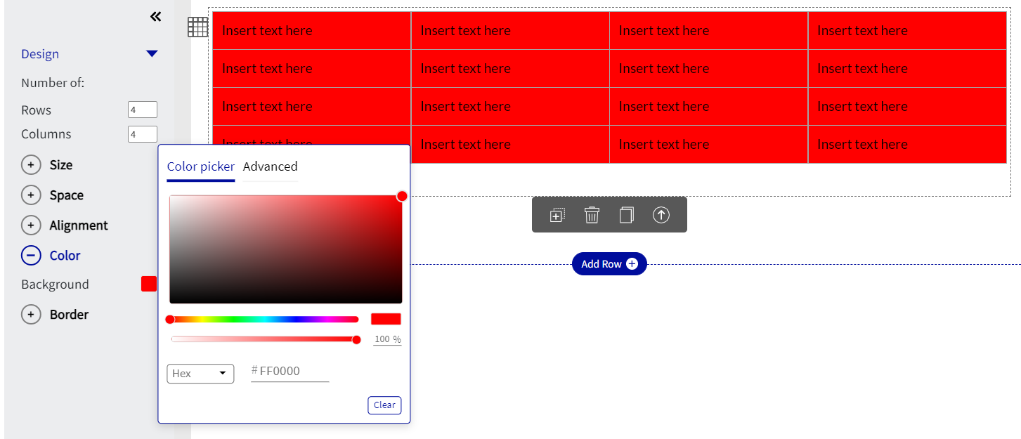
Color
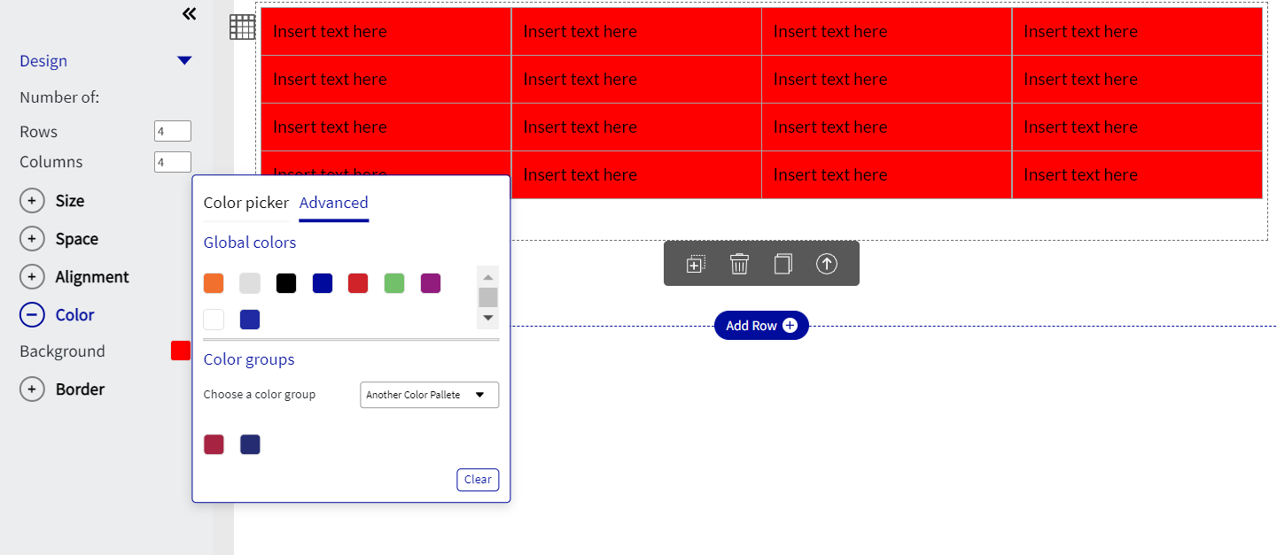
Color enables the user to change the color of the background within the table.As per the below screen grab, the color red or HEX code #FF0000 was selected, or RGBA Code 255, 0, 0, 255 was selected and applied to the table. Users can also choose the colors from the Global color Palette or from the predefined color groups.
Deleting Column
Once selected a pop-up or modal is presented to the user which either allows the user to do one of two:
Delete the entire column or
Clear the content in the column

The first option “Delete the entire column” will clear the entire column field and all the content within. Any pre-defined margins or layouts of the column will be deleted.
The second option “clear the content”, will only delete the specific content within the column, however, will leave the layout as it was.
Table Content customization
Loree 2.0 editor allows the user to apply styles for the entire row or the entire column, individual rows or columns to update the Margins, Padding, Font style, Font Family, and Font size. This is more flexible and gets easy customization for their own table users.
Enable the ‘Select entire Row’ and ‘Select entire Column’ checkboxes to select the entire row and column.

Container
The container feature enables the user to add sub-sections to the row. This allows for a more versatile section and provides space between content.

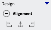
Alignment
The container is able the be aligned either by default to the left or can be centre or right-aligned.
Size
The size can be adjusted based on width, this can be changed based on percentage size, as per the below screenshot.

Space
Margin pertains to the area directly outside of the container. Adding a margin to either top, bottom left or right will change the border dimensions of the container. All margins are adjustable using pixels as a standard of measure.
Padding pertains to the area directly inside the container. Adding padding to either to top, bottom left or right will move the content within the border of the container. All padding is adjustable using pixels as a standard of measure.
Border
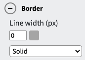
The border is able to be adjusted based on the width, color, and style. As with all other border styles through Loree, this is easy to change function and has the color scaling gradient for easy use.
Color
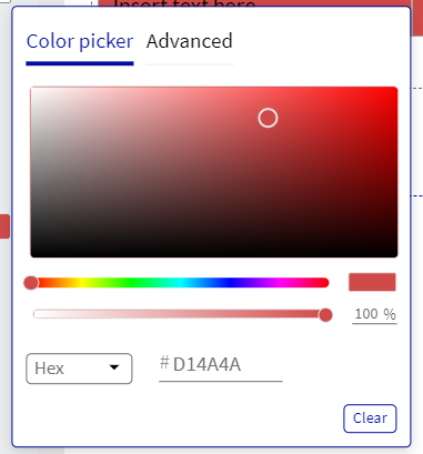
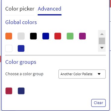
Color enables the user to change the color of the background within the table.As per the below screen grab, the color red or HEX code #FF0000 was selected, or RGBA Code 255, 0, 0, 255 was selected and applied to the table. Users can also choose the colors from the Global color Palette or from the predefined color groups.
Special Elements
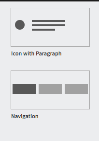
Special Elements allows users to have quick and easy access to the Navigation menu and Icon with text elements in Loree 2.0.

Navigation menu
In Loree, Now we can create navigation bar elements, and using that we can add logos and other menu items to the navigation bar.
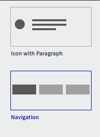
On clicking the navigation option, you can see various navigation bars like Text Navigation, Navigation with an image aligned left, Navigation with an image aligned right, and Navigation with 2 images aligned centres.

Duplicate, copy, paste, delete, and move up and down icons are available for the specific menu item.
In the navigation bar, there will be five menu options In which all the style properties like border, color, size, space, Alignment, and background color are customizable.

We can customize the navbar to increase and decrease the number of Navigation menus on the editor itself.
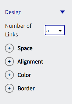
Text Navigation
In the text navigation, the menu bars can be customized with text and other style options.

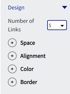
Navigation with an image aligned left
In Navigation with the image aligned left, the menu bars can be customized with an image on the left corner and text on the right edge. Text can be customized using the style options.

Navigation with an image aligned right
In Navigation with the image aligned right, the menu bars can be customized with the image on the right corner and text on the left edge. Text can be customized using the style options.

Navigation with 2 images aligned centre
In Navigation with Navigation with 2 images aligned centre, the menu bars can be customized with two images on the right and left corner and text in the middle. Text can be customized using the style options.

Custom Elements
Custom Elements allows users to have quick and easy access to all elements that have been made previously and saved in Loree 2.0.
Creating a custom element
Once a column has been created to your desire, the user is able to save the column as a custom element. See the below screengrab, detailing the initial step:

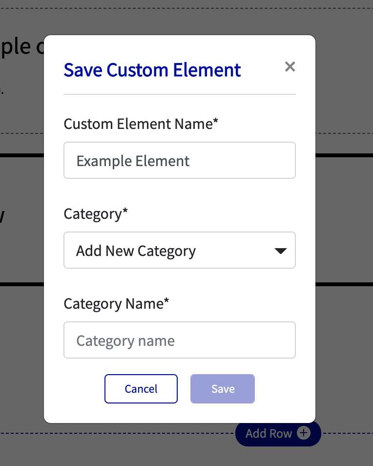
The top-left icon in the column section menu is the save column button. Once this is clicked a pop-up (modal) will appear, see below:
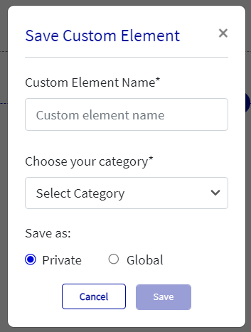
The user is then able to name the custom element and choose a category that the particular element belongs. If no categories are saved, a new category is able to be created and a category name text box will appear. The user can save a custom Element as a private or global. Only the particular user who created the custom blocks as private can view and use them. And if the user creates blocks as global then it will be shared globally and all the users in the organisation can use them, (see below):
Adding a custom element to a column
Once a custom element has been made and saved, it will be added to “My Elements” (See below for further details on My Elements), which will allow quick access for the user to add into the column selected.
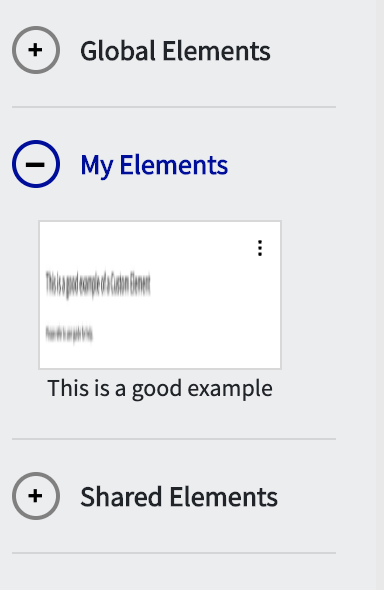
“This is a good example” is a custom element that was created for the purposes of this User Guide. Once the user selects the desired element it will automatically populate in the column that was originally selected and prompt the user to either cancel the action or add the custom element. See the below screengrab for visual reference:

Global Elements
Global elements are elements that have been approved by the admin of Loree version 2.0 for global distribution or created as Global while creating an element. This enables all users of Loree from an entire organization to access the custom elements that have been made. If an element is not created as a global element then only the admin is able to declare whether or not a custom row is distributed globally.
My Elements
My elements are elements that have been created by the user and can only be seen by the user who created the element. When saving a custom element, if private is selected then that element will reflect under my element.
Shared Elements
Shared elements are elements that have been shared with various departments within an organization. The admin can declare that only certain departments from an organization have access to custom elements. For example, a school may only want a custom element to be seen by the Science and Math department, therefore only making the particular custom element in question available for Science and Math departments Loree users.
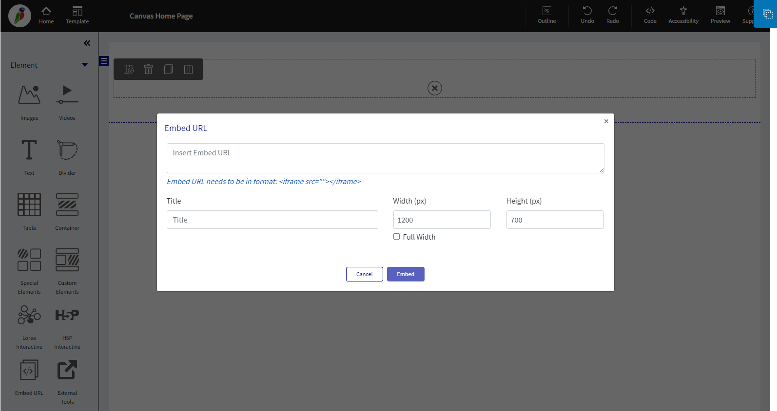
Embed URL Block
Loree 2.0 introduces the “Embed URL“ block for the convenience of updating the iframes in the editor directly. For example, YouTube iframe links or any iframe links to get to the page.

External Tools
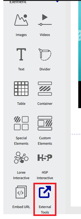
Lore introduces the “External Tools“ Block inside the Loree editor. Here you can link your External Tools with the Loree editor and can directly Insert, Add and Edit any content to a Loree page from your Linked External tools.
For Example; We have linked H5P in our editor as seen in the screenshot below
Loree Interactives
The complete Loree Interactives user guide is available on page → Loree Interactive in Loree 2.0 User guide.
Loree Admin Dashboard
The complete Loree Admin Dashboard user guide is available on page → Loree 2.0 Admin Dashboard User guide.
Thank you!!!