Table of contents
| Table of Contents |
|---|
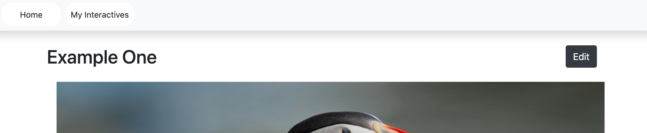
Welcome to Loree Interactive
Interactive content is content that requires active engagement from its consumers. Interactive content facilitates better interaction between the content creator and the audience. The purpose of the interactive content is to make learning easier. It gives more interest to the students. It explains the concepts in an easy and interactive manner. more than just a passive viewer, the individual than just a passive viewer, the individual becomes an integral part of a dynamic, two-way experience.
...
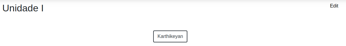
When clicking the Back to the editor icon then it displaysthe input form with the contents.
Create
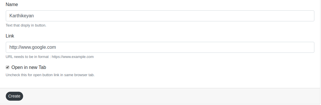

Users can enter all details in the input-form and customization form and then click the create button it redirects to the view page to view the created content.
Edit

Users can click the edit button then it retrieves the created content in input form and able to add the content and customization options.
...
Multiple Choice questions can be an effective assessment tool. The learner is given immediate performance feedback. The Multiple Choice questions can have a single or multiple correct options per question.
Input Form
...
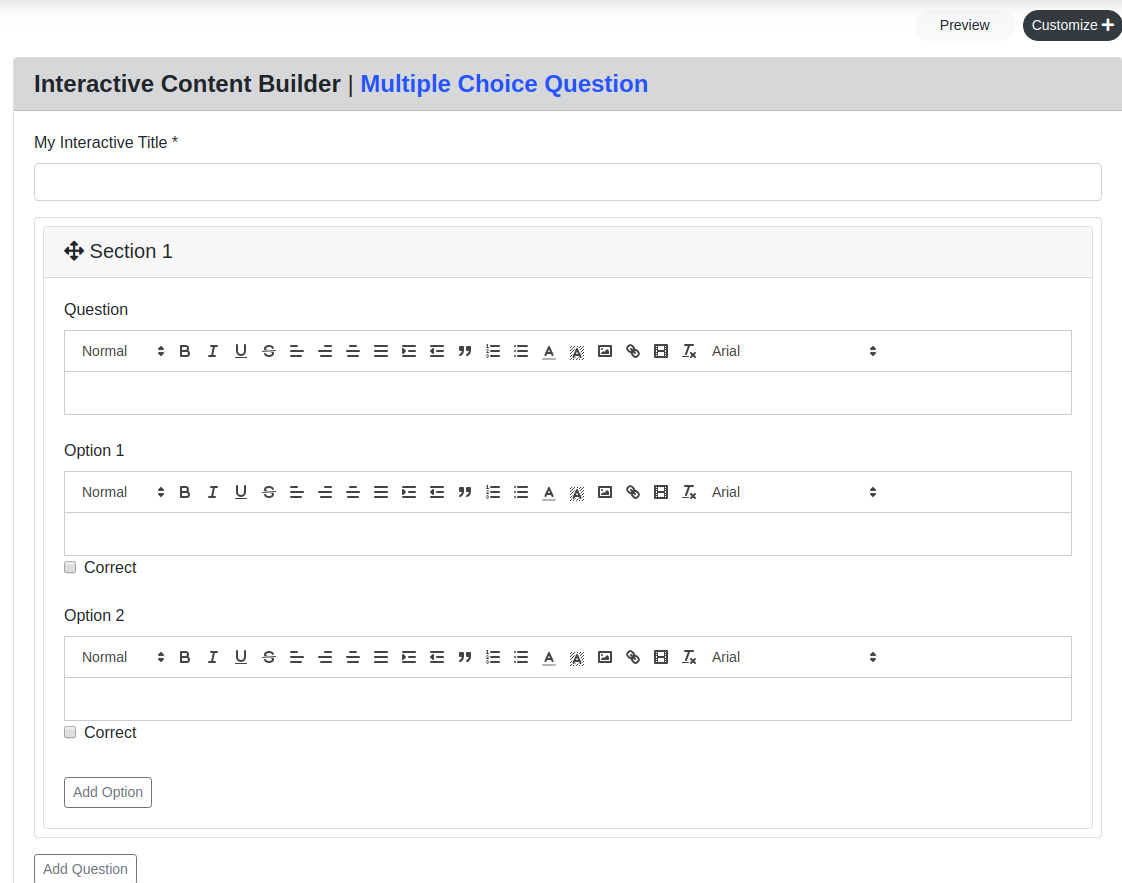
Users can create an MCQ form by entering the,
...
For the text editor, the same features in the accordion and tab included in the MCQ component.
Drag and Drop
...
Drag and Drop is a very interactive and user-friendly concept that makes it easier to move the panel over the panels by grabbing it. This allows the user to click and hold the mouse button over an element, drag it to another location, and release the mouse button to drop the element there.
Preview
...
This feature provides a live preview of the component created.
...
Preview
This feature provides a live preview of the component created. Clicking on the Preview option opens the popup module in preview mode. To return to the Input form, click on the Back to the editor icon or on the greyed-out space outside the pop-up (modal).
...
Customization
...
In customization Button form, there are two blocks. They are Question Type and Behavioural Setting
Question Type:
...
There are two option are single and multiple
Users can click the single select it displays the radio button for the MCQ component.
Users can click the multi-select it displays the checkbox for the MCQ component. so users can able to select multiple answers.
Behavioral Setting:
...
There is three option in the customization form. They are Check Answer, Retry Button, and Shuffle Order.
In default, all the customization options are enabled.
If a designer can enable the Check Answer then it displays the check button in the view page
...
If a designer can enable the Retry then the user can answer again and again
...
...
, Behavioural Settings, Font and style options for questions, answers, and options in the MCQ. Users can apply background color and border color for the question section and answer section, Font color, Font weight, Background color for the progress bar, and button colors.
Border style customization,
...
Behavioral settings,
...
Progress bar customization,
...
MCQ option customization,
...
Question customization,
...
Buttons customization,
...
Once customizations applied,
...
Question Type
There are two option are single and multiple
Users can click the single select it displays the radio button for the MCQ component.
Users can click the multi-select it displays the checkbox for the MCQ component. so users can able to select multiple answers.
*Please see the above screenshot for reference.
Behavioral Settings
There is three option in the customization form. They are Check Answer, Retry Button, and Shuffle Order.
In default, all the customization options are enabled.
If a designer can enable the Check Answer then it displays the check button in the view page
...
If a designer can enable the Retry then the user can answer multiple times over.
...
If a designer can enable the Shuffle then it displays the answer shuffled in the view page
Click & Reveal Interactions
The click and Reveal Loree Interactive is a great way to allow users to offer additional information and have the end-user engaged with the content. These can be typically placed throughout the page as reference points.
Input Form
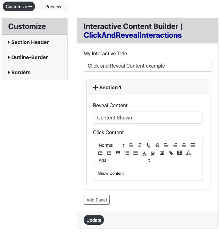
Users can create a “Click and Reveal Interaction” form by entering the,
Interactive Title
Reveal Content
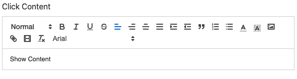
Click Content
Customize
Click the create “Click and Reveal Interaction” to view the created Interaction in the view page.
...
Title
This title display on the view page of the component and in Loree.
Reveal Content
This is the content that will be shown once the end-user clicks on the “Click Content” box. The content can be written as either a heading or general paragraph depending on the user's needs.
...
Click Content
This is the content that is presented to the end-user and once selected by the click of the mouse, will open the “Reveal Content” interactive.
Preview
This feature provides a live preview of the component created. Clicking on the Preview option opens the popup modal in preview mode. When clicking the Back to the editor icon then it displaysthe input form with the contents.
...
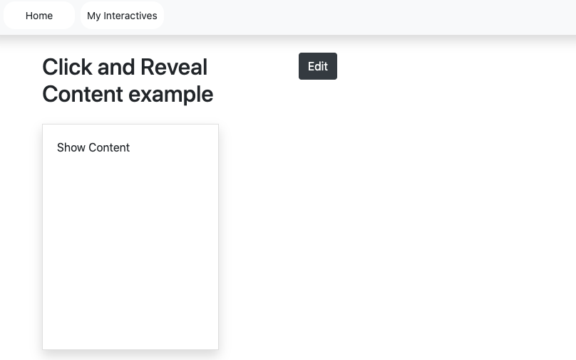
As per the interactive feature, in preview, the user is able to click in the left side box and reveal the right-hand side content. See screengrab below for example:
...
Create
Users can enter all details in the input-form and customization form and then click the create button it redirects to the view page to view the created content.
Edit
Users can click the edit button then it retrieves the created content in input form and able to add the content and customization options. Refer to the screengrab above for the location of an edit button.
Update
When clicking the update button then it adds the contents and customization option in the component.
...
Customization
Users are able to customize the created component in terms of color, alignment, icons, and borders. The Click & reveal Interaction customization form consists of Three headers. They are Section Header, Outline-Border, and Borders.
Section Header:
The section header consists of the following options: Font Header, family, size, and weight and color are fonts and background color and alignment.
Font header:
There are the 6 headers are H1 – H6. Users can customize the font headers for the header
Font Family:
There are the 13 Typeface
Arial
Arial Black
Brush Script MT
Comic New Courier
Georgia
Helvetica
Lucida
Open sans
Sans Unicode
Tahoma
Times new roman
Trebuchet MS
Verdana
Font size:
There 10-32 Font Sizes are available. Users can customize the header font size.
Font weight:
Bold, Normal, and Lighter font-weight
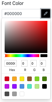
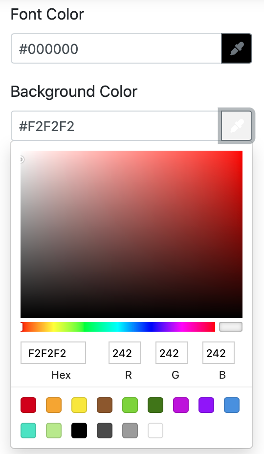
Font and Background Color:
Users can customize the font and background color. There are 3 ways to add color in the color palette.
Type the Hex value in the color picker box.
Drag the picker inside the color palette.
Add the RGB value in the color palette.
Font alignment:
Users can align the LEFT, CENTRE, and RIGHT alignment for the header.
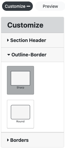
Outline-Border
In the Outline-border, there are two border option
Square edges - it displays the square border
Rounded edges - it displays the curved border
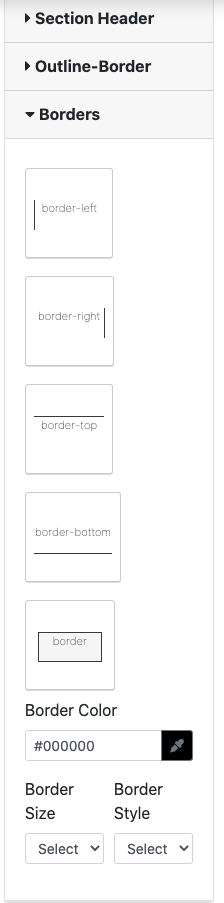
Borders
The border option has up to 5 different borders including, border-left, border-right, border-top, border-bottom and border. This feature also allows the user to change the color, border size (pixels) and border style.
Flip Card
Loree introduces the flip card Interactive which, allows the user to create a movement/motion element within its interactive to increase learner engagement.
Input Form
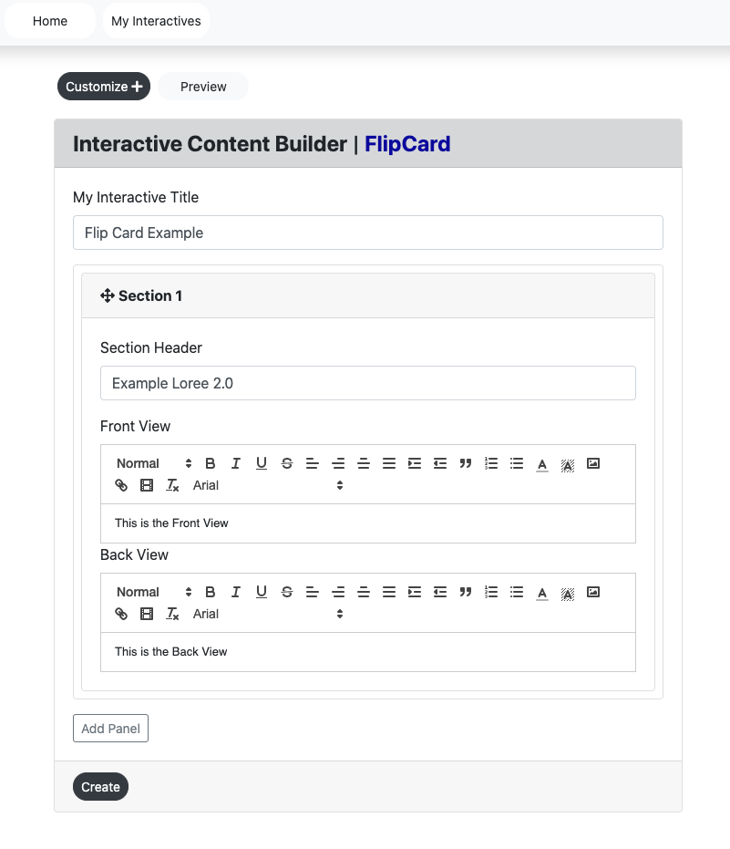
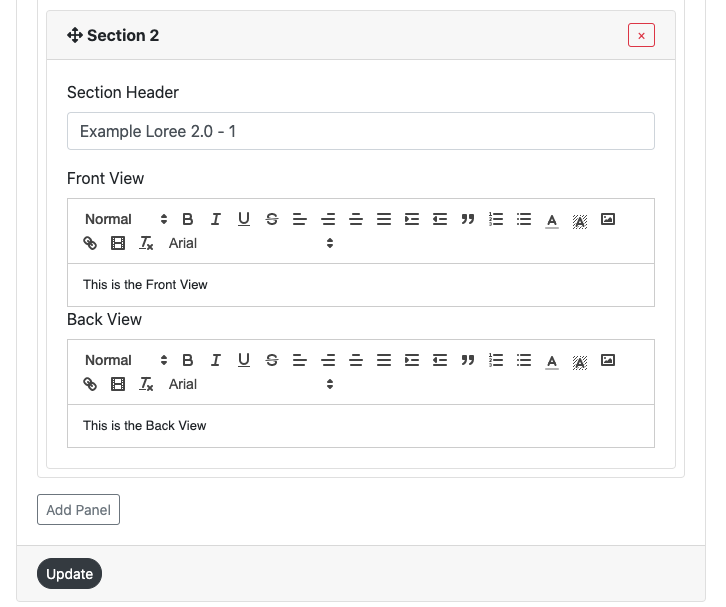
Users can create a “Flip Card” form by entering the following:
Interactive Title
Section Header
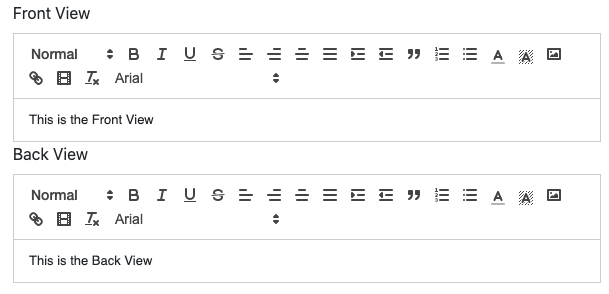
Front View
Back View
Customize
Click the create “Flip Card” to view the created Interaction in the view page.
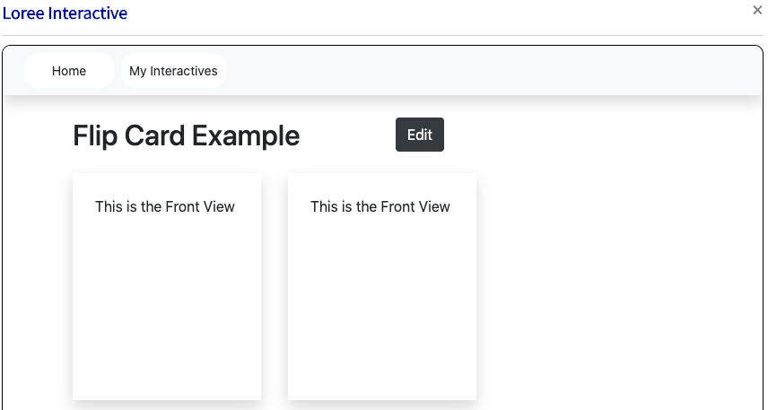
Title
This title display on the view page of the component and in Loree.
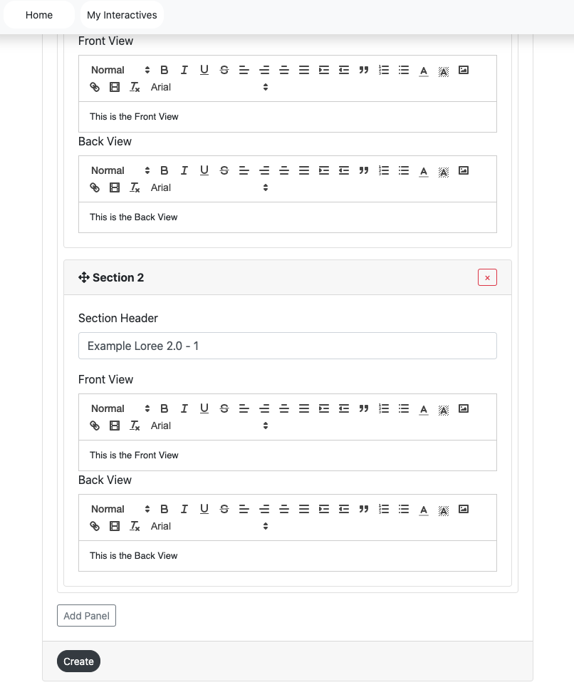
Section Header
Each flip card is able to be named for reference. As per the above screengrab, the section header for the particular flip card is Example Loree. This will NOT be shown on the page or where the Flip Card interactive is placed throughout the document.
Front and Back View
The user is able to add text to the front and back section of the flip card. As per all other Loree text editors, the front and back views are able to be changed, please refer to “Accordion - font” interactive for more information.
Users click the “add panel” it adds one flip card (Section)
Users can remove the panel by clicking the remove button on the particular panel.
Users click the remove button it opens the pop up modal “Are you sure you wish to remove this panel?”
Users click the “Ok” button it removes the panel.
Users click the “Cancel” button it does not remove the panel and return to the input form.
Create
Users can enter all details in the input-form and customization form and then click the create button it redirects to the view page to view the created content. (Create button located on the bottom left of the screen - as per the screengrab above).
Edit
Users can click the edit button then it retrieves the created content in input form and able to add the content and customization options.
Update
When clicking the update button then it adds the contents and customization option in the component. (Located on the bottom left-hand side of the screen).
Customization
Users are able to customize the created component in terms of Section Header and Borders. The Flip Card Interaction customization form consists of Two headers. They are Section Header and Borders.
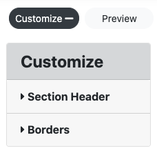
Section Header
The section header allows the user to change the front and backside of the Flip Card. Users can customize the background color. There are 3 ways to add color to the color palette.
Type the Hex value in the color picker box.
Drag the picker inside the color palette.
Add the RGB value in the color palette.
In the below screengrab the colors red and blue have been given to both respective fields.
...
These two selected colors will be shown on the flip card as per the below preview. (Note the screen grabs for both the front side and backside of the flip card):
...
Number of cards in Rows
The number of cards presented per row can be changed to the desired number of either 1, 2, 3, or 4. As a default, 3 cards per row have been selected. As an example, the number of cards per row has been changed to two and shown below in preview as it would show on the Loree page. *Please note, 4 flip cards were made for this example.
...
Event Click and Hover
To engage the end-user the functionality of either flipping the card via a click or hover element has been added.
Click - When a user clicks on the particular flip card, the card will flip to the backside. If the user clicks again, the card will revert back to the original front side.
Hover - When a user hovers their mouse over a particular flip card, the card will flip to the backside. Once the mouse is moved away from the card, the card will revert back to the original front side.
Preview
This feature provides a live preview of the component created. Clicking on the Preview option opens the popup module in preview mode. To return to the Input form, click on the Back to the editor icon or on the greyed-out space outside the pop-up (modal). For screen grab, please refer to the Multiple choice questions interactive section.
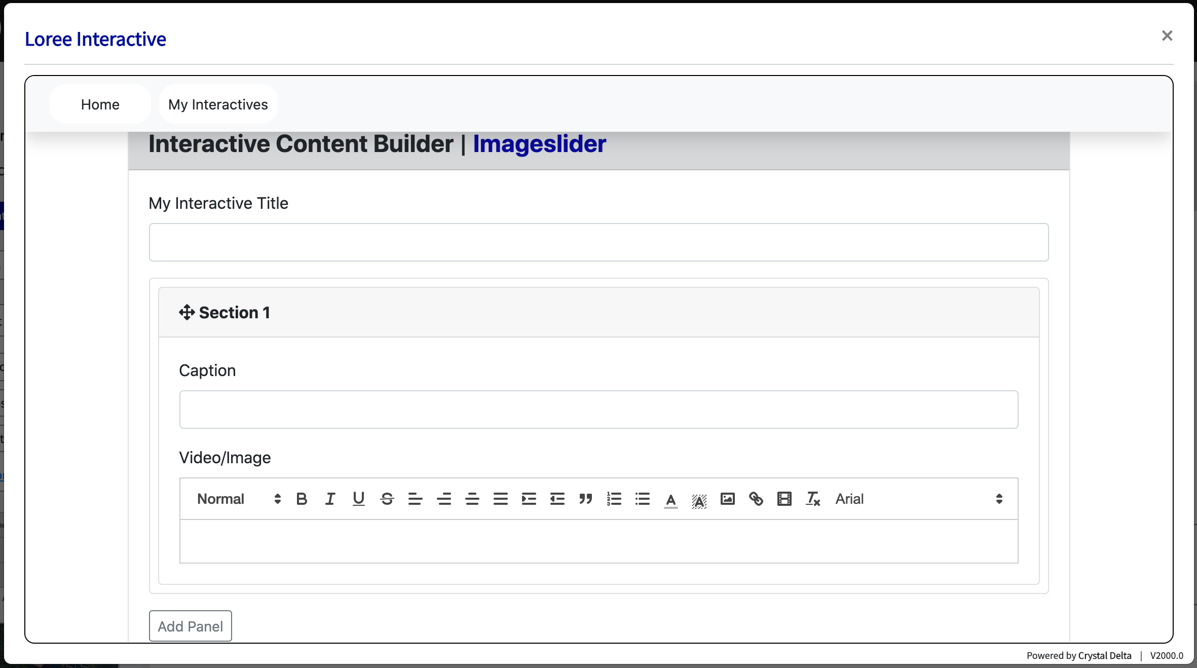
Video/Image Slider
New to Loree is the ability to engage with end-users via a video and or image slider. Enhancing the experience by delivery of visual information and reducing the time scrolling.
Input Form
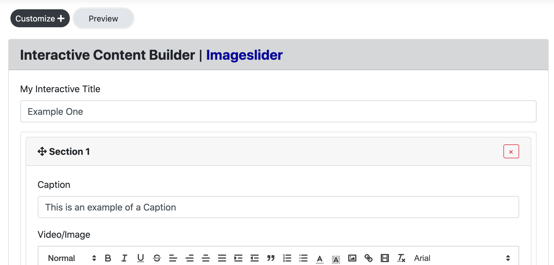
Users can create a “Video/Image Slider” form by entering the following:
Interactive Title
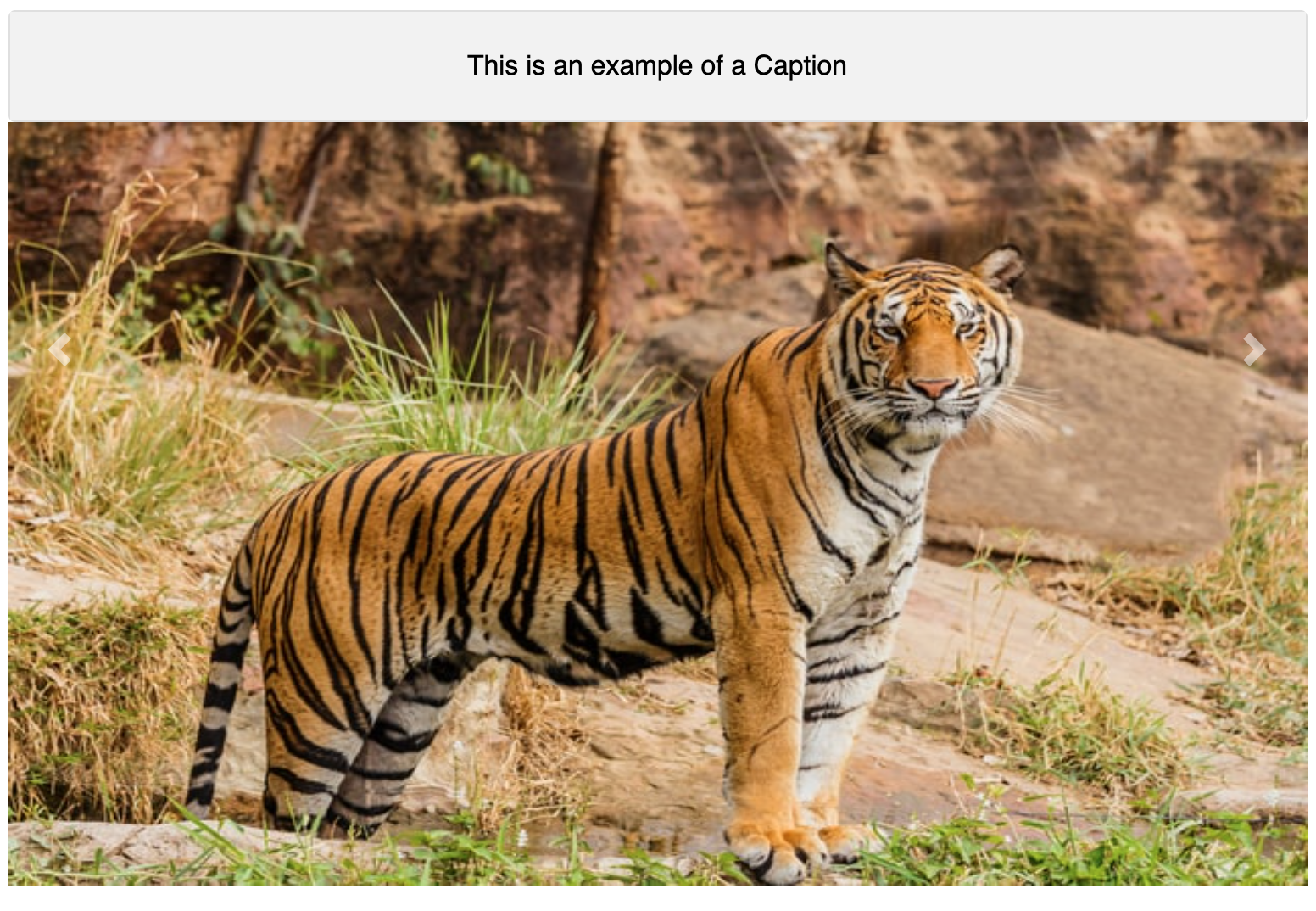
Caption
Video / Image
Title
This title display on the view page of the component and in Loree.
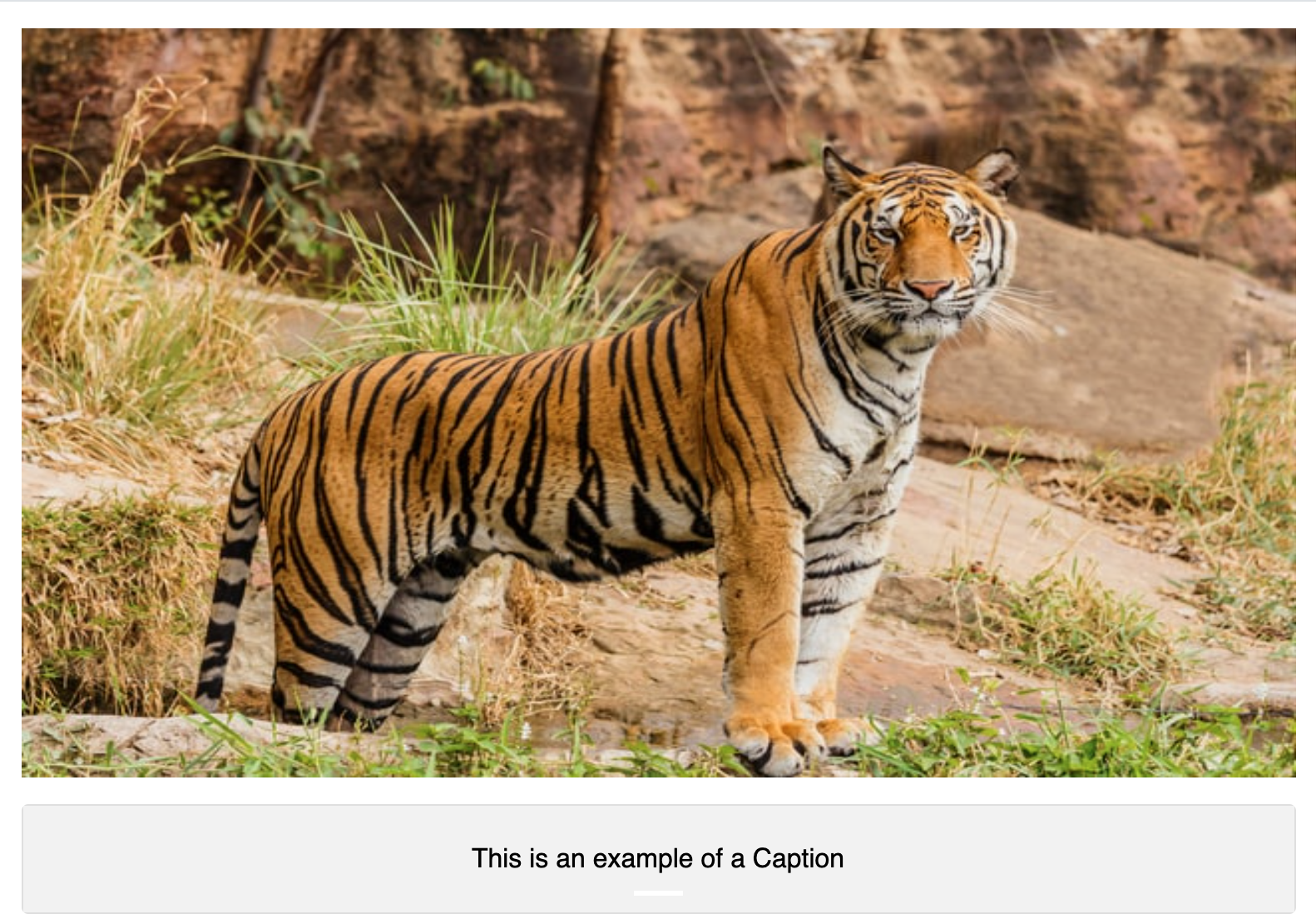
Caption
The caption section is considered the heading that will be placed next to the video. This can be used to describe the video/image or simply be a one-word header of your choice. As an example, please see the below preview:
Video/Image
The video/Image section is similar to the other text editing sections throughout Loree, however with some small adjustments to allow for easy access to videos and images.
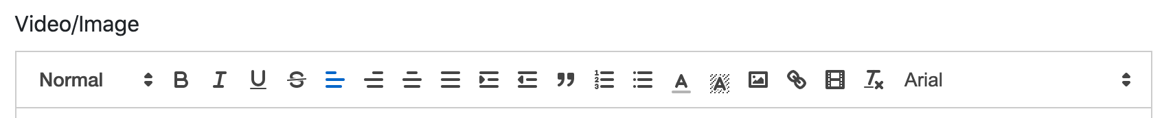
Please note, the image icon, link icon and movie strip icon, which allows the users to easily access videos/images to upload to the slider. (Icons of image, link and movie strip are below for reference)
Creating the Slider
Once a video/image has been selected in the first panel, click on “Add Panel” to add another Section. Fill in the input form and add another video/image to create your slider.
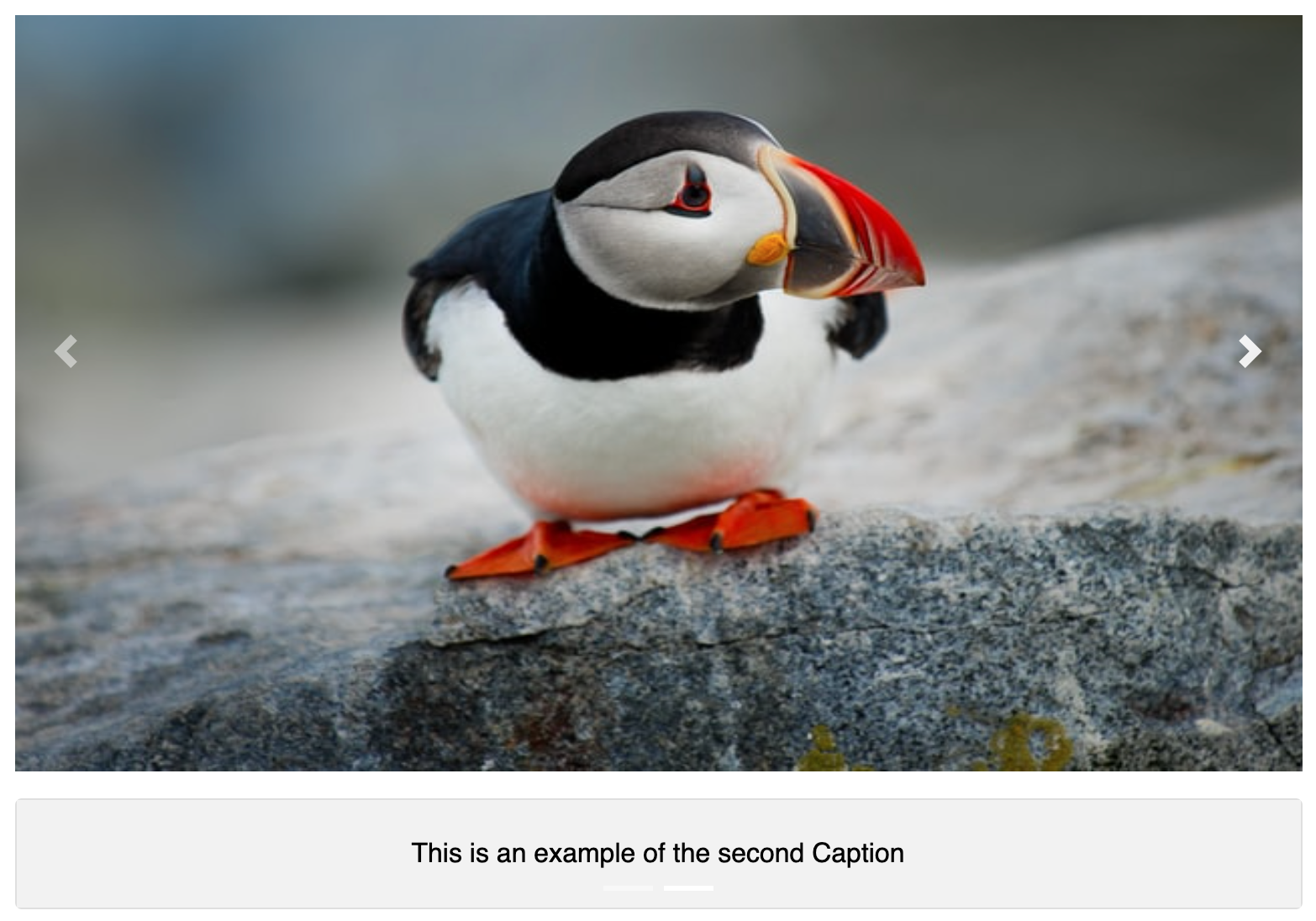
Once two or more videos/images have been added to the input-form, the user is able to preview the slider with the “Preview” button adjacent to the Customize+ button at the top left corner of the pop-up (modal).
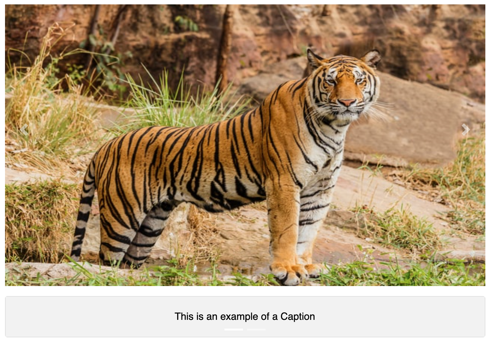
The preview will show the images as per the above screengrab, automatically populating with both a left and right button midway down the images. Further to this, the caption will be displayed at the bottom of the images. Note: The images will automatically scroll as a default.
Preview
This feature provides a live preview of the component created. Clicking on the Preview option opens the popup modal in preview mode. When clicking the Back to the editor icon then it displaysthe input form with the contents.
Edit
Users can click the edit button then it retrieves the created content in input form and able to add the content and customization options.
Update
The update will only be shown if selecting “edit” as per the above. When clicking the update button it adds the contents and customization option in the component. (Located on the bottom left-hand side of the screen).
Customization
Users are able to customize the created component in terms of the Section Header. The Video/Image Interaction customization form consists of one customization component. This is Section Header.
Section Header
The section header consists of the following options: Font Header, family, size, weight, and color of fonts and background.
Font header:
There are the 6 headers are H1 – H6. Users can customize the font headers for the header
Font Family:
There are the 13 Typeface
Arial
Arial Black
Brush Script MT
Comic New Courier
Georgia
Helvetica
Lucida
Open sans
Sans Unicode
Tahoma
Times new roman
Trebuchet MS
Verdana
Font size:
There 10-32 Font Sizes are available. Users can customize the header font size.
Font weight:
Bold, Normal, and Lighter font-weight
Font and Background Color:
Users can customize the font and background color. There are 3 ways to add color in the color palette.
Type the Hex value in the color picker box.
Drag the picker inside the color palette.
Add the RGB value in the color palette.
Caption Alignment
Caption Alignment allows the user to change the Caption to align on top of the image or below the image. For a screengrab of both top and bottom, please see below:
Top - Caption Alignment
Bottom - Caption Alignment
My Interactive on the Dashboard page
...
Hovering the mouse on these buttons will display the tool-tip either “Click to active” or “Click to Inactive”.
Edit
...
Users can click the edit button then it retrieves the created content in input form and able to add the content and customization options.
...
The LI plugin and their contents will be available to the user only when the user changes the loree toolbar from Editor to designer.
Drag and Drop
Once a user creates the content is automatically stored in the loree editor tool. The LI content is displayed under the LI contents menu bar.
When designer drags and drops the created content to the loree editor tool on a particular page, it displayed for the student in the canvas.
...
Edit
The user can click the right-click button to open the pop-up modal for edit and delete.
...