Versions Compared
| Version | Old Version 4 | New Version Current |
|---|---|---|
| Changes made by | ||
| Saved on |
Key
- This line was added.
- This line was removed.
- Formatting was changed.
Loree User Guide
| Table of Contents |
|---|
Are you ready to Explore the benefits of Loree?
Welcome to Loree
INTUITIVE Instinctual and easy to use toolset that supports academic workflows and delivers consistent course designs across users. | EFFICIENT Boosts academic input and decreases effort, slashing build time and costs. |
Loree 2.0 On Course Navigation
Here we go! The powerful content editor tool is now on your D2L Course Navigation. After a successful configuration of Loree, it can be accessed on all D2L Course Navigations. On the top navigation bar, you can find out the Loree and by clicking on that it will open the Loree tool.
 Image Removed
 Image Added
OAuth Verification
In order to use the Loree product as an External tool from D2L, the user must accept the D2L authorization. So that they can easily access D2L integrated external applications.
 Image Removed
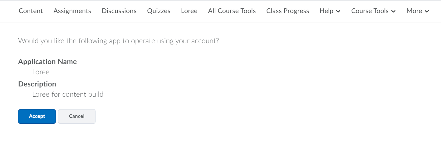 Image Added
Create unit
Loree provides the option to create a new Unit for D2L courses. If you want to Create new Modules, you have to open the Loree, There you can see the icon “+ New Unit” on the top right of the list. By clicking on the icon, it will open the new modal.
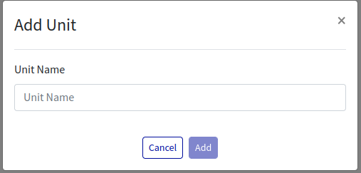
From the above, you have to enter the valid module name, Until then the Add button will be disabled once you have entered the Unit name the Add button would be enabled and you can add units to the Course.
Edit Unit
Loree allows users to Edit their existing unit. By clicking on the “Edit” icon from the unit. To add new lessons or new Pages into the unit, click the unit name there you can see two buttons d New Lesson and Add New Page.

By clicking the edit icon, It will open the Loree Editor, where you can design your course contents and you can save them.
Add New Lesson
By clicking Add New Lesson button you will see the popup, where you need to enter the Lesson Name. Same like unit only after specifying the Lesson name the Add button will be enabled. Once done you can create/add new lessons inside the unit.
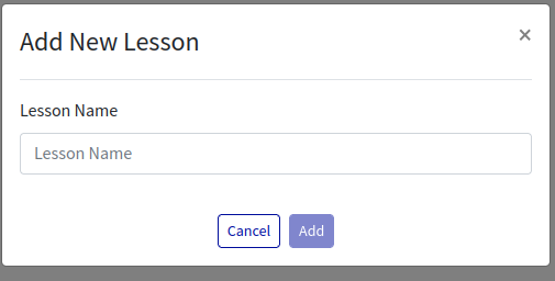
Once the lesson is added to the unit, By clicking the unit name you can see the lessons under the unit. Any number of Lessons can be created under unit. To add a folder or New page under the Lessons click on the Lesson name and you will see Add New Folder and Add New Page button.

By clicking the edit icon, It will open the Loree Editor, where you can design your course contents and you can save them.
Add New Folder
To create a new folder, click on the Add New Folder button, enter the folder name and add the Folder under a Lesson
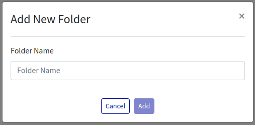
Once a Folder/Page is created, it is listed below the Lesson. Any number of Lessons can be created under Lesson. You can also create New page under the Folder.

By clicking the edit icon, It will open the Loree Editor, where you can design your course contents and you can save them.
Under each folder you can create a new page and edit, where you can design your course contents.

Edit the Course Content
Loree allows users to edit and design their course contents. Following are the types of contents which allow the users to Edit the content:
Units
Lessons
Folders
Pages
To edit the course content, you have to select the “Edit“ icon on each content. It will open the Loree Editor.
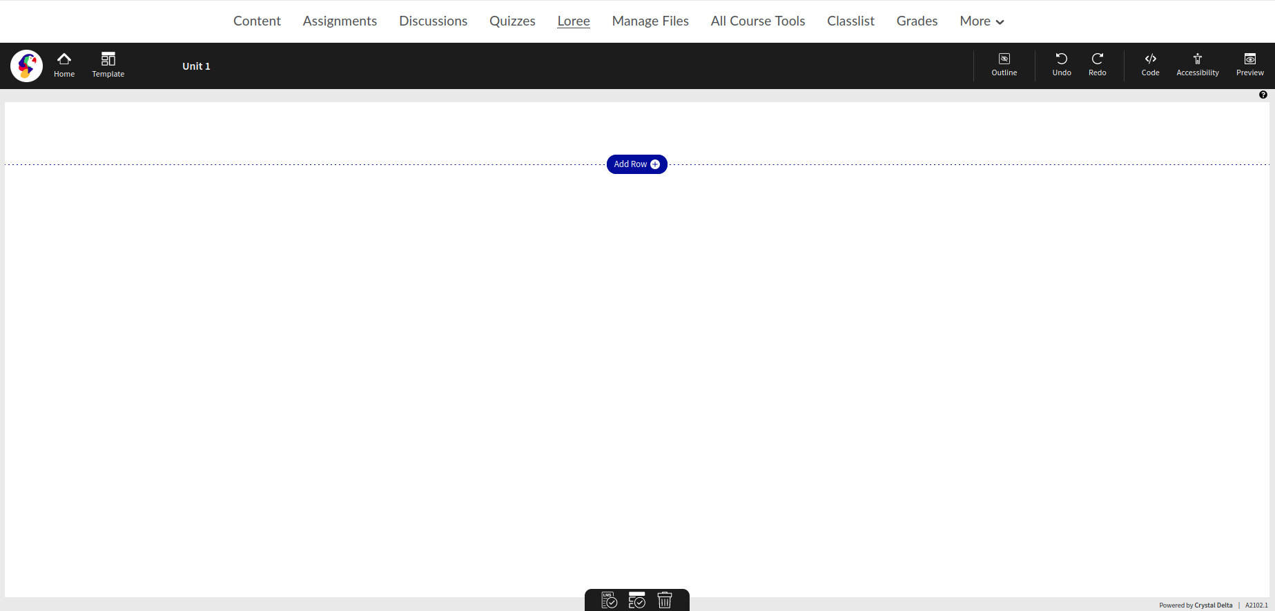
Creating a page
Adding a Row
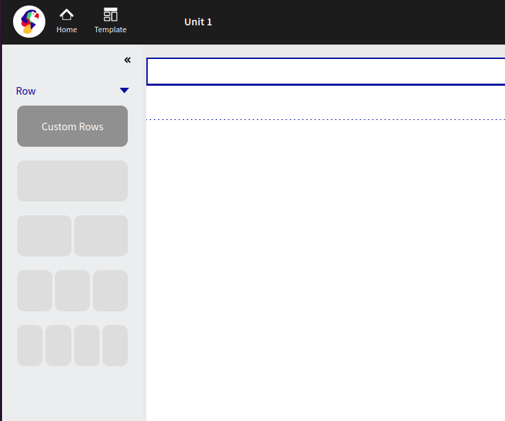
Loree 2.0 now gives the user the ability to customize the structure of the page based on rows and columns. By adding a row, allows you to determine the size of each column and the content.

Pre-determined column sizes are provided based on what has been generally used in many modern page layouts, as shown below.
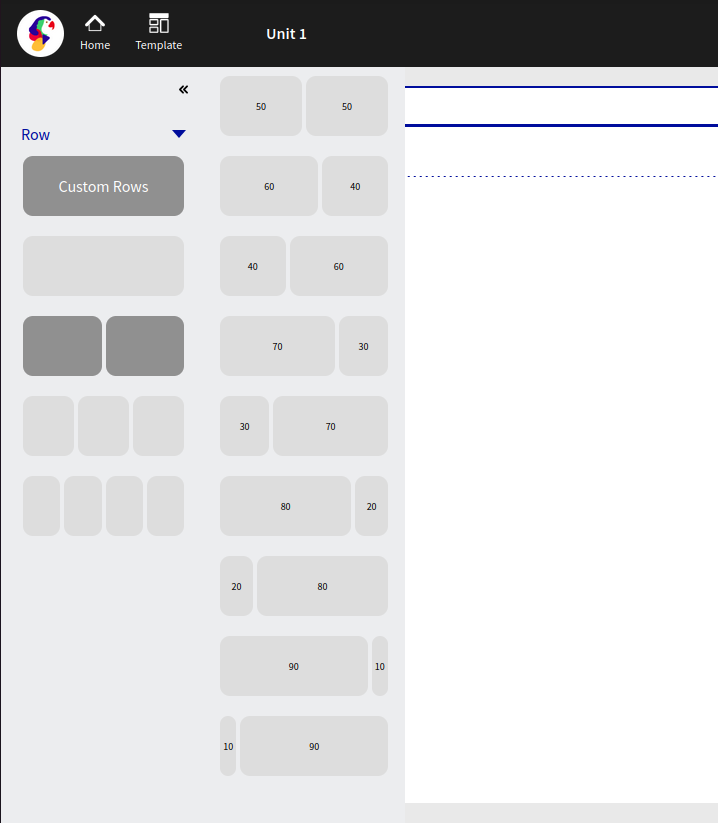
Once a selection has been made, a secondary menu will appear which allows the user to determine the size of the columns based on percentage. (For example, 50 / 50 will split the column sizes equally)
Custom Rows
Loree 2.0 allows users to design, create and share custom rows for their own use or for the whole organization.
Once a row has been designed, the user is able to save the row (please see below under “Editing a Row” for further instructions on saving a row) and use the custom row in the future.
Once saved, the user is able to add a new row, and simply click on “Custom Row”, as per the below screengrab:
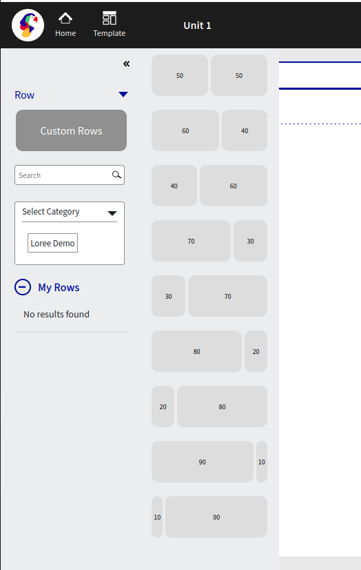
My Rows
My Rows are rows that have been created by the user and can only be seen by the user who created the row. When saving a custom row, this will always show in the My Rows section.
Editing a Row
Once a row has been created, the user is now able to edit the row by either clicking on the row area or by clicking the row menu, as shown below (The small blue menu icon, upper left corner of the row)

Once selected, the menu will provide the user with four options, including:
Save Row
Duplicate
Delete
Edit Row
Row move up or down

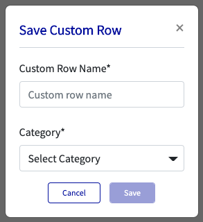
Save Row
Once selected, a pop-up (modal) will appear, which allows the user to save the row for use at a later time; this gives the user the ability to both name the row and classifies it under a category.
Duplicate
Users are able to copy the entire row by selecting the duplicate option. This allows for quick and easy “copy and pastes” of the entire row and its content. *Particularly useful if the content is very repetitive.
Edit Row
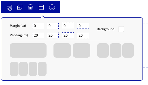
The user is given the ability to change Margins, Padding, Background and or change the row layout by selecting the fourth menu option.
Margin & Padding
All margin and Padding are defined by pixels and are preset as margin: 0px and Padding: 20px.
Background
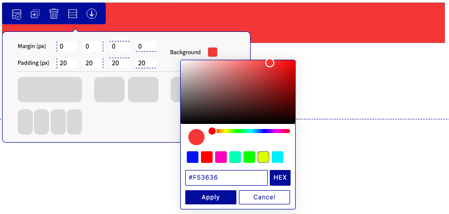
Background allows users to select a color for the particular row selected. The user can either choose their color through a greyscale using their mouse or if a particular color is known the user has the ability to input the HEX code.
Row Move Up or Down
Rows are able to be moved either up or down depending on where you would like them positioned on the page. The option to move the rows or columns will appear once the user has made 2 or more rows, columns, or elements. Please refer to the below screengrab where you will notice the additional arrows at the far right of the blue menu.

Columns Options
Loree 2.0 allows users to easily add content (elements) to each particular column that has been made on the page. Once a user clicks on a column the “plus” button will appear, which opens up a side menu, as shown below:

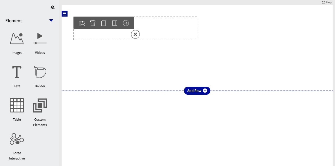
Each element is able to be individually customized based on individual preferences and also allows for custom elements to be made and placed into the columns.
Images
As a Loree 2.0 user, by selecting images, it will now give you multiple pre-defined options, which easily adds images, images with text, or both in combination. By selecting one of the options from the below, it will add the content to the particular column that has been selected.
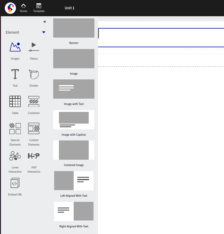
Once one of the above has been selected, a pop-up (modal) will appear that will prompt you to either choose an image that has been previously uploaded or to upload a new image/link of an image.
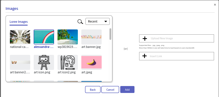
Videos
Videos are easily uploaded to the page, and similar to images, Loree 2.0 allows users to choose from predefined layouts to assist in completing the page. See below for a screenshot of the layout, options:
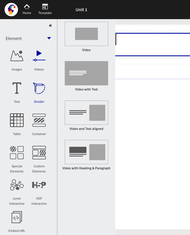
Once one of the above has been selected, a pop-up (modal) will appear that will prompt you to either choose a video that has been previously uploaded or to upload a new video/link of a video (YouTube, Vimeo, or other).
Text
This element can be used to add text to the page. By selecting the text, will give you four options as detailed below:
Header
Paragraph
Heading with paragraph
QuoteBlock
Source Format
Source Format
Source format allows the user to copy text or content from another web page source and paste it into Loree. while keeping all the original staying and content the same. This allows the user to easily copy and paste content from various sources without having to manually adjust the styling each and every time if preferred.
Once the user has made the selection, further design options are available, see below:

By clicking the particular column, (similar to selecting a row), it will give you options in the grey menu bar directly above the chosen column. The four options are:
Duplicate
Delete
Copy
Move Bottom
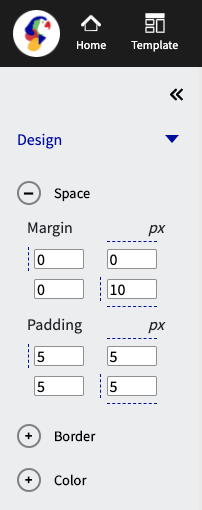
Further to the above, the side menu (left) will appear, with design options including:
Space
Border
Color
Space
Margin pertains to the area directly outside of the column. Adding margin to either top, bottom, left or right will change the border dimensions of the column. All margins are adjustable using pixels as a standard of measure.
Padding pertains to the area directly inside the column. Adding padding to either to top, bottom, left or right will move the content within the border of the column. All padding is adjustable using pixels as a standard of measure.
Border
This design element enables users to add a border to the column selected. Its features include changing the color, width, and styling. Width sizes are adjustable using pixels as a standard of measure.

Color
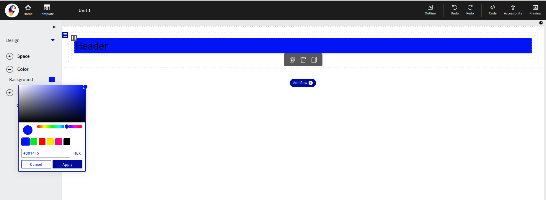
The background color of the entire column is able to change with the “Color” design tool. Users have the ability to either choose from a color scaling tool or input a specific Hex code for a color to be applied.
Text - Control Menu
Much like many conventional text writers, Loree 2.0 gives users the ability to change the text based on various text editing options, these include:
Style
Bold
Italic
Font
Size
Line Height
Text Color
Background Color
Border Color
Unordered List
Ordered List
Word Options
Alignment
Insert Link
Clear Format

To access the text editing feature, double click the word or paragraph that you would like to edit.
Divider
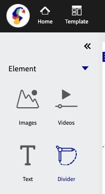
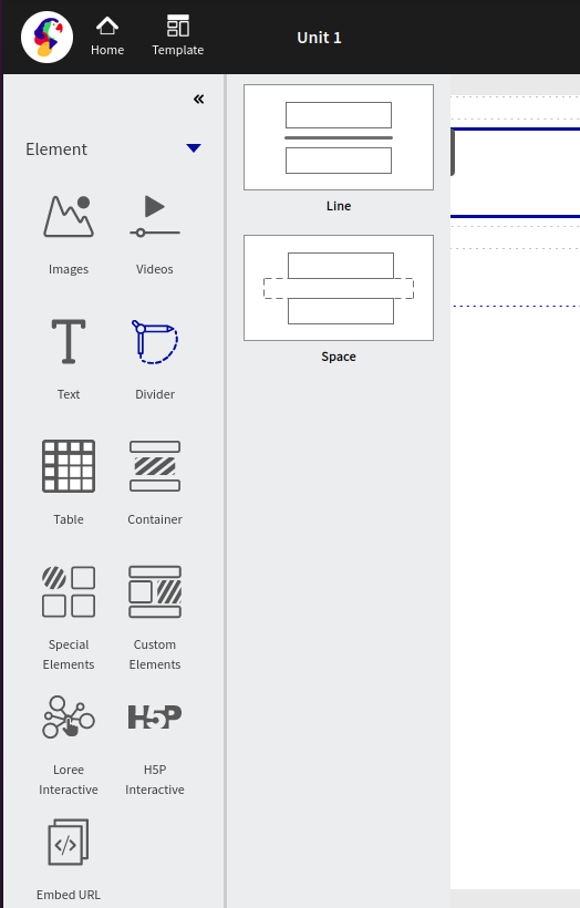
The divider features allow users to clearly divided pages with either a line or spacing. The line and spacing options are customizable depending on what particular style you desire. The two screenshots below highlight the divider feature option and the two options of “Line” and “Space”.
Line Divider
Selecting a line will present a clear horizontal line, dividing the page or content. Once the line has been selected, a design menu will appear on the “left-hand side” of the screen, presenting 5 different customizations for the line.

Size
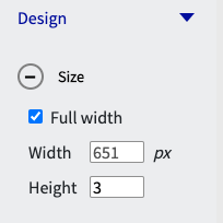
The size options allow the user to adjust the width and height of the line that spans across the page. By default, the line is the full width of the screen. This option is able to be toggled on and off via the checkbox and both the width and height are able to be adjusted to the user's desired size.
Alignment
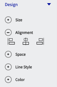
Alignment can assist the user in determining where the position of the line is in relation to the page. Alignment has three options which are, left align, center align and right align.
Space
Margin pertains to the area directly outside of the row. Adding margin to either top, bottom, left or right will change the border dimensions of the row. All margins are adjustable using pixels as a standard of measure.
Padding pertains to the area directly inside the row. Adding padding to either to top, bottom, left or right will move the content within the border of the row. All padding is adjustable using pixels as a standard of measure.
Line Style
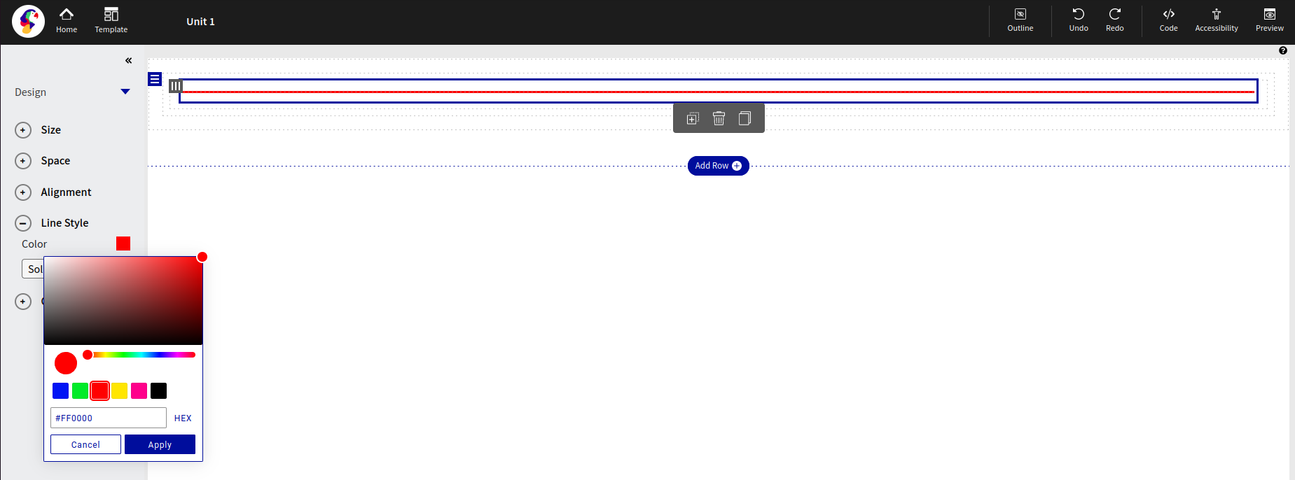
The line style option allows the user to change the color of the line with either the color grade selector or a HEX code.
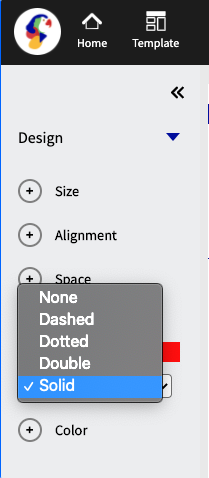
There are also, 5 options of style that are able to be applied to the line, which is detailed in the screengrab below:
Color
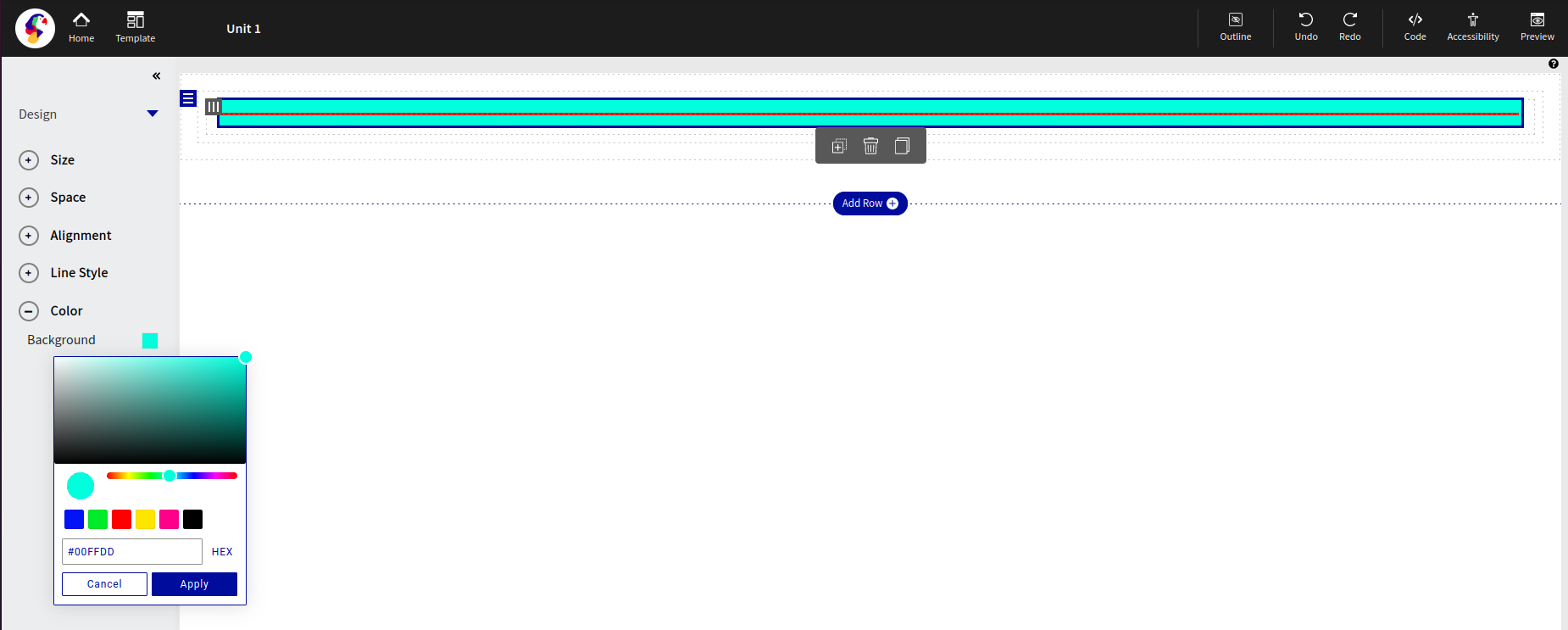
The last feature of color enables the user to change the color of the entire row background (not the color of the line). As per the below screen grab, the color of red or HEX code #F30606 was selected and applied to the row.
Space Divider
Selecting a line will present a clear horizontal line, dividing the page or content. Once the space divider has been selected, a design menu will appear on the “left-hand side” of the screen, presenting 3 different customization for the line.

Size
The size options allow the user to adjust the width and height of the line that spans across the page. By default the line is the full width of the screen. This option is able to be toggled on and off via the checkbox and both the width and height are able to be adjusted to the user's desired size.

Space
Margin pertains to the area directly outside of the row. Adding margin to either top, bottom, left or right will change the border dimensions of the row. All margins are adjustable using pixels as a standard of measure.
Padding pertains to the area directly inside the row. Adding padding to either to top, bottom, left or right will move the content within the border of the row. All padding is adjustable using pixels as a standard of measure.
Color
The last feature of color enables the user to change the color of the entire divider.As per the below screen grab, color of red or HEX code #FD0707 was selected and applied to the divider.
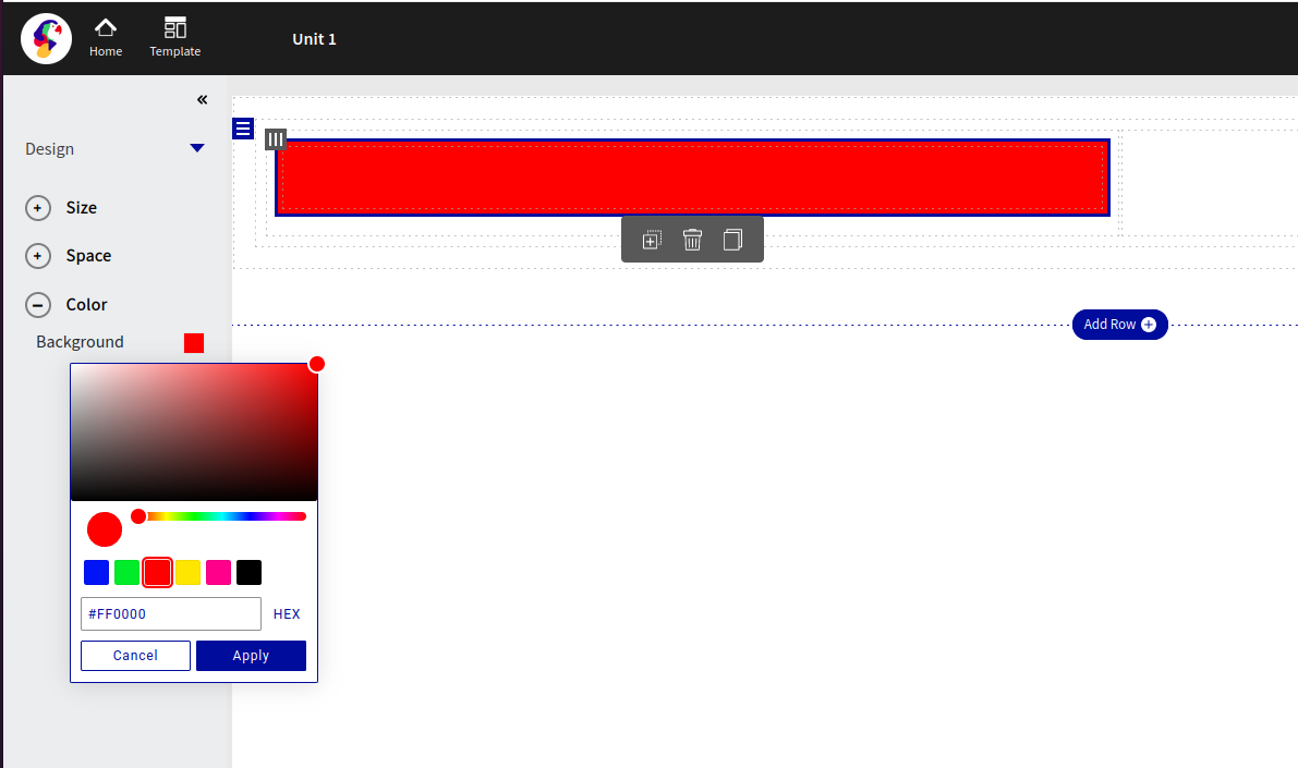
Table
The table feature allows
the user to easily create and add a table to the page. There are 4 pre-defined styles of tables that are as shown below:
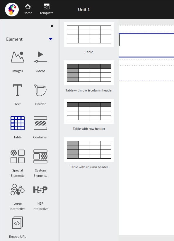
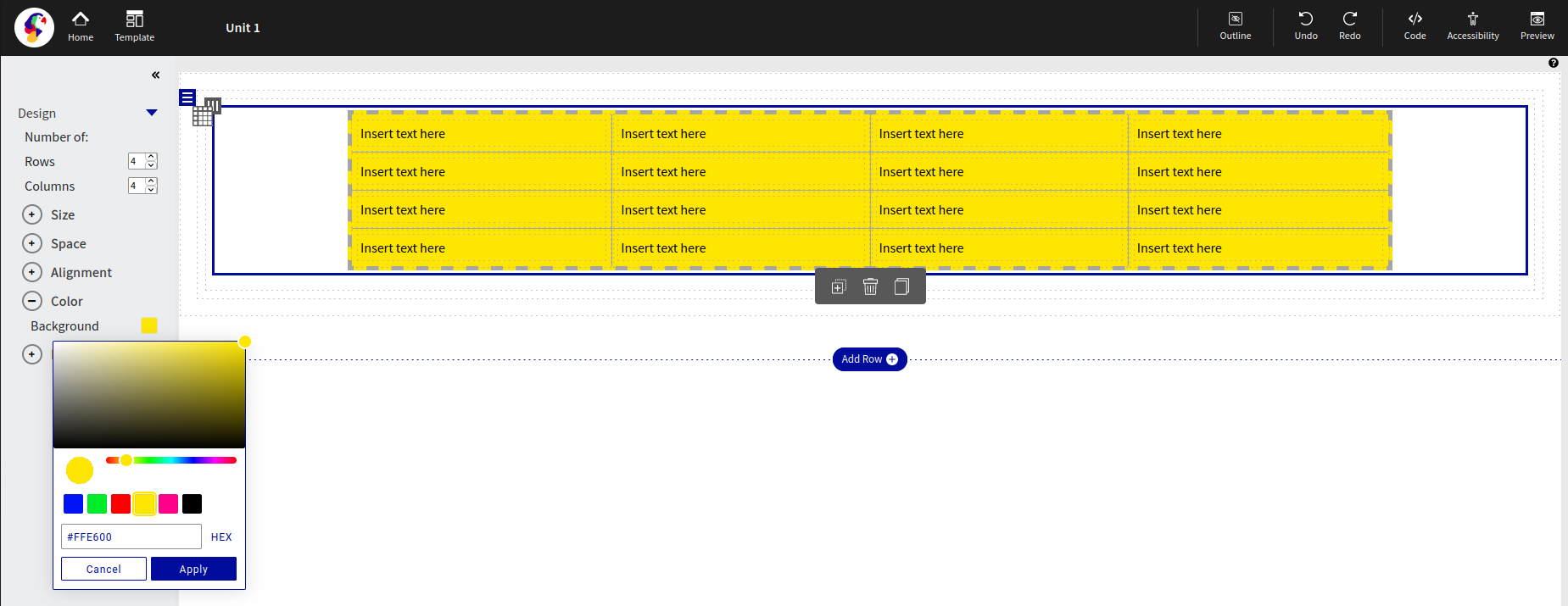
Once selecting the table from the “left-hand menu”, the menu will auto-populate onto the page and the design menu will appear on the left-hand side.

As shown in the above screengrab, the user has the ability to select the number of rows and columns based on the size of the table required. The default table size is 4 rows and 4 columns.
Table Content customization
The editor now allows the user to apply styles for the entire row or the entire column, individual rows, or columns to update the Margins, Padding, Font style, Font Family, and Font size. This is more flexible and get easy customization for their own table users.
Enable the ‘Select entire Row’ and ‘Select entire Column’ checkbox to select the entire row and column.

Pro-tips on short-cut keys:
Function | Short-cut keys |
|---|---|
To select Multiple cells in a table | cmd/ctrl+shift+desired cells. |
Font style section: | |
Bold or Un-bold | cmd/ctrl+B |
Italic/remove Italic | cmd/ctrl+I |
Underline/remove Underline | cmd/ctrl+U |
Alignment
Alignment can assist the user in determining where the position of the table is in relation to the page. Alignment has three options which are, left align, center align and right align.

Size
The user is able to determine how wide the table is across the page based on a percentage of the page size. By default, the table is set to 100%, which therefore spans across the full width of the page. As an example, the table size shown in the screengrab below has been reduced to 80%.

Space
Margin pertains to the area directly outside of the table. Adding margin to either top, bottom left or right will change the border dimensions of the table. All margins are adjustable using pixels as a standard of measure.
Padding pertains to the area directly inside the table. Adding padding to either to top, bottom left or right will move the content within the border of the table. All padding is adjustable using pixels as a standard of measure.
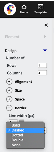
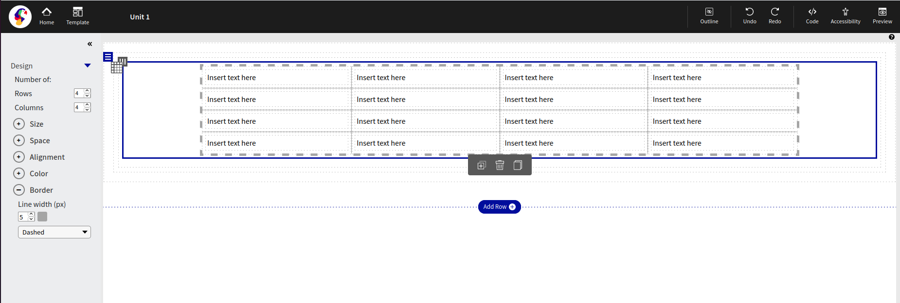
Border
The border of the table is able to customized by width, color, and style. 5 options of style that are able to be applied to the line, which is detailed in the screengrab below:
Color
Color enables the user to change the color of the background within the table.As per the below screen grab, the color of red or HEX code #FF0000 was selected and applied to the table.
Deleting Column
Once selected a pop-up or modal is presented to the user which either allows the user to do one of two:
Delete the entire column or
Clear the content in the column

The first option “Delete the entire column” will clear the entire column field and all the content within. Any pre-defined margins or layouts of the column will be deleted.
The second option “clear the content”, will only delete the specific content within the column, however will leave the layout as it was.
Container
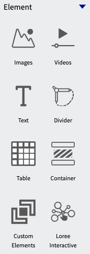
The container feature enables the user to add sub-sections into the row. This allows for a more versatile section and provides space between content.
Alignment
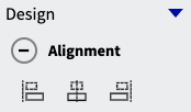
The container is able the be aligned either by default to the left or can be center or right-aligned.
Size
The size can be adjusted based on width, this can be changed based on percentage size, as per the below screenshot.

Custom Elements
Custom Elements allows users to have quick and easy access to all elements that have been made previously and saved in Loree 2.0.
Creating a custom element
Once a column has been created to your desire, the user is able to save the column as a custom element. See below screengrab, detailing the initial step:

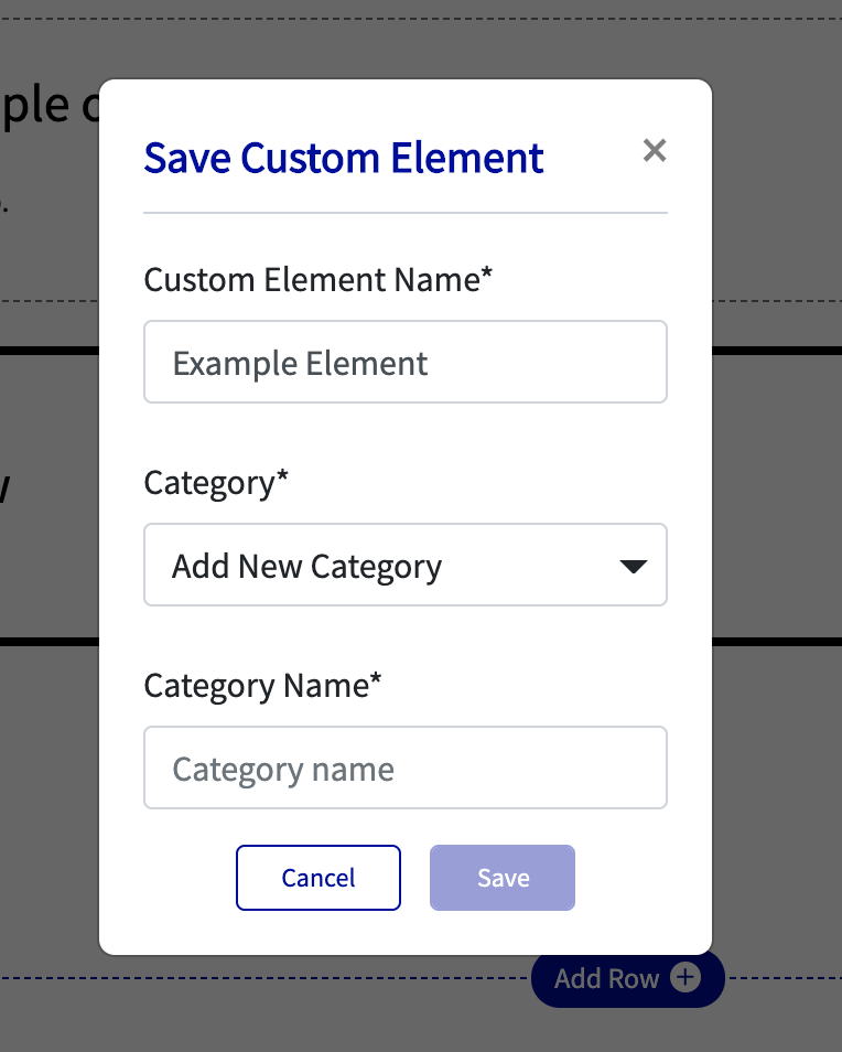
The top-left icon in the column section menu is the save column button. Once this is clicked a pop-up (modal) will appear, see below:
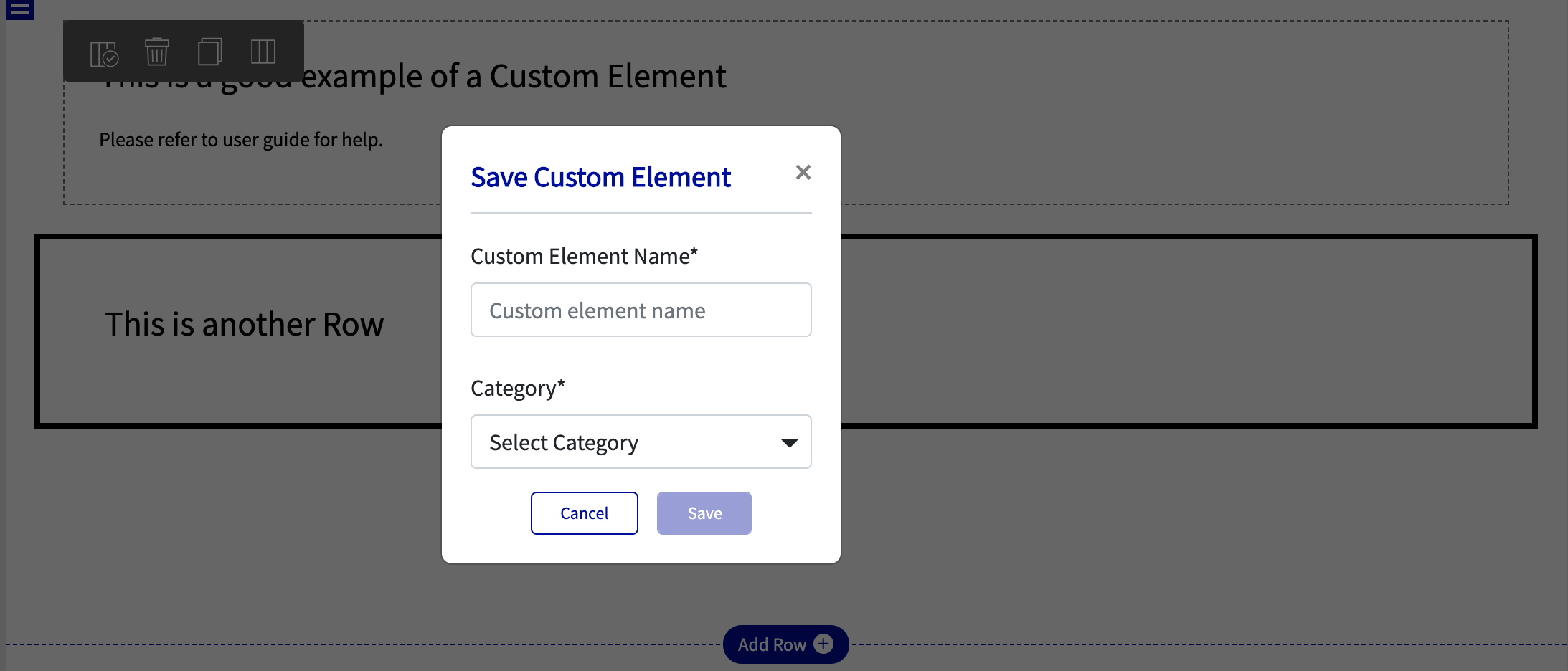
The user is then able to name the custom element and choose a category that the particular element belongs to. If no categories are saved, a new category is able to be created and a category name text box will appear (see below):
Adding a custom element to a column
Once a custom element has been made and saved, it will be added to “My Elements” (See below for further details on My Elements), which will allow quick access for the user to add into the column selected.
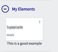
“This is a good example” is a custom element that was created for the purposes of this User Guide. Once the user selects the desired element it will automatically populate in the column that was originally selected and prompt the user to either cancel the action or add the custom element. See below screengrab for visual reference:

My Elements
My elements are elements that have been created by the user and can only be seen by the user who created the element. When saving a custom element, this will always show in the My Elements section.
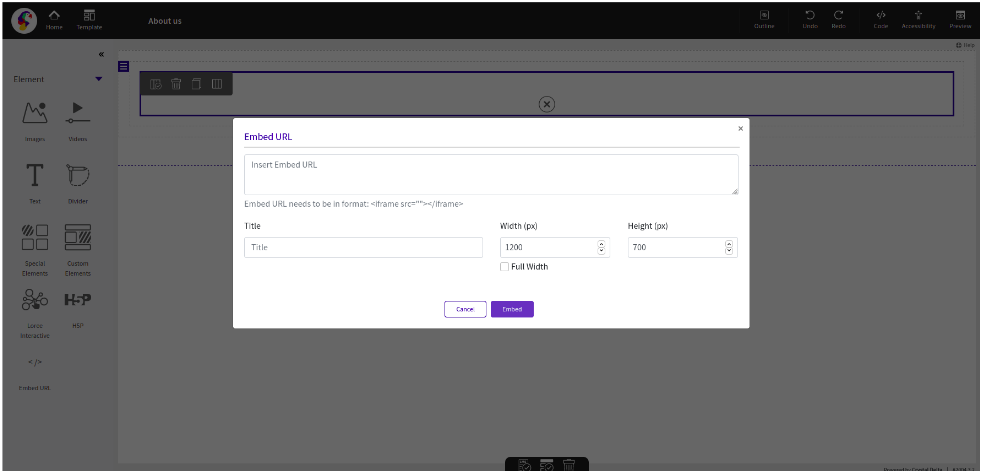
Embed URL Block
Loree 2.0 introduces the “Embed URL“ block for the convenience of updating the iframes in the editor directly. For example, YouTube iframe links or any iframe links to get in the page.

Loree Template Pages
The Loree will allow the user to create a page with the existing templates they have under ‘My Templates. Saved templates are listed under the My templates.
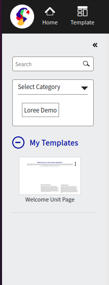
Select the template that needs to be added to the page. Now you can see the template in the editor with pop-up Add and Cancel. Click add to edit/save the template to the unit.
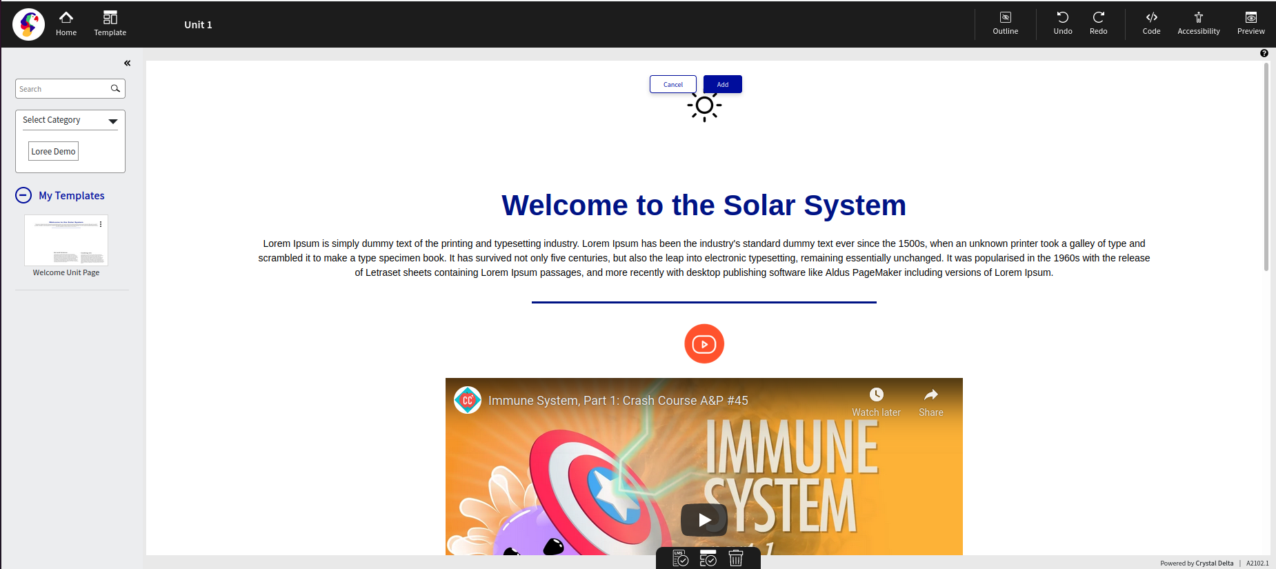
Once added you can see the alert showing Custom template added successfully.

Viewing Components
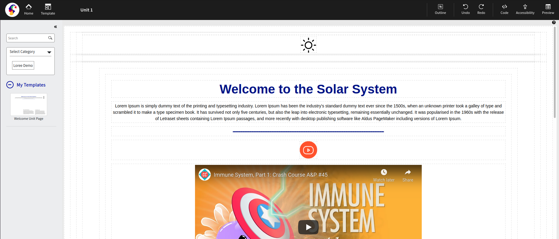
Loree 2.0 allows users to view the various outlines of each section, component row, or column on the screen.
For example, in the image below, the various components on the page are individually identifiable, delineated by a dotted line boundary. This function is able to be toggled on and off by clicking the “Outline” button in the top black menu bar.
Preview
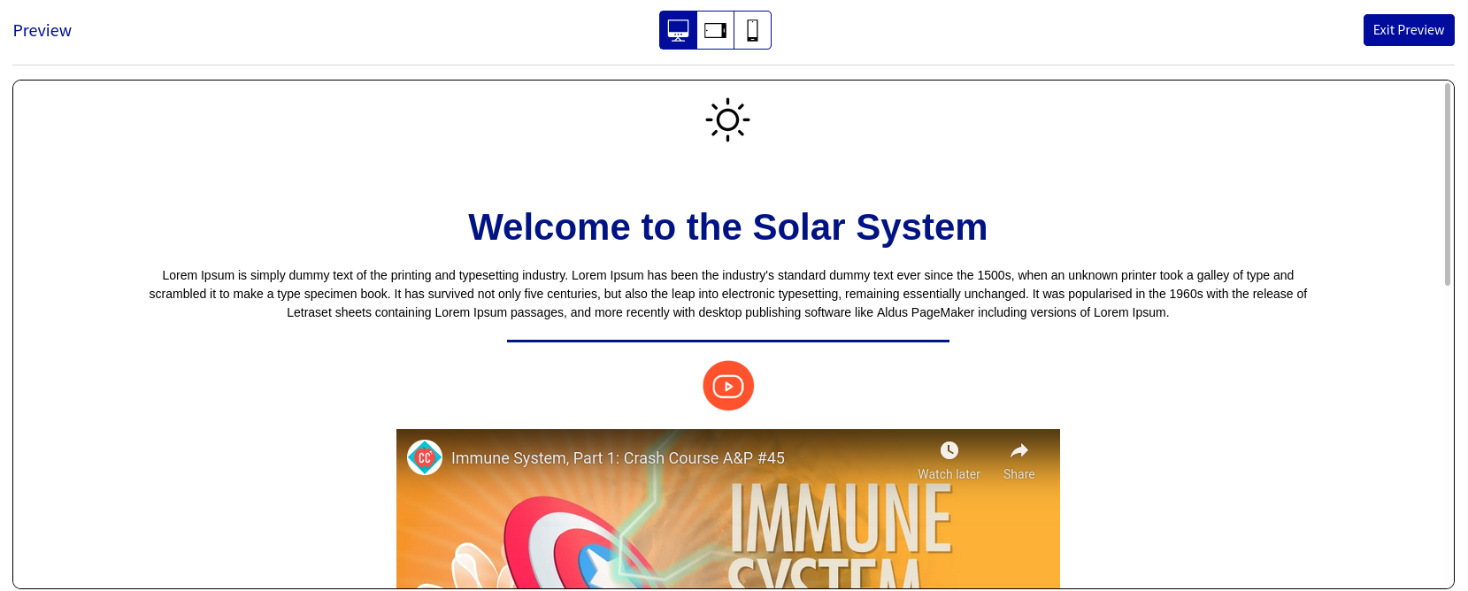
This feature provides a live preview of the pagebeing designed.
By clicking on the preview option opens the modal in preview mode.

Device Selection
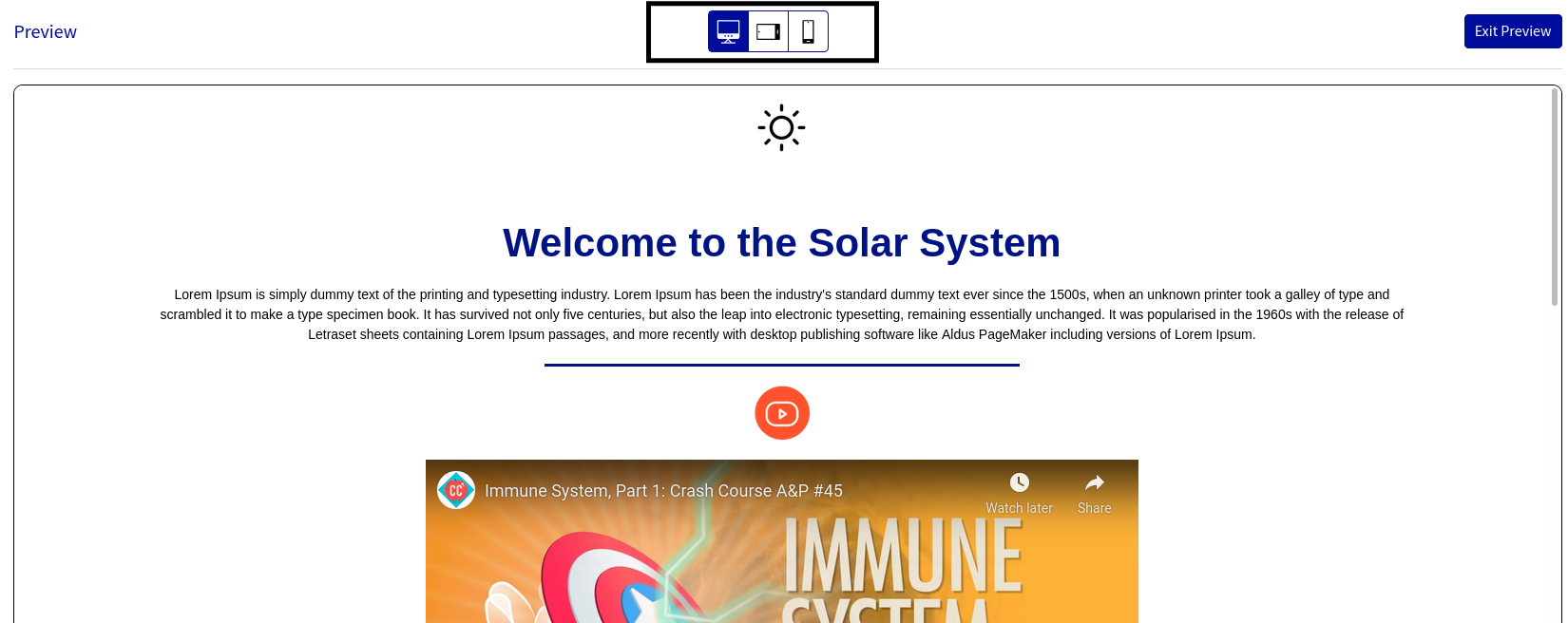
It allows the user to select the orientation of the page being designed based on the target device on which the page is intended to be viewed. A modal will appear with the three predefined screen sizes in the middle-upper section of the screen:
Desktop
Tablet
Mobile
View Code
The View Code option is for advanced users; This feature enables users to view the underlying HTML and CSS code for the course pages. The “View Code” selection can be made in the top menu bar, as shown below:

Upon selection on the Toolbar, a new window will pop up (modal), displaying the HTML/CSS content of the page.
At the bottom of the view code window, an option to export the code in compressed form is available (‘Export to ZIP’). This file is saved in the download folder of the web browser.
This functionality is provided in order to allow the user to make design modifications directly on to the HTML / CSS code in their preferred editor.
Once a user clicks on “Code” the below screengrab will appear:
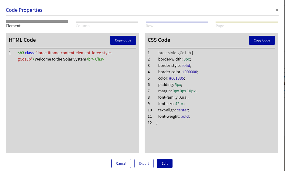
Edit Code
The edit code feature allows the user to update HTML and CSS content within a selected component (also referred to as a block) or for the entire page content on the editor.

If the user clicks on Edit Code with no selected contents, it will fetch the whole editor page content and if a particular block selected then, it will fetch the particular block’s HTML and CSS properties.
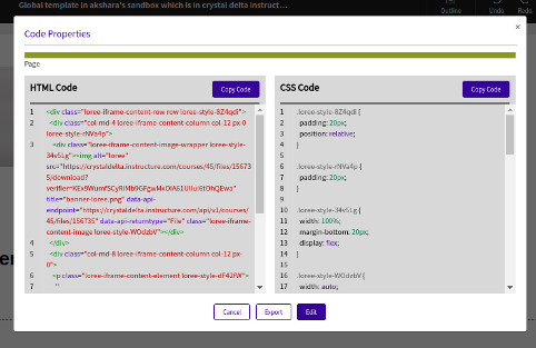
Once the Edit code is clicked (Code, in between Redo and Accessibility checker options) based on the Feature list in admin dashboard feature configuration, the editor block will be fetched and you can copy only the HTML or CSS property just by clicking the Copy Code button on the top right corners

or click the Edit button to edit the HTML and CSS content:

Once the desired edition is completed, click Update to save the edited content to the Loree editor or click the Don’t update button if you changed your mind about updating the content.
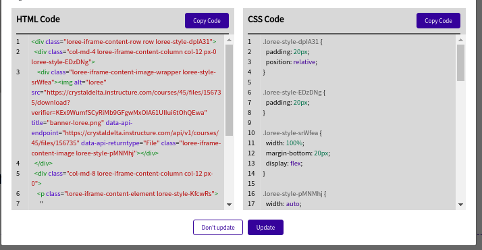
Loree edit code also giving you a special option of Exporting your page content by just clicking the Export button at the bottom of the Code modal.

Accessibility Checker
Accessibility Checker is an innovative solution that lets users inspect the accessibility level of content created in Loree 2.0 Editor and immediately solve any accessibility issues that are found.
It Provides visualizations of accessibility features of web pages like headings, landmarks, images, links and form controls. Provides computed information on the role, accessible name and accessible descriptions for accessible elements that are visualized.
This feature is enabled for everyone by default. Later it can be enabled or disabled for users by the Admin in Loree 2.0 Admin Dashboard.
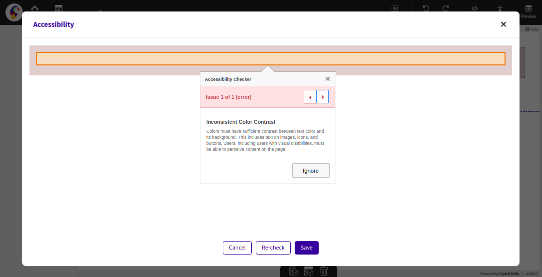
Within Loree 2.0 Editor, you can see the Accessibility Checker icon on top of the Menu bar when it’s enabled. By click on the Accessibility Checker icon will open the sample below modal:
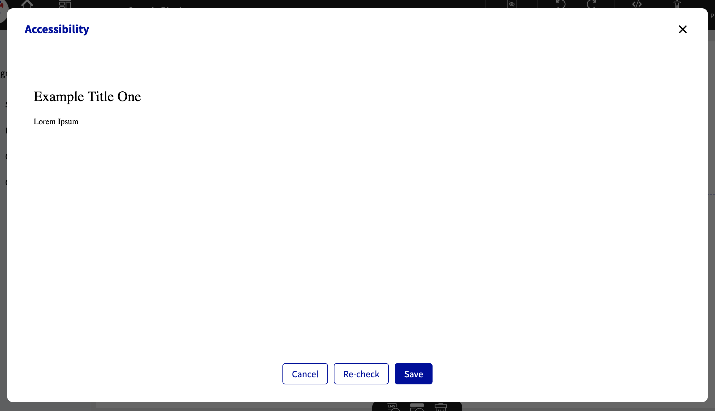
The above screen describes that the Accessibility issues can be resolved within the tool itself. When any accessibility issues found in Loree Editor, it will trigger the issues in a small modal along with a brief description of how they can be fixed.
You can easily find out the issue type by viewing the checker report window. In case of Accessibility issues found, will pop-up the alert with no accessibility issues.
In the modal bottom, you can see “Check Again” and “Update & Exit” as an option.
“When you choose“
“Check Again” will run the Accessibility Checker again and display the results.
“If you select“
“Update & Exit”, the fixes you made on accessibility issues will get an update in Loree Editor content. So, Save and Exit will solve the issues.
NOTE: In case if you do not click on “Update & Exit”, will discard the fixes which you made in the Accessibility window.
You can navigate to previous and next issues by click on the “Previous” and “Next” arrows in the modal header.
Loree provides the option to the users that you can use the “Quick Fix” option to solve the issues within the Accessibility Checker result modal. Or you can select “Ignore” to ignore the issues from the results.
Removed title field from image pop-up. The image pop-up requires users to include a title field when adding an image. This title is then added to the image HTML. The user will be required to include a "title" but it will be added to area-label.
H5P
Loree 2.0 introduces H5P interactives inside the Loree editor in which you may create different interactives provided by the H5P WordPress provider. Some of the features like Hotspots, Multiple-choice questions, Accordion, etc by the H5P provider. Inside the Loree editor, you can create a new H5P interactive, Edit the existing one, or delete the existing one.
H5P under Elements in Loree editor,
.png?version=3&modificationDate=1618575506177&cacheVersion=1&api=v2)
Once H5P is clicked, will Load the H5P block

It will fetch the existing H5P interactive based on user-created and action to create new H5P,
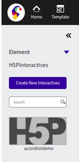
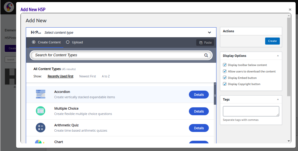
Once click 'Create New Interactives', the below pop-up will appear for creating the desired interactive under H5P provider,
You can also Edit the existing H5P block, by clicking 3 dots in the block
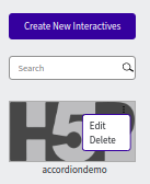
By clicking Edit, an alert asks for confirmation
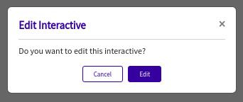
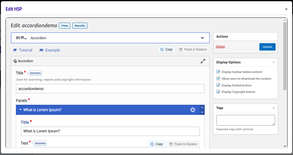
By clicking the Edit button in the above alert box, It will fetch and opens the H5P interactive with content,
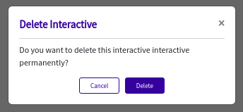
Click ‘Delete’ in the block will pop-up the below alert box to confirm before deleting,
Loree Interactives
The complete Loree Interactives user guide is available on page → Loree Interactive in Loree 2.0 User guide.
Loree Admin Dashboard
The complete Loree Admin Dashboard user guide is available on page → Loree 2.0 Admin Dashboard User guide.
Thank you!!!