

MELBOURNE
CHENNAI
| Table of Contents |
|---|
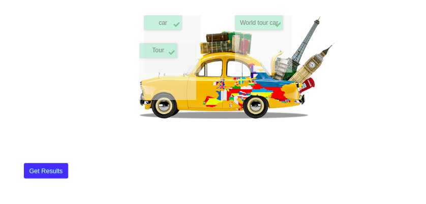
Welcome to Loree Interactives
Interactive content is content that requires active engagement from its consumers. Interactive content facilitates better interaction between the content creator and the audience. The purpose of the interactive content is to make learning easier. It gives more interest to the students. It explains the concepts in an easy and interactive manner. more than just a passive viewer, the individual than just a passive viewer, the individual becomes an integral part of a dynamic, two-way experience.
The LI tool is integrated with the Loree. In the future, we can able to integrate this with the Xenops, Canvas.
Loree Interactives
Interactive content is content that requires active engagement from its consumers. Interactive content facilitates better interaction between the content creator and the audience. The purpose of the interactive content is to make learning easier. It gives more interest to the students. It explains the concepts in an easy and interactive manner. more than just a passive viewer, the individual than just a passive viewer, the individual becomes an integral part of a dynamic, two-way experience.
The LI tool is integrated with the Loree. In the future, we can able to integrate this with the Xenops, Canvas.
To select Loree Interactives, choose from the left-hand side menu, as per the below screen grab:
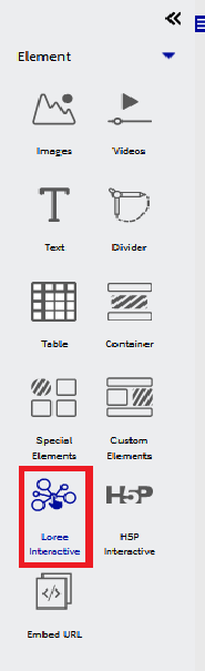
Once Selected, a new left-hand side menu will appear, which will show the following options:
Create new Interactives
Search; allows users to search for interactives that have previously been built or pre-made in Loree 2.0.
Select by category
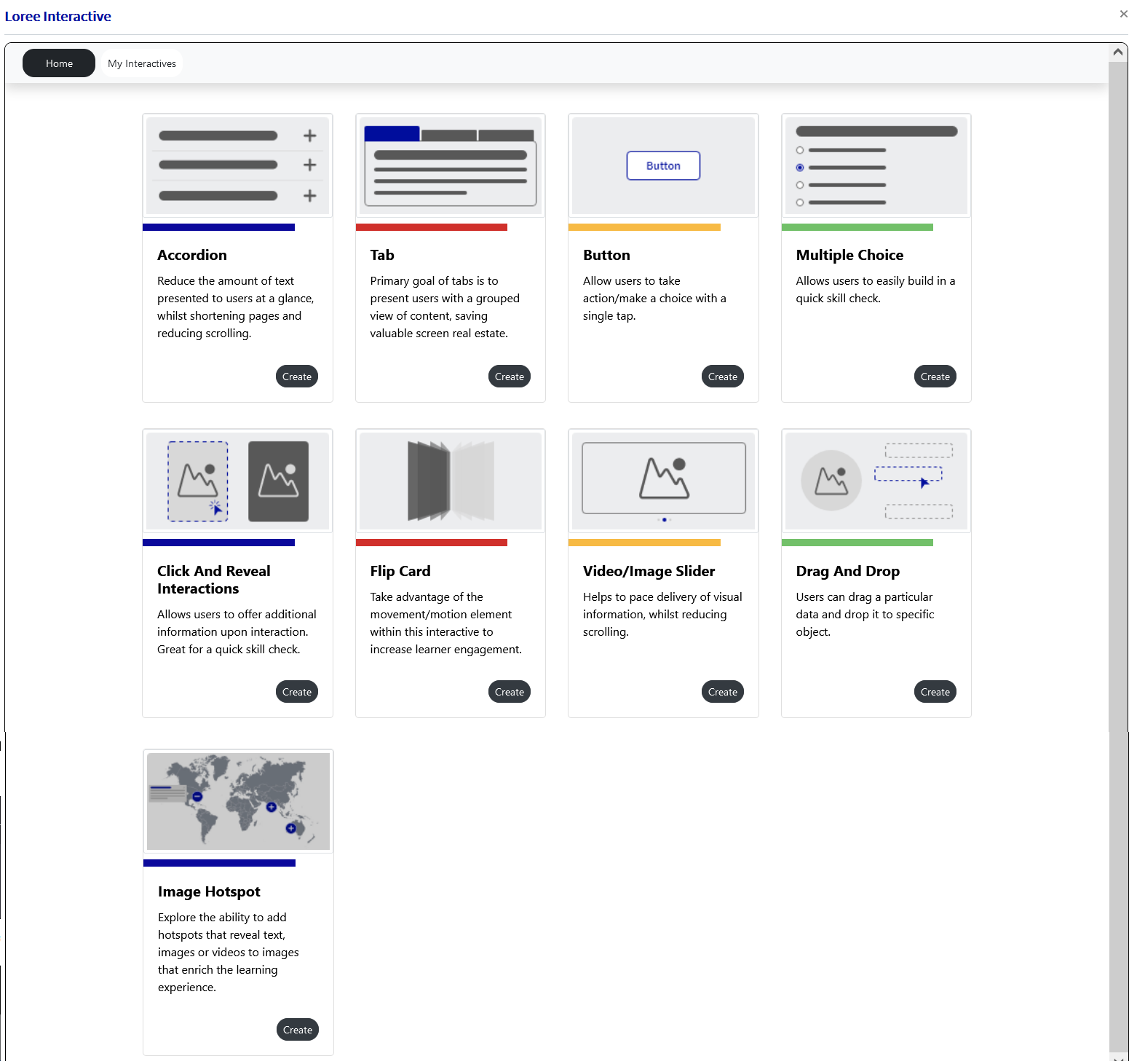
Selecting “Create New Interactives” will bring the user to the dashboard pop-up (modal), shown below:
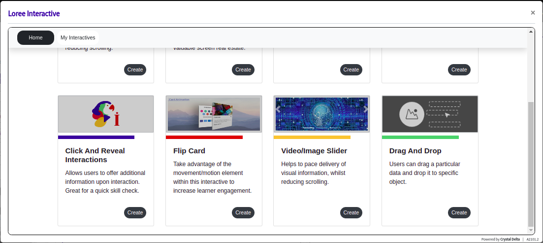
Loree Interactives Dashboard
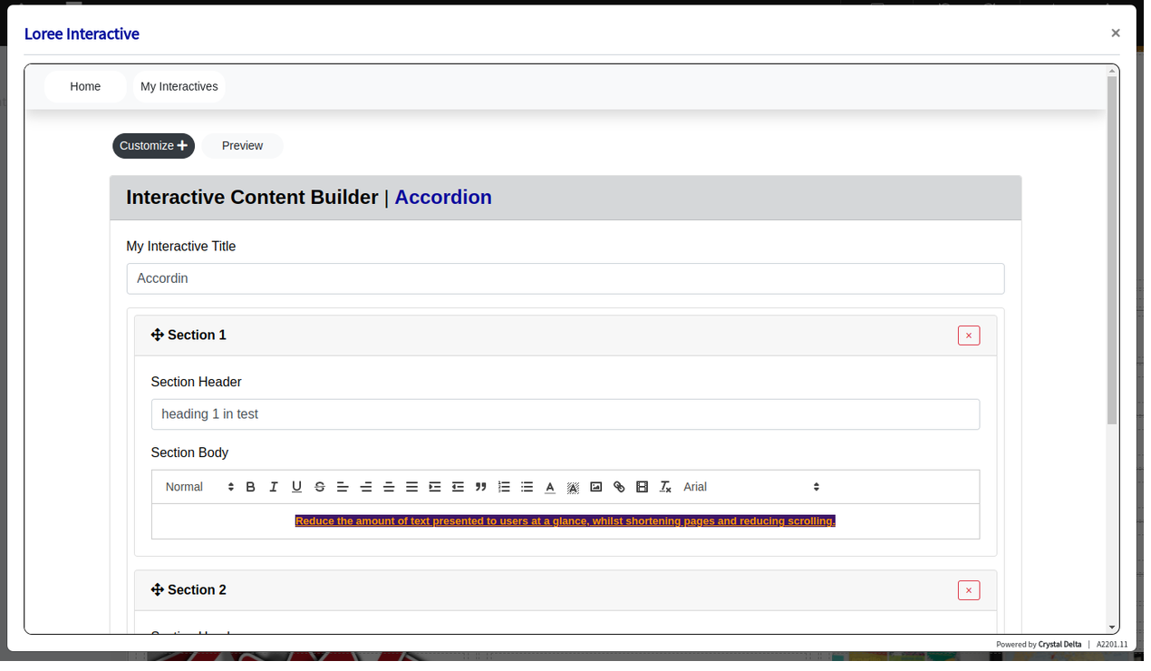
Loree interactives or “LI” (for short) dashboard displays seven interactive components. The Nine components are Accordion, Tab, Button, MCQ, Click & reveal, flip card, Video/Image Slider, Drag and Drop & Image Hotspot. It allows the user to create a component, by clicking the “Create” button.
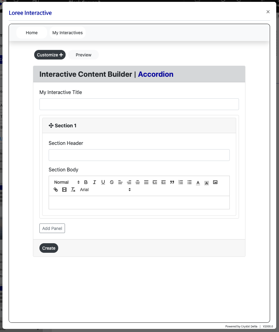
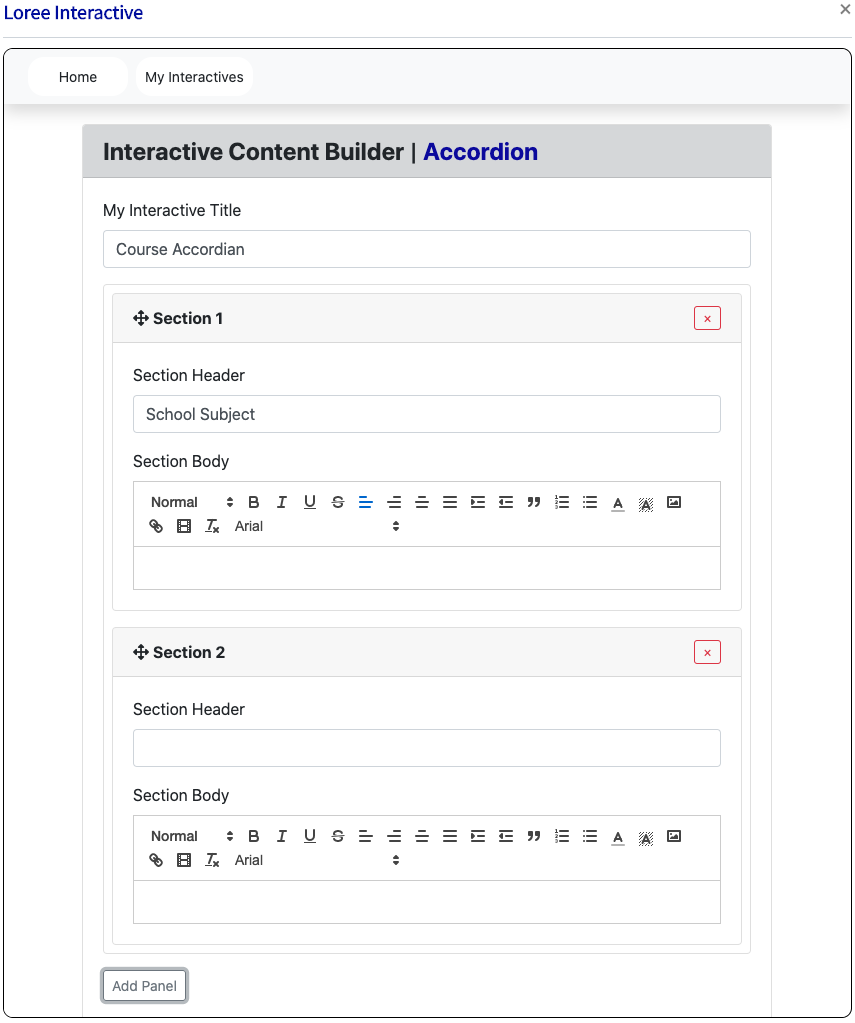
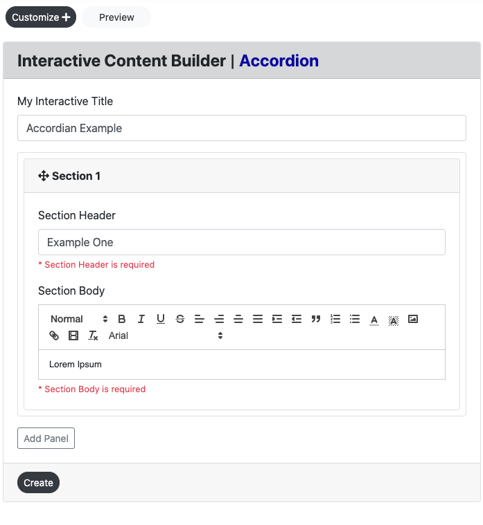
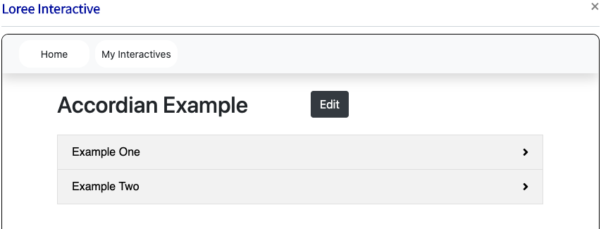
Accordion
Reduce the amount of text presented to readers by using this responsive accordion. Readers decide which headlines to take a closer look at by expanding the title. Excellent for providing an overview with optional in-depth explanations.
Tab
The primary goal of tabs is to present users with a grouped view of related data - which in turn allows content builders to modularize groups of information in a compacted manner, saving valuable screen real estate.
The input form and customization options are the same for accordion and tab except the Icons are included on the accordion form.
Input Form
Users can create an accordion form by entering the,
Title,
Section Header,
Section Body,
customize, and
Click the create button to view the created accordion in the view page.
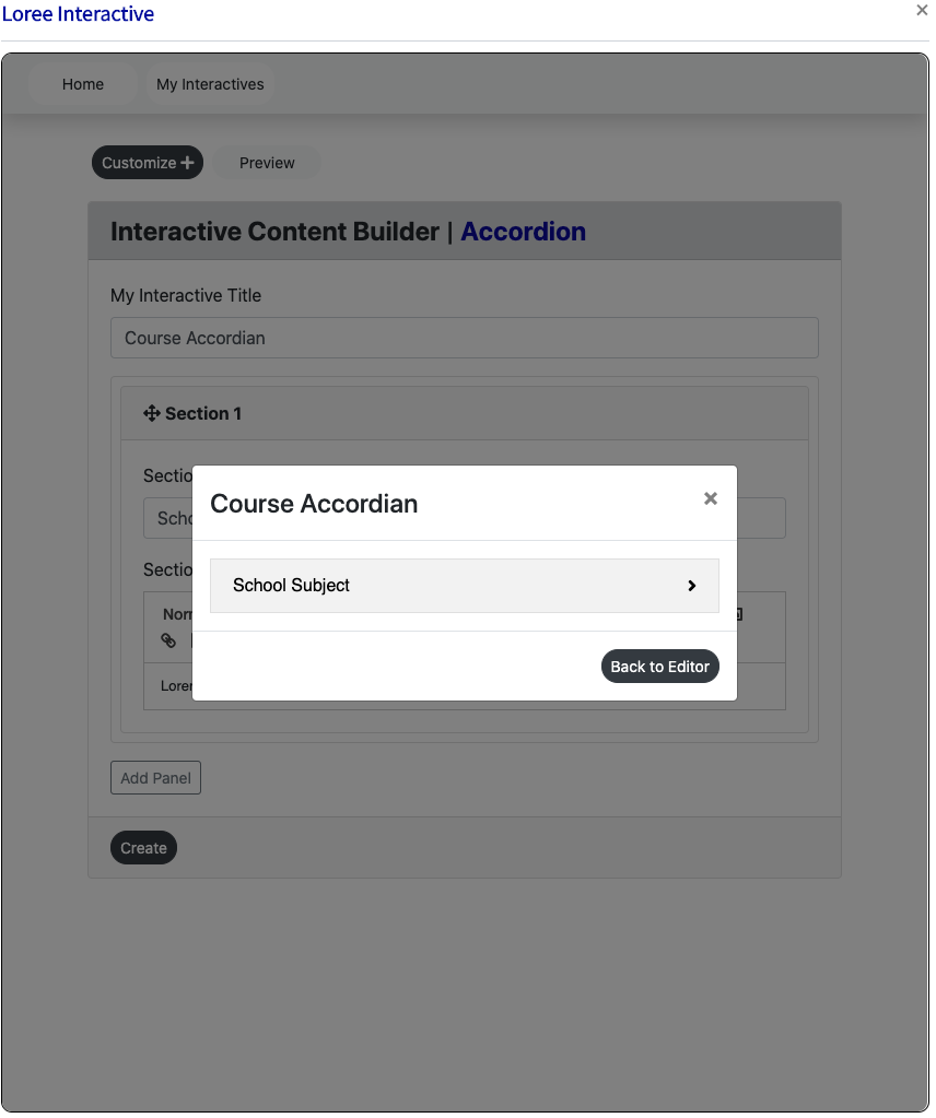
Loree 2.0 also allows the user to Preview the accordian style content before creating it and adding it to the page. This is to ensure the user can be certain that the design and content match the intended need required. If selected, a pop-up (modal) will appear previewing the LI, as shown below:
Title:
This is the mandatory field for all the components. This title display on the view page of the component and in Loree 2.0.
Section header:
The section header is the title for the individual panels. It displays as accordion/tab title for each panel.
Section Body: Text Editor
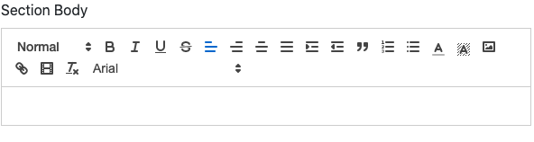
Editors or text editors are software programs that enable the user to create and edit text files. In the field of programming, the term editor usually refers to source code editors that include many special features for writing and editing code.
In the Loree interactive, we integrated the quill editor. In the quill editor, users have the following features:- There are Font format, Bold, Italic, Underline, Strikethrough, Alignment, Indent, Blockquotes, Order and Bullet list, Font and Background color, Image, Text Link and Video Link, Format Text and Typeface.
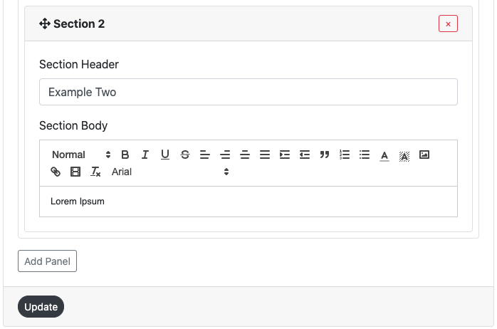
Add Panel and Remove Panel
Users click the add panel it adds the one section header and one section body.
Users can add up to 100 panels.
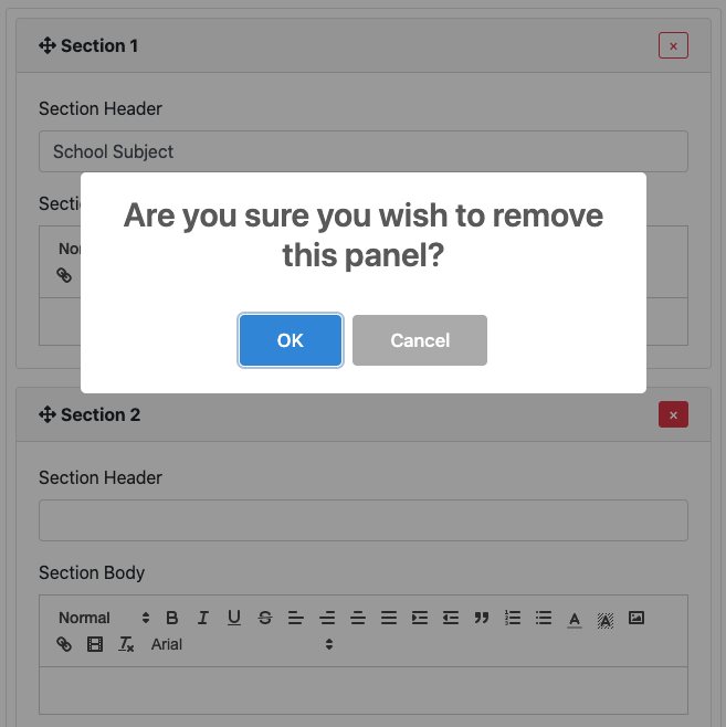
Users can remove the panel by clicking the remove button (upper right corner - red cross) on the particular panel.
Users click the remove button it opens the pop up modal “Are you sure you wish to remove this panel?”
Users click the “Ok” button it removes the panel.
Users click the “Cancel” button it does not remove the panel and return to the input form.
Customization
Users are able to customize the created component in terms of color, alignment, icons, and borders. The accordion customization form consists of Four headers.
They are Section Header, Outline-Border, and Icons and Borders
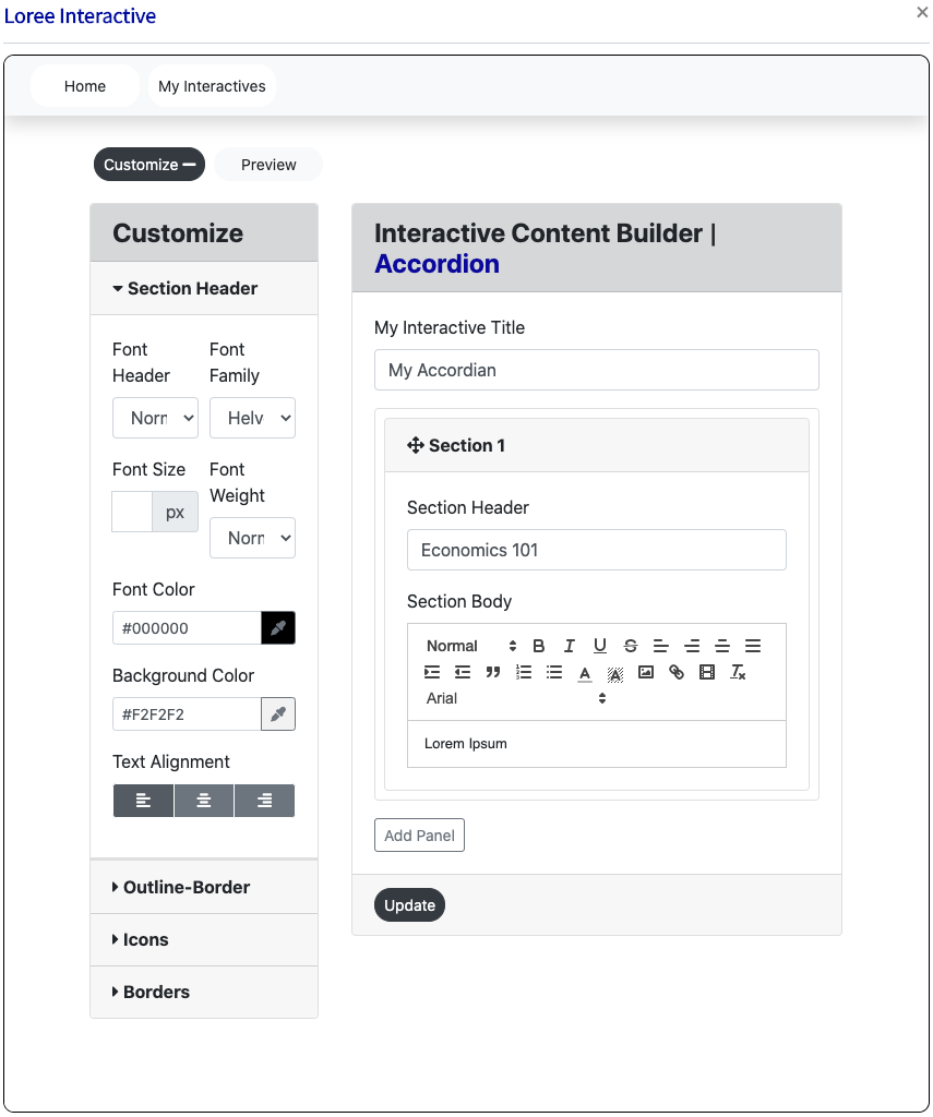
Section Header:
The section header consists of the following options: Font Header, family, size, and weight and color are fonts and background color and alignment.
Font header:
There are the 6 headers are H1 – H6. Users can customize the font headers for the header
Font Family:
There are the 13 Typeface
Arial
Arial Black
Brush Script MT
Comic New Courier
Georgia
Helvetica
Lucida
Open sans
Sans Unicode
Tahoma
Times new roman
Trebuchet MS
Verdana
Font size:
There 10-32 Font Sizes are available. Users can customize the header font size.
Font weight:
Bold, Normal, and Lighter font-weight
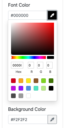
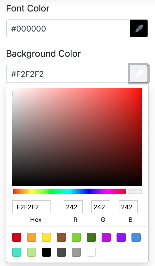
Font and Background Color:
Users can customize the font and background color. There are 3 ways to add color in the color palette.
Type the Hex value in the color picker box.
Drag the picker inside the color palette.
Add the RGB value in the color palette.
Font alignment:
Users can align the LEFT, CENTRE, and RIGHT alignment for the header.
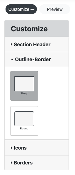
Outline-Border
In the Outline-border, there are two border option
Square edges - it displays the square border
Rounded edges - it displays the curved border
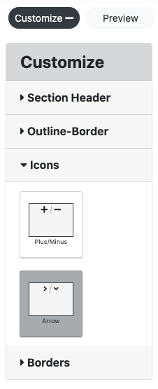
Icons
The icons are only for the accordion not for the tabs.
In the Icons are two options Plus/ minus and Arrow
Plus or minus - It displays the +\- icon to open and close the accordion
Arrow - It displays the ^\< icon to open and close the accordion
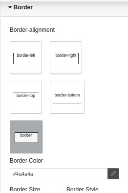
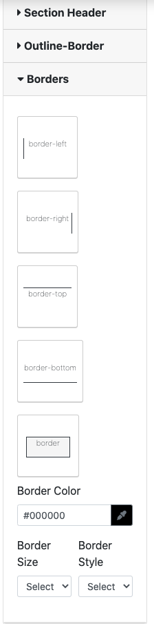
Borders
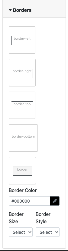
The border option has up to 5 different borders including, border-left, border-right, border-top, border-bottom and border. This feature also allows the user to change the color, border size (pixels) and border style.
Create
Users can enter all details in the input-form and customization form and then click the create button it redirects to the view page to view the created content.
Edit
Users can click the edit button then it retrieves the created content in input form and able to add the content and customization options.
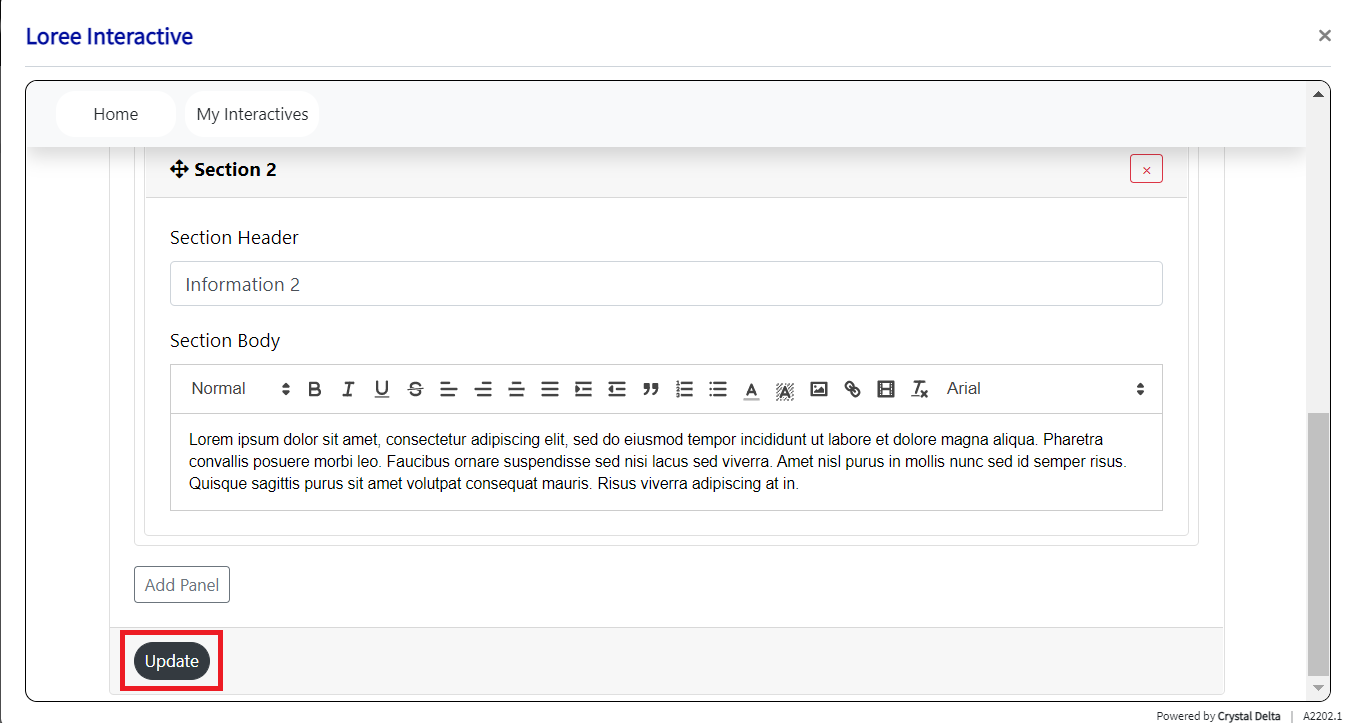
Update
When clicking the update button then it adds the contents and customization option in the component.
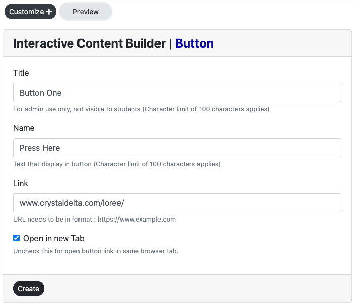
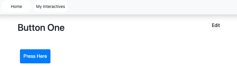
Button
Buttons allow users to take actions, and make choices, with a single tap. They are typically placed throughout the UI, in places like Dialogs, Modal windows, Forms, Cards, Toolbars.
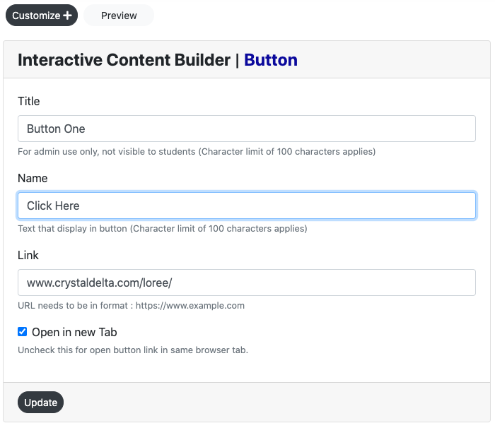
Input Form
Users can create a Button form by entering the,
Title
Button Name
Link
customize
Click the create button to view the created button in the view page.
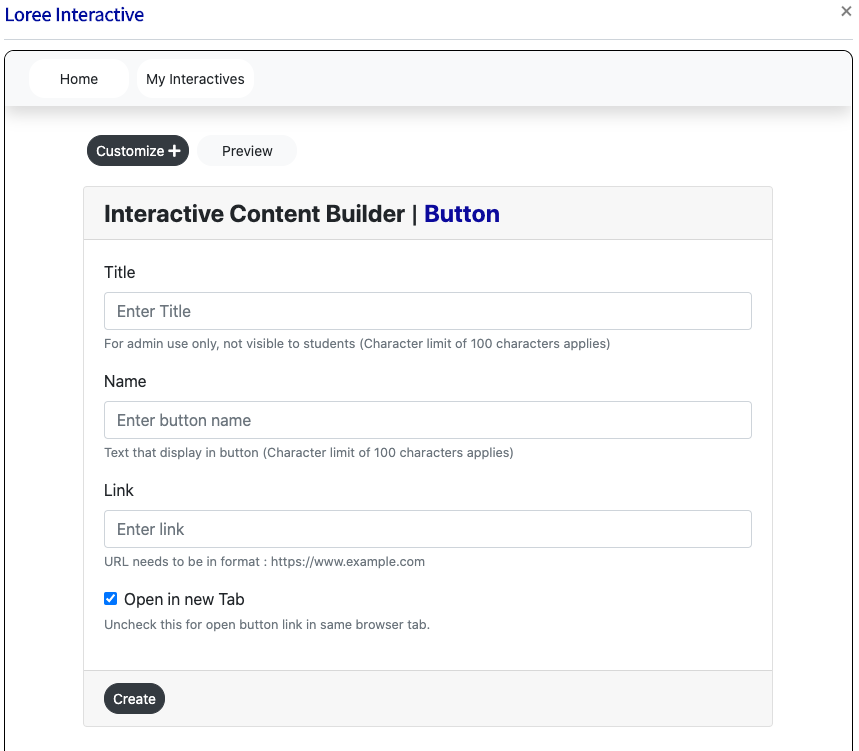
Title:
This title display on the view page of the component and in the Loree.
Button Name:
This is the button name display inside the button.
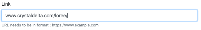
Link:
Hyperlinks are one of the most exciting innovations the Web has to offer. Well, they've been a feature of the Web since the very beginning, Here the Loree interactive adds the button link to redirect anywhere and the URL needs to be a format method in LI.
Checkbox:
In default, the checkbox is enabled, and open the link in the different tab.
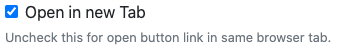
When the checkbox is disabled it opens the link in the same tab.
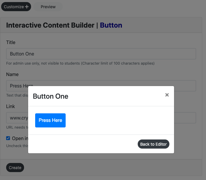
Preview:
This feature provides a live preview of the component created.
Clicking on the Preview option opens the popup modal in preview mode.
When clicking the Back to the editor icon then it displaysthe input form with the contents.
Create:
Users can enter all details in the input-form and customization form and then click the create button it redirects to the view page to view the created content.
Edit:
Users can click the edit button (top right corner) then it retrieves the created content in input form and able to add the content and customization options.
Update:
When clicking the update button then it adds the contents and customization option in the component.
Customization
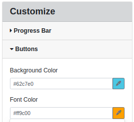
In the button customization Button form, there are two blocks. They are Font and Button:
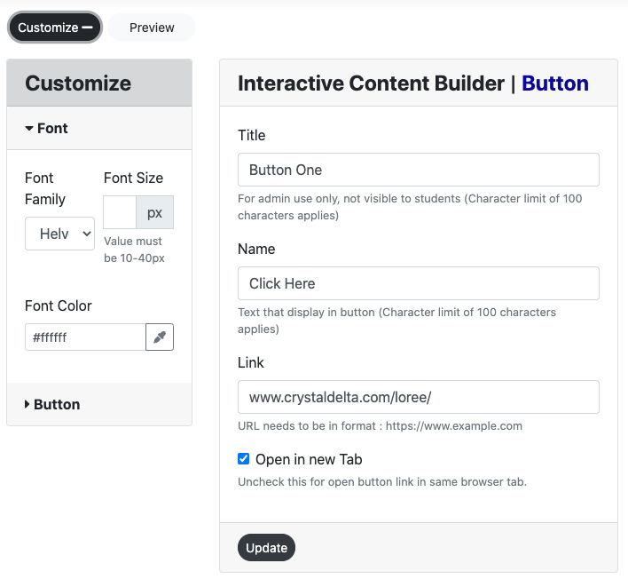
Font:
The font can be customized by three options. They are Font Family, Font Size, Font color.
Font Family:
There are 13 font Typeface
Arial
Arial Black
Brush Script MT
Comic New Courier
Georgia
Helvetica
Lucida
Open sans
Sans Unicode
Tahoma
Times new roman
Trebuchet MS
Verdana
Font size:
There 10-32 Font Sizes are available. Users can customize the header font size.
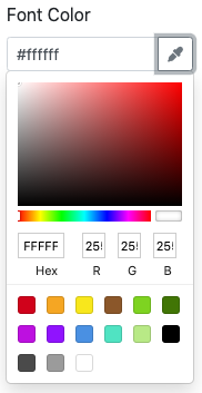
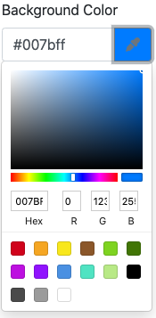
Font Color:
Users can customize the font color. There are 3 ways to add color to the color palette.
Type the Hex value in the color picker box.
Drag the picker inside the color palette.
Add the RGB value in the color palette.
Button:
The font can be customized by three options. They are Button Type, Button color, Button Alignment.
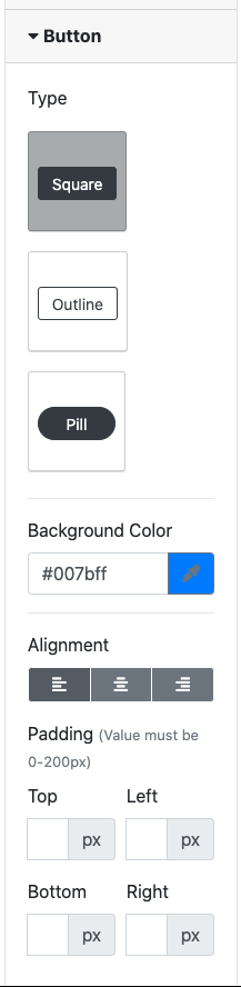
Button Type:
There are three types of button types in the customization form.
They are:
Square
Outline
Pill
If the user clicks the Square then button type is displayed in square button in the view page
If the user clicks the pill then button type is displayed in the curved button in the view page
If the user clicks the outline then button type is displayed in the outline button in the view page
Button Color:
Users can customize the font color. There are 3 ways to add color in the color palette.
Type the Hex value in the color picker box.
Drag the picker inside the color palette.
Add the RGB value in the color palette.
Button alignment:
Users can align buttons on the LEFT, CENTRE, and RIGHT.
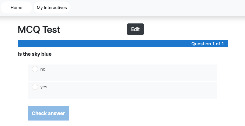
Multiple Choice Questions
Multiple Choice questions can be an effective assessment tool. The learner is given immediate performance feedback. The Multiple Choice questions can have a single or multiple correct options per question.
Input Form
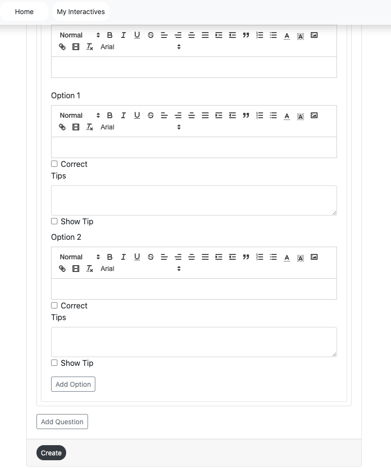
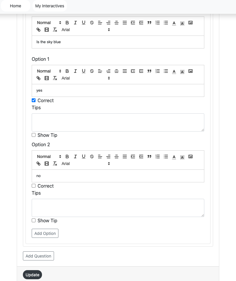
Users can create an MCQ form by entering the,
Title,
Question,
Options,
customize, and
Click the create button to view the created MCQ on the view page.
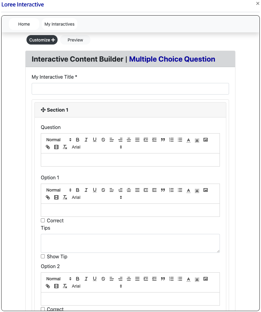
My Interactive Title
This is the mandatory field for all the components. This title display on the view page of the component and in Loree 2.0.
Add Questions & Remove Questions
Users click the add question it adds one question
Users can add up to 100 questions.
Users can remove the panel by clicking the remove button on the particular panel.
Users click the remove button it opens the pop up modal “Are you sure you wish to remove this panel?”
Users click the “Ok” button it removes the panel.
Users click the “Cancel” button it does not remove the panel and return to the input form.
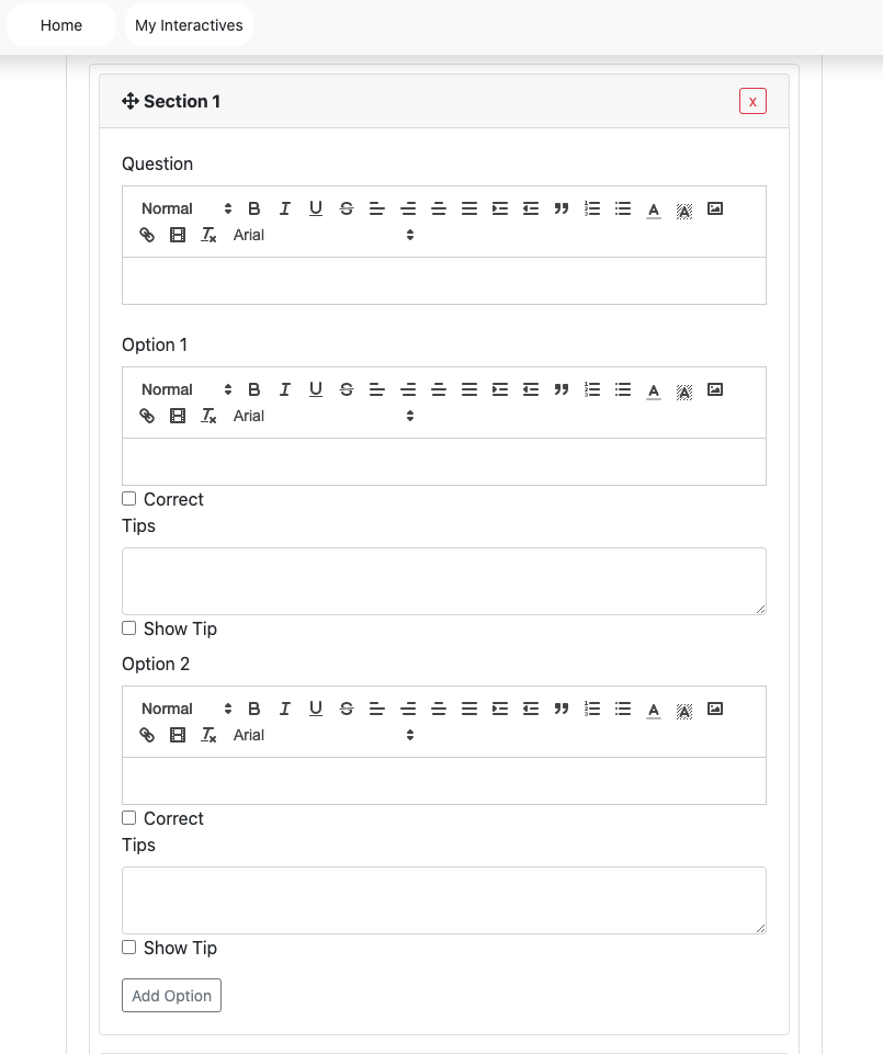
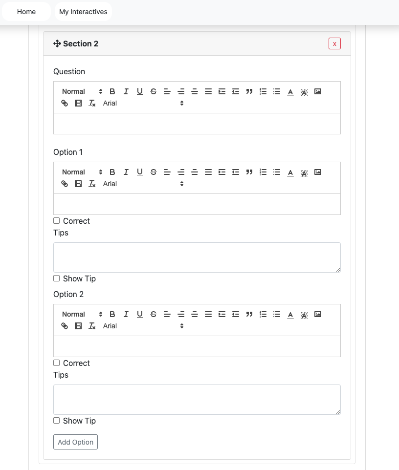
Add Options and Remove Options
Users click the add option it adds one option
Users can add up to 100 options.
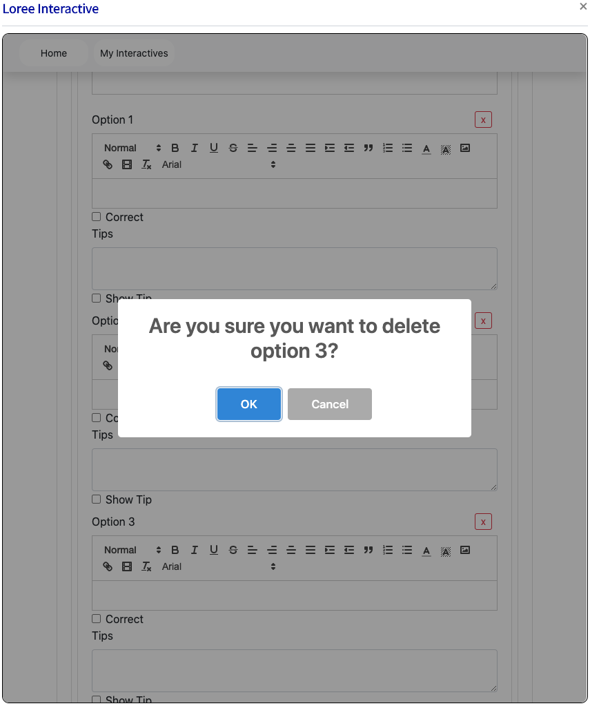
Users can remove the panel by clicking the remove button on the particular panel.
Users click the remove button it opens the pop up modal “Are you sure you wish to remove this panel?”
Users click the “Ok” button it removes the panel.
Users click the “Cancel” button it does not remove the panel and return to the input form.
Create
Users can enter all details in the input-form and customization form and then click the create button it redirects to the view page to view the created content. (Create a button located on the bottom left of the screen).
Edit
Users can click the edit button then it retrieves the created content in input form and able to add the content and customization options.
Update
When clicking the update button then it adds the contents and customization option in the component.
Text Editor
For the text editor, the same features in the accordion and tab included in the MCQ component.
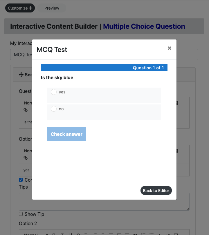
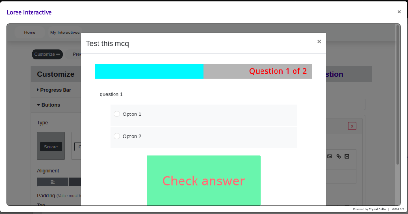
Preview
This feature provides a live preview of the component created. Clicking on the Preview option opens the popup module in preview mode. To return to the Input form, click on the Back to the editor icon or on the greyed-out space outside the pop-up (modal).
Customization
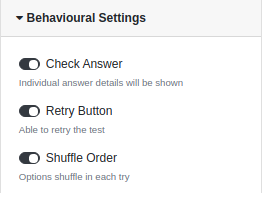
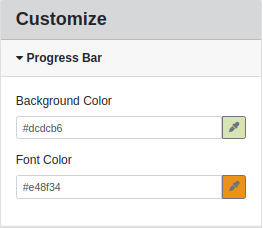
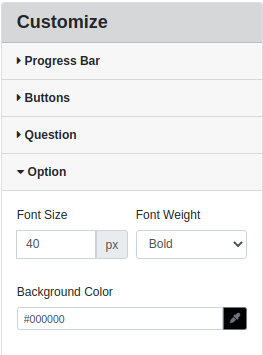
In customization Button form, there are two blocks. They are Question Type, Behavioural Settings, Font and style options for questions, answers, and options in the MCQ. Users can apply background color and border color for the question section and answer section, Font color, Font weight, Background color for the progress bar, and button colors.
Border style customization,
Behavioral settings,
Progress bar customization,
MCQ option customization,
Question customization,
Buttons customization,
Once customizations applied,
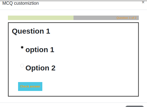
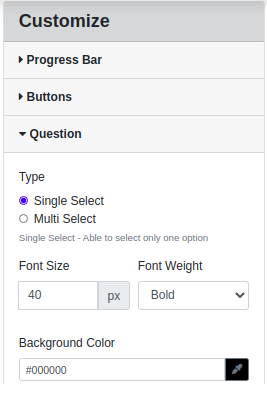
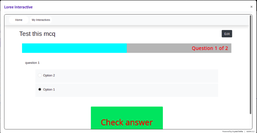
Question Type
There are two option are single and multiple
Users can click the single select it displays the radio button for the MCQ component.
Users can click the multi-select it displays the checkbox for the MCQ component. so users can able to select multiple answers.
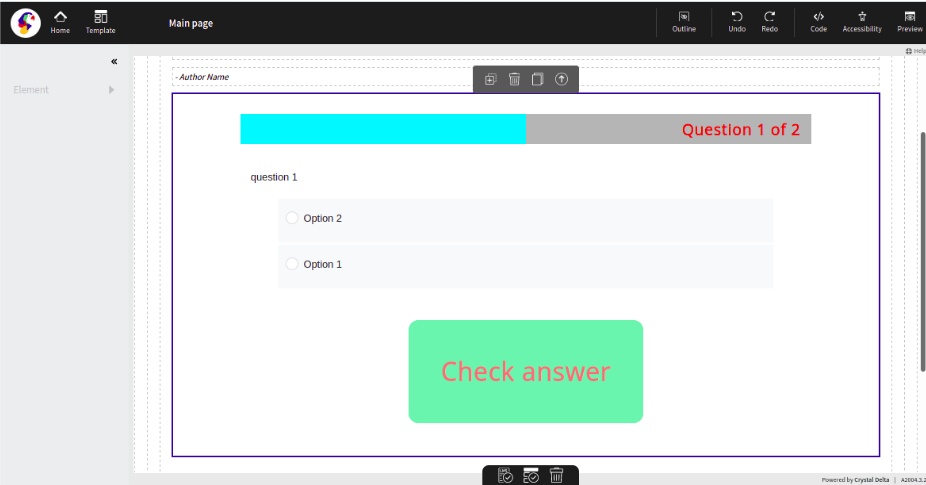
*Please see the above screenshot for reference.
Behavioural Settings
There is three option in the customization form. They are Check Answer, Retry Button, and Shuffle Order.
In default, all the customization options are enabled.
If a designer can enable the Check Answer then it displays the check button in the view page
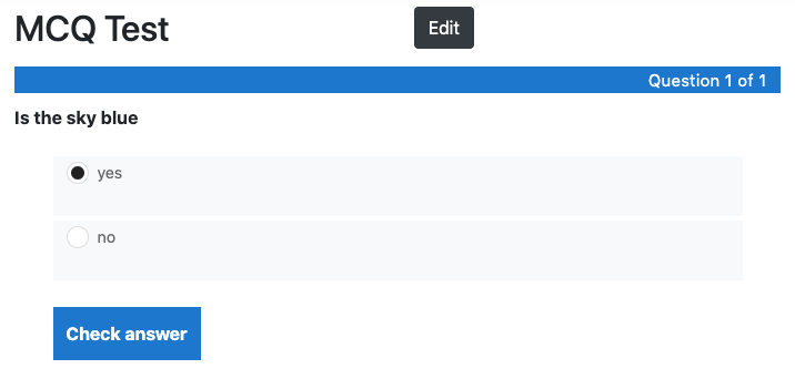
If a designer can enable the Retry then the user can answer multiple times over.
If a designer can enable the Shuffle then it displays the answer shuffled on the view page
Font and Background:
Multiple-Choice questions now have a variety of customization for Progress bar Font and Background options in the MCQ. Users can able to apply Font colour, Font-weight, Font Size, Font Family, Font Header, and added validations for the buttons like Button Type, Button alignment, Button padding, Button background-color, Button foreground text colour. Based on the font size and font header the progress bar size is increasing automatically.
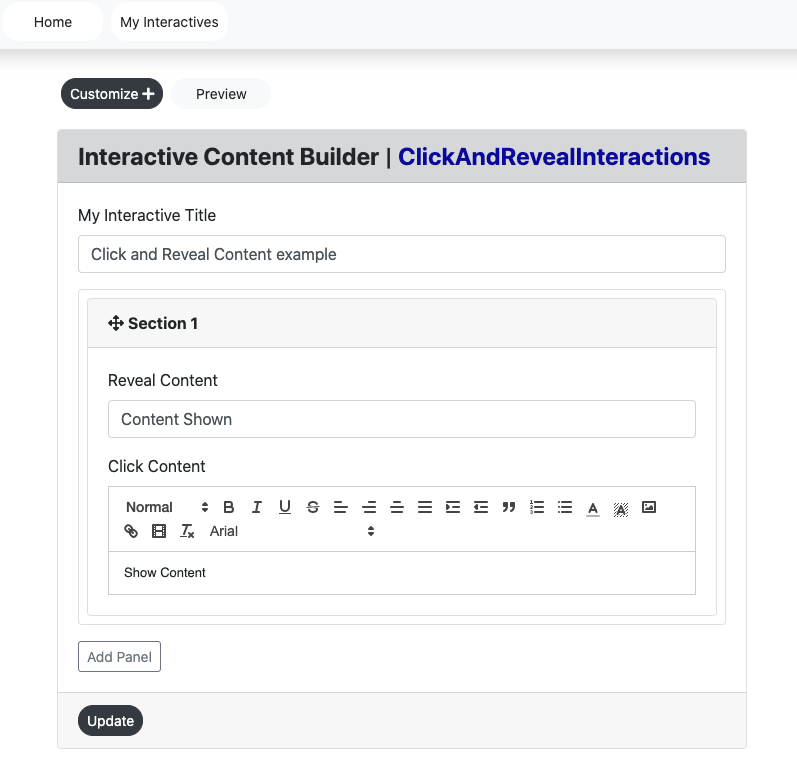
Click & Reveal Interactions
The click and Reveal Loree 2.0 Interactive is a great way to allow users to offer additional information and have the end-user engaged with the content. These can be typically placed throughout the page as reference points.
Input Form
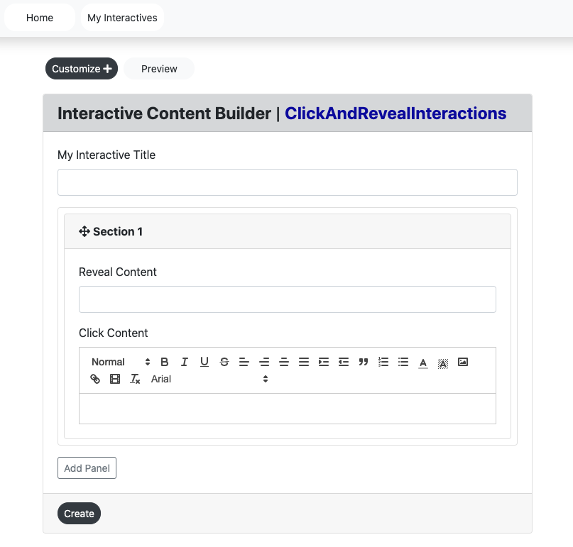
Users can create a “Click and Reveal Interaction” form by entering the,
Interactive Title
Reveal Content
Click Content
Customize
Click the create “Click and Reveal Interaction” to view the created Interaction in the view page.
Title
This title display on the view page of the component and in Loree 2.0.
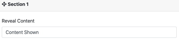
Reveal Content
This is the content that will be shown once the end-user clicks on the “Click Content” box. The content can be written as either a heading or general paragraph depending on the user's needs.
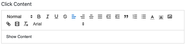
Click Content
This is the content that is presented to the end-user and once selected by the click of the mouse, will open the “Reveal Content” interactive.
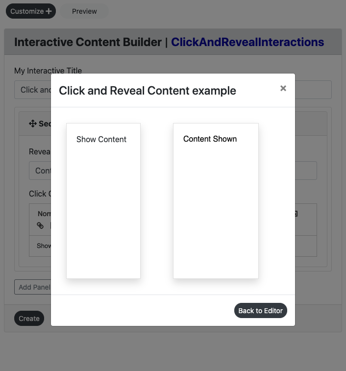
Preview
This feature provides a live preview of the component created. Clicking on the Preview option opens the popup modal in preview mode. When clicking the Back to the editor icon then it displaysthe input form with the contents.
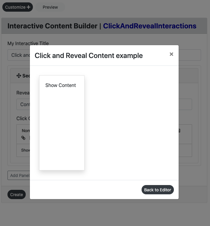
As per the interactive feature, in preview, the user is able to click in the left side box and reveal the right-hand side content. See screengrab below for example:
Create
Users can enter all details in the input-form and customization form and then click the create button it redirects to the view page to view the created content.
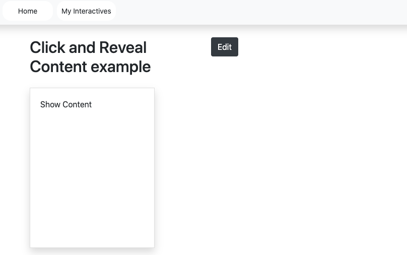
Edit
Users can click the edit button then it retrieves the created content in input form and able to add the content and customization options. Refer to the screengrab above for the location of an edit button.
Update
When clicking the update button then it adds the contents and customization option in the component.
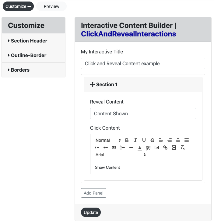
Customization
Users are able to customize the created component in terms of color, alignment, icons, and borders. The Click & reveal Interaction customization form consists of Three headers. They are Section Header, Outline-Border, and Borders.
Section Header:
The section header consists of the following options: Font Header, family, size, and weight and color are fonts and background color and alignment.
Font header:
There are the 6 headers are H1 – H6. Users can customize the font headers for the header
Font Family:
There are the 13 Typeface
Arial
Arial Black
Brush Script MT
Comic New Courier
Georgia
Helvetica
Lucida
Open sans
Sans Unicode
Tahoma
Times new roman
Trebuchet MS
Verdana
Font size:
There 10-32 Font Sizes are available. Users can customize the header font size.
Font weight:
Bold, Normal, and Lighter font-weight
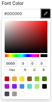
Font and Background Color:
Users can customize the font and background color. There are 3 ways to add color in the color palette.
Type the Hex value in the color picker box.
Drag the picker inside the color palette.
Add the RGB value in the color palette.
Font alignment:
Users can align the LEFT, CENTRE, and RIGHT alignment for the header.
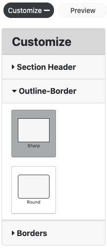
Outline-Border
In the Outline-border, there are two border option
Square edges - it displays the square border
Rounded edges - it displays the curved border
Borders
The border option has up to 5 different borders including, border-left, border-right, border-top, border-bottom and border. This feature also allows the user to change the color, border size (pixels) and border style.
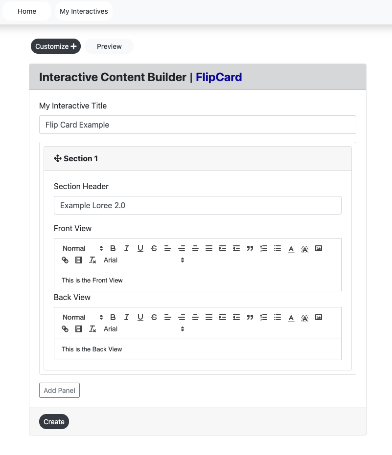
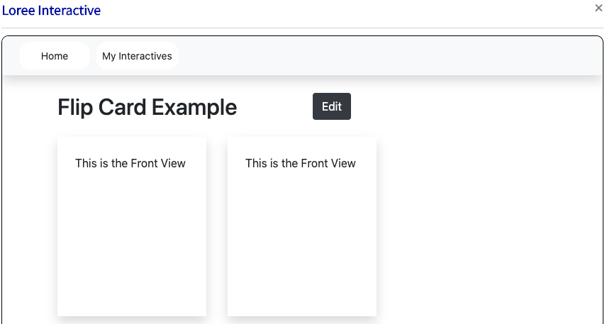
Flip Card
Loree 2.0 introduces the flip card Interactive which, allows the user to create a movement/motion element within its interactive to increase learner engagement.
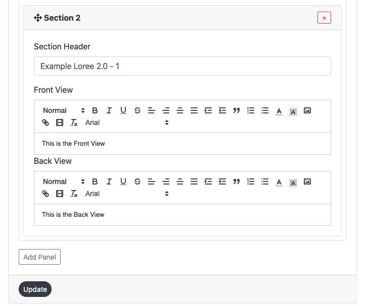
Input Form
Users can create a “Flip Card” form by entering the following:
Interactive Title
Section Header
Front View
Back View
Customize
Click the create “Flip Card” to view the created Interaction in the view page.
Title
This title display on the view page of the component and in Loree 2.0.
Section Header
Each flip card is able to be named for reference. As per the above screengrab, the section header for the particular flip card is Example Loree 2.0. This will NOT be shown on the page or where the Flip Card interactive is placed throughout the document.
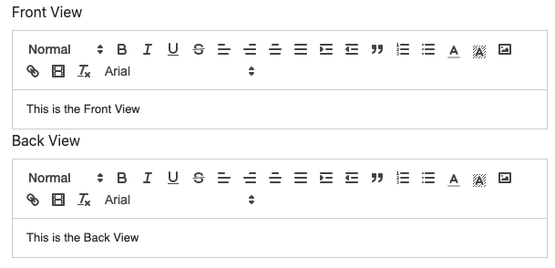
Front and Back View
The user is able to add text to the front and back section of the flip card. As per all other Loree 2.0 text editors, the front and back views are able to be changed, please refer to “Accordion - font” interactive for more information.
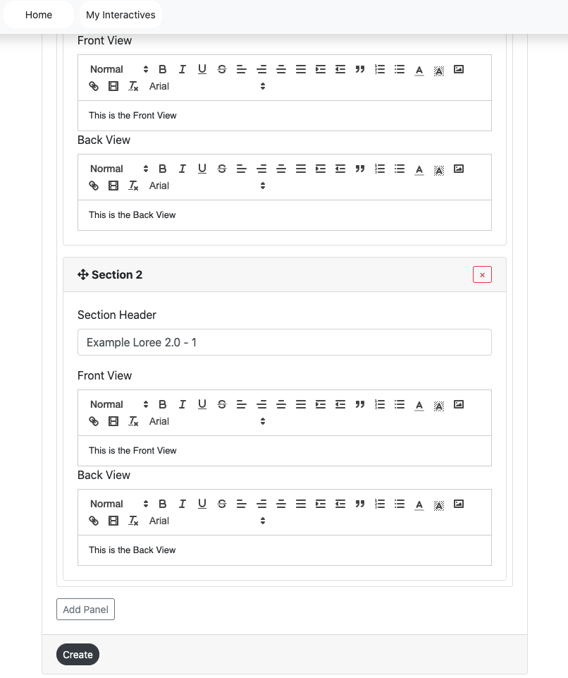
Users click the “add panel” it adds one flip card (Section)
Users can remove the panel by clicking the remove button on the particular panel.
Users click the remove button it opens the pop up modal “Are you sure you wish to remove this panel?”
Users click the “Ok” button it removes the panel.
Users click the “Cancel” button it does not remove the panel and return to the input form.
Create
Users can enter all details in the input-form and customization form and then click the create button it redirects to the view page to view the created content. (Create button located on the bottom left of the screen - as per the screengrab above).
Edit
Users can click the edit button then it retrieves the created content in input form and able to add the content and customization options.
Update
When clicking the update button then it adds the contents and customization option in the component. (Located on the bottom left-hand side of the screen).
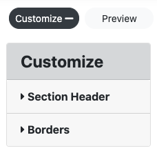
Customization
Users are able to customize the created component in terms of Section Header and Borders. The Flip Card Interaction customization form consists of Two headers. They are Section Header and Borders.
Section Header
The section header allows the user to change the front and backside of the Flip Card. Users can customize the background color. There are 3 ways to add color to the color palette.
Type the Hex value in the color picker box.
Drag the picker inside the color palette.
Add the RGB value in the color palette.
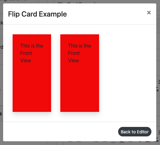
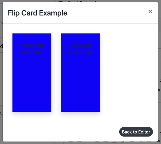
In the below screengrab the colors red and blue have been given to both respective fields.
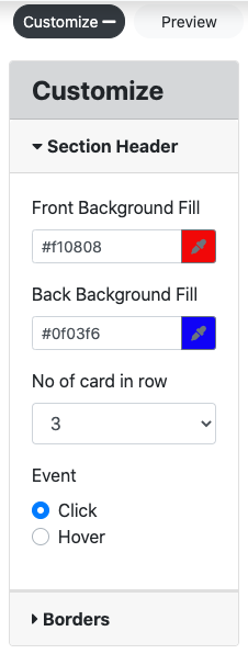
These two selected colors will be shown on the flip card as per the below preview. (Note the screen grabs for both the front side and backside of the flip card):
Number of cards in Rows
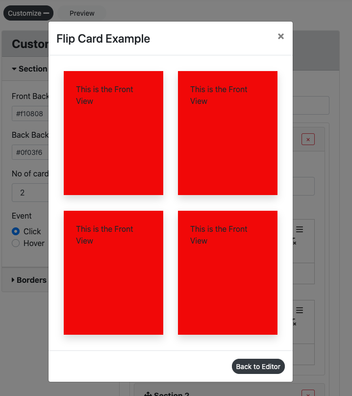
The number of cards presented per row can be changed to the desired number of either 1, 2, 3, or 4. As a default, 3 cards per row have been selected. As an example, the number of cards per row has been changed to two and shown below in preview as it would show on the Loree 2.0 page. *Please note, 4 flip cards were made for this example.
Event Click and Hover
To engage the end-user the functionality of either flipping the card via a click or hover element has been added.
Click - When a user clicks on the particular flip card, the card will flip to the backside. If the user clicks again, the card will revert back to the original front side.
Hover - When a user hovers their mouse over a particular flip card, the card will flip to the backside. Once the mouse is moved away from the card, the card will revert back to the original front side.
Preview
This feature provides a live preview of the component created. Clicking on the Preview option opens the popup module in preview mode. To return to the Input form, click on the Back to the editor icon or on the greyed-out space outside the pop-up (modal). For screen grab, please refer to the Multiple choice questions interactive section.
Video/Image Slider
New to Loree 2.0 is the ability to engage with end-users via a video and or image slider. Enhancing the experience by delivery of visual information and reducing the time scrolling.
Input Form
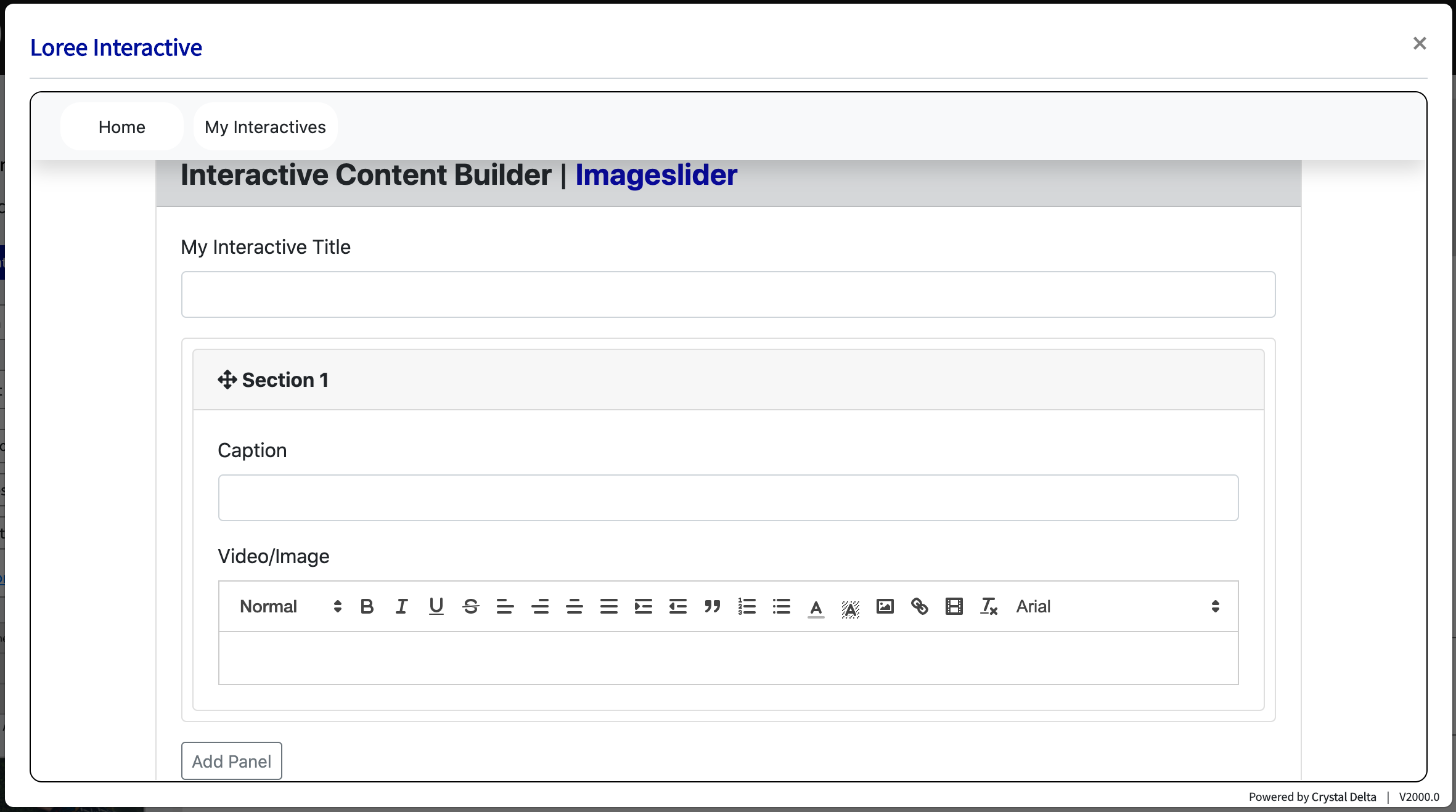
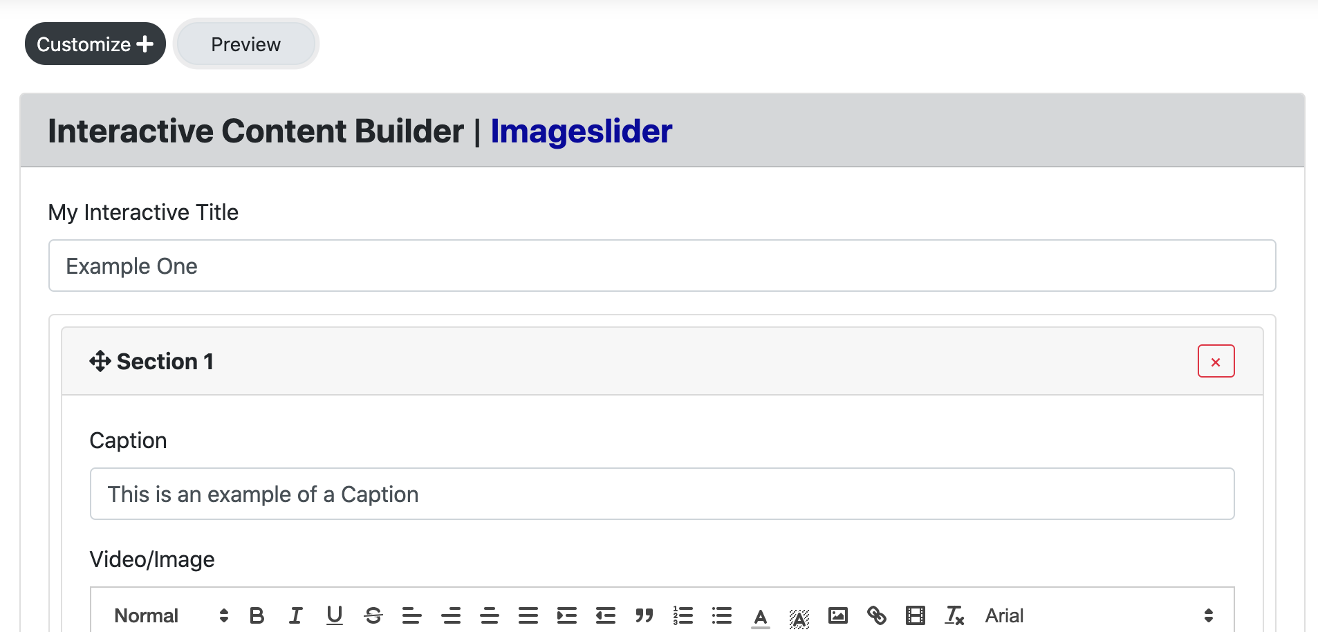
Users can create a “Video/Image Slider” form by entering the following:
Interactive Title
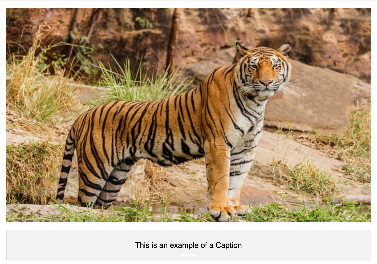
Caption
Video / Image
Title
This title display on the view page of the component and in Loree 2.0.
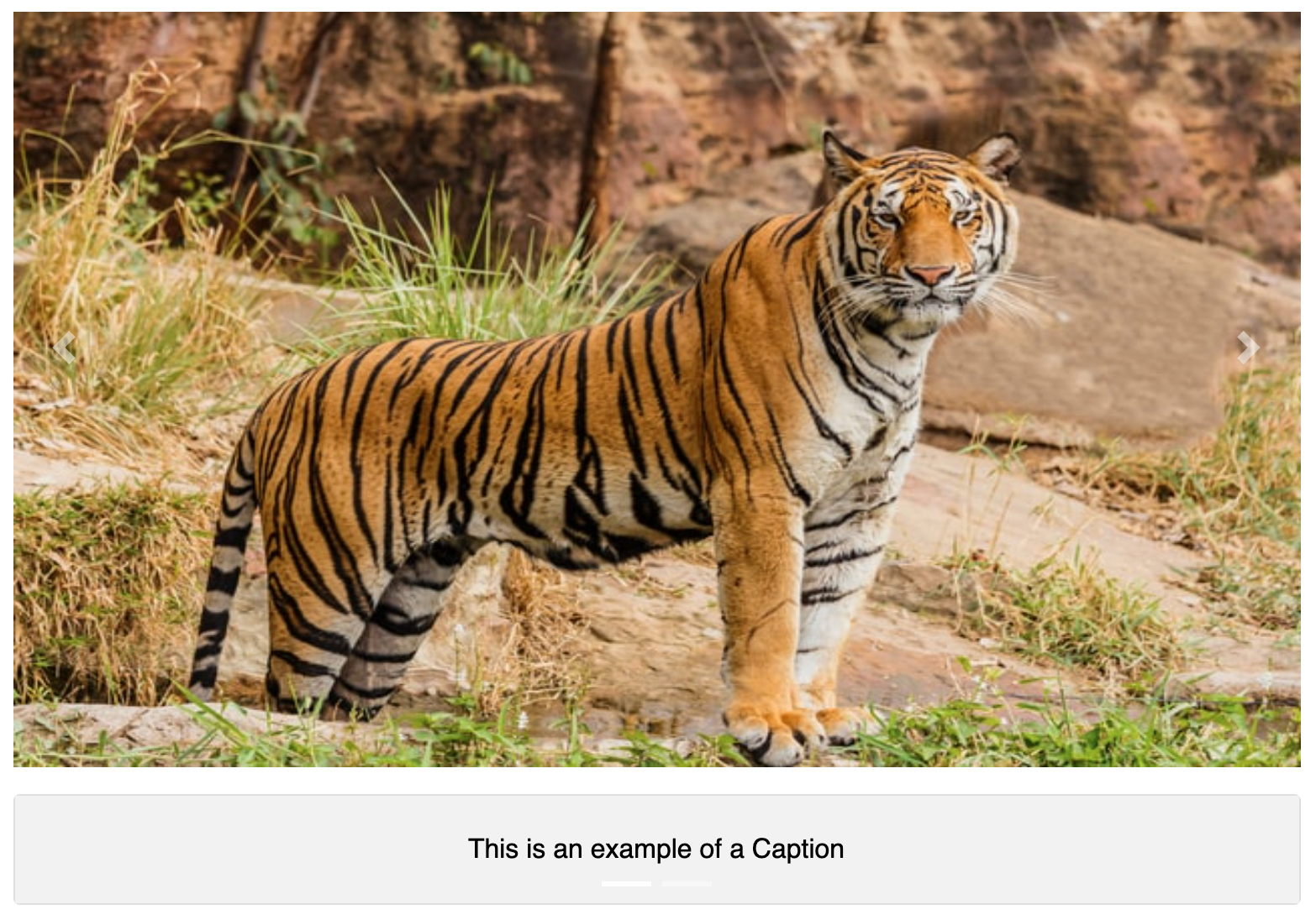
Caption
The caption section is considered the heading that will be placed next to the video. This can be used to describe the video/image or simply be a one-word header of your choice. As an example, please see the below preview:
Video/Image
The video/Image section is similar to the other text editing sections throughout Loree 2.0, however with some small adjustments to allow for easy access to videos and images.
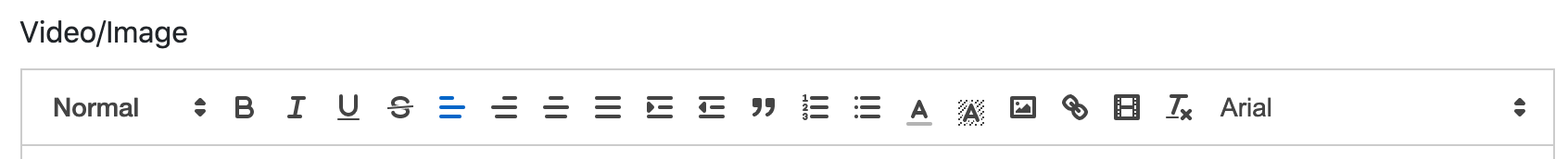
Please note, the image icon, link icon and movie strip icon, which allows the users to easily access videos/images to upload to the slider. (Icons of image, link and movie strip are below for reference)
Creating the Slider
Once a video/image has been selected in the first panel, click on “Add Panel” to add another Section. Fill in the input form and add another video/image to create your slider.
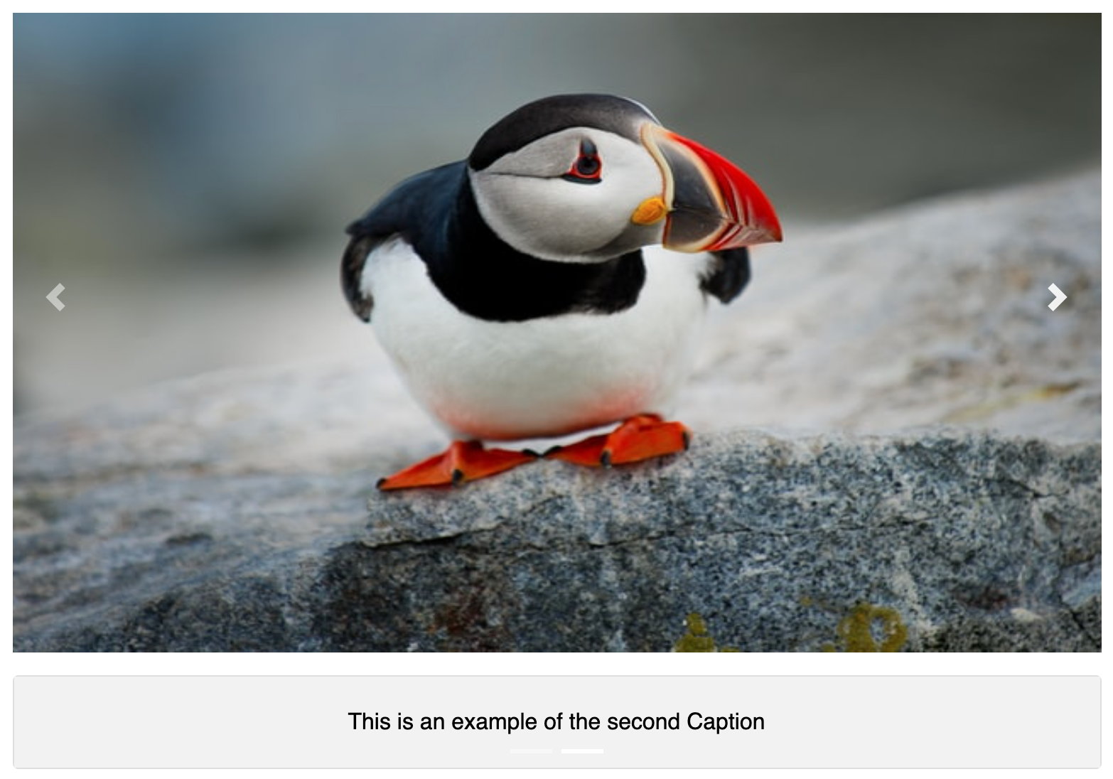
Once two or more videos/images have been added to the input-form, the user is able to preview the slider with the “Preview” button adjacent to the Customize+ button at the top left corner of the pop-up (modal).
The preview will show the images as per the above screengrab, automatically populating with both a left and right button midway down the images. Further to this, the caption will be displayed at the bottom of the images. Note: The images will automatically scroll as a default.
Preview
This feature provides a live preview of the component created. Clicking on the Preview option opens the popup modal in preview mode. When clicking the Back to the editor icon then it displaysthe input form with the contents.
Edit
Users can click the edit button then it retrieves the created content in input form and able to add the content and customization options.
Update
The update will only be shown if selecting “edit” as per the above. When clicking the update button it adds the contents and customization option in the component. (Located on the bottom left-hand side of the screen).
Customization
Users are able to customize the created component in terms of the Section Header. The Video/Image Interaction customization form consists of one customization component. This is Section Header.
Section Header
The section header consists of the following options: Font Header, family, size, weight, and color of fonts and background.
Font header:
There are the 6 headers are H1 – H6. Users can customize the font headers for the header
Font Family:
There are the 13 Typeface
Arial
Arial Black
Brush Script MT
Comic New Courier
Georgia
Helvetica
Lucida
Open sans
Sans Unicode
Tahoma
Times new roman
Trebuchet MS
Verdana
Font size:
There 10-32 Font Sizes are available. Users can customize the header font size.
Font weight:
Bold, Normal, and Lighter font-weight
Font and Background Color:
Users can customize the font and background color. There are 3 ways to add color in the color palette.
Type the Hex value in the color picker box.
Drag the picker inside the color palette.
Add the RGB value in the color palette.
Caption Alignment
Caption Alignment allows the user to change the Caption to align on top of the image or below the image. For a screengrab of both top and bottom, please see below:
Top - Caption Alignment
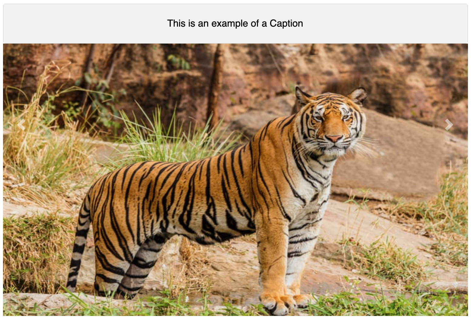
Bottom - Caption Alignment
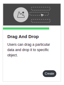
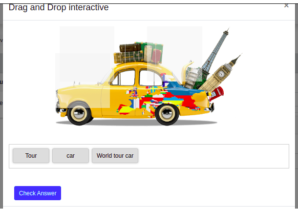
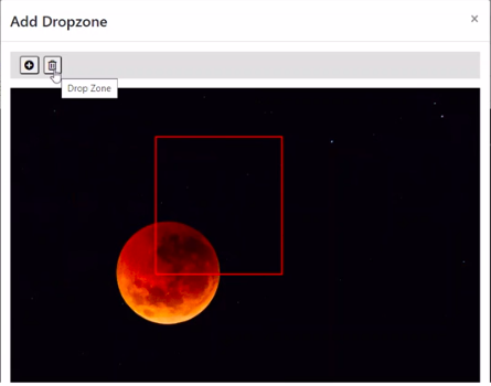
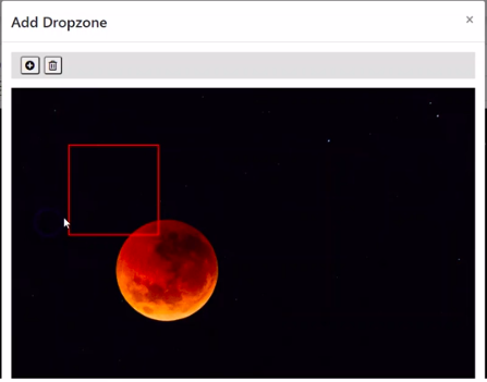
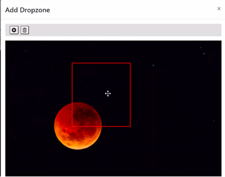
Drag and Drop interactive
Loree interactive introduces a new component called “Drag and Drop“ along with other 7 existing components in the Loree interactive. This drag and drop component will help the user to create drag and drop elements inside the Loree editor and in the Canvas.
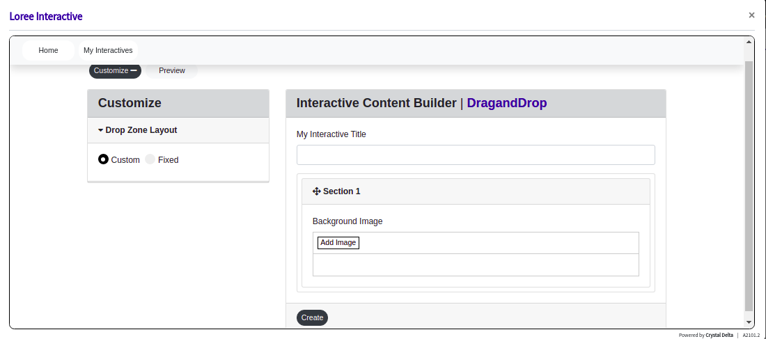
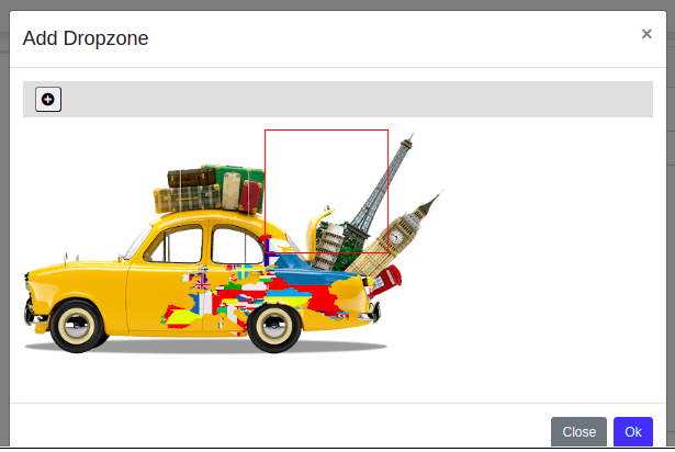
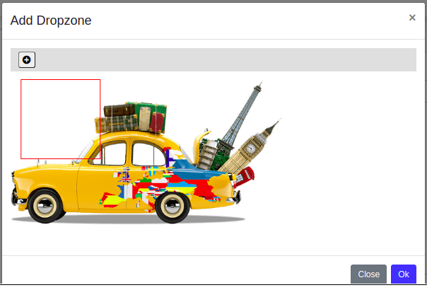
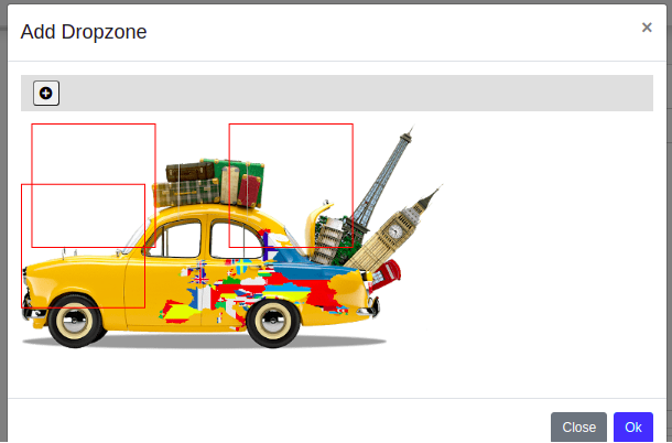
Click the “Add Image“ button to add an image to the drag and drop element,
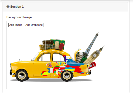
Click “Add Dropzone“ for a draggable text to be added,
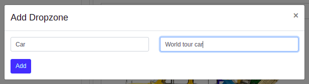
The user can add as many drop zones and can also move the drop zones as in the below images.
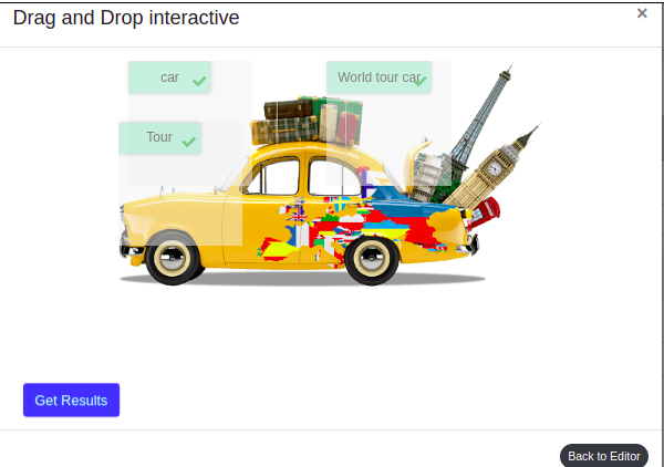
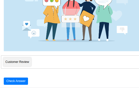
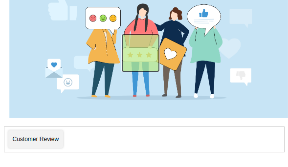
In a preview, the drag and drop zones will be notified
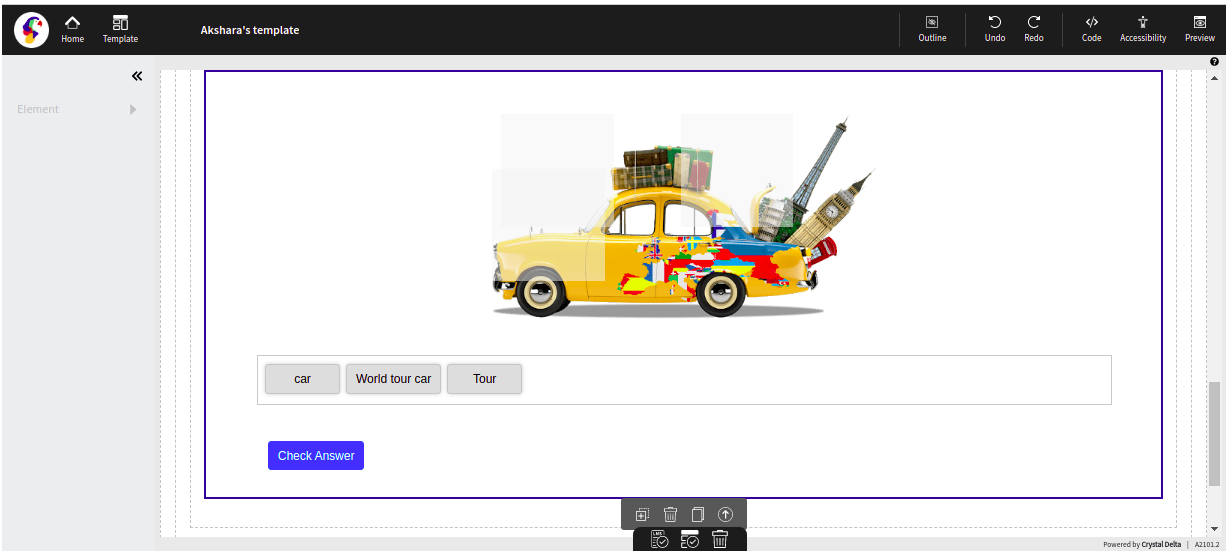
Inside Loree editor,
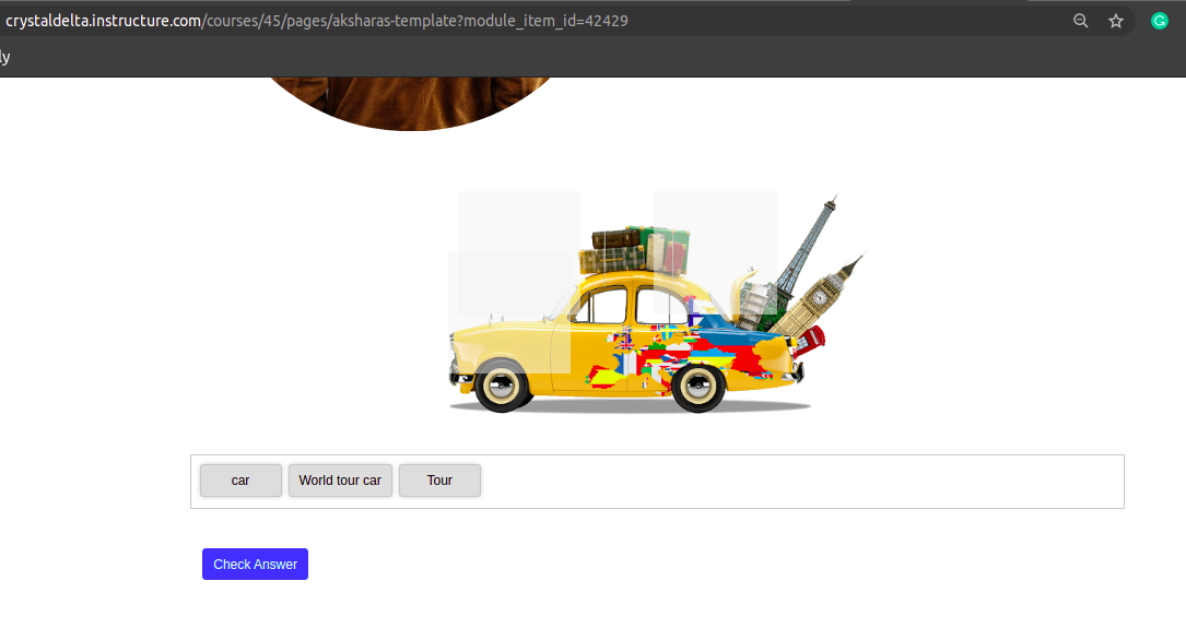
Inside Canvas,
Once after getting the results, you can ‘Try again’ with others answers too by clicking on the ‘Get Results → Try Again’ buttons.
Here is the second phase release for ‘Drag and Drop’ interactive items, We have multiple drop zones for the images and add images, deleting the drop zone are available now.
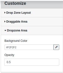
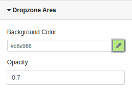
Loree has enhanced the ‘Drag and Drop’ feature more for the best user experience. Loree has enhanced the Drop zone features like, now the dropzone is editable, deletable, have the background and opacity customization.
Edit and Delete feature for the Drop zone,
.png?version=1&modificationDate=1614620949663&cacheVersion=1&api=v2)
Drop zone customization in default,
Drop one customization when updated,
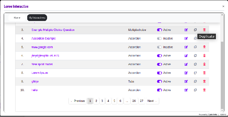
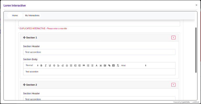
Loree Interactive duplication
In Loree interactive, now we can duplicate the interactive. As a user, I should be able to create and duplicate my own interactive. So that I can use my existing content with the same style and by doing only content changes and can use as a different interactive.

Edit option in element's mini-menu for Loree Interactive
As a Loree user, When we have to edit a Loree interactive already present on a page or within a template - We have to either add a new row and click on the ➕ icon and then click Loree Interactive then click edit, or click on the ➕ icon and click Loree Interactive then click edit within any existing column that is already present on the page.

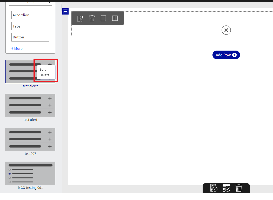
In order to make editing of Loree Interactive effortless, we have introduced a pencil (edit) icon in Loree interactive mini menu.
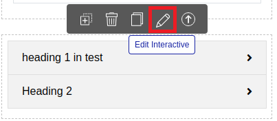
This will allow the user to click on the edit icon in the mini menu of any Loree Interactive component to edit it. When we click on the Pencil Icon we will get a pop-up window with a confirmation message for editing the selected interactive.
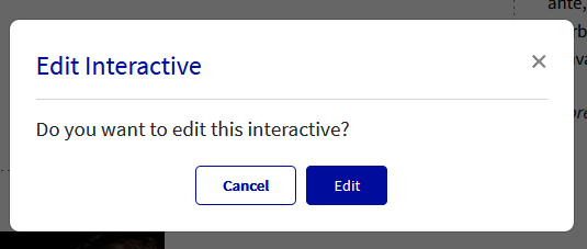
On clicking on Edit the edit modal will be launched where we can edit the content and click on update the same.
As soon as we click on update we will get a pop-up message with the message Content updated Successfully.
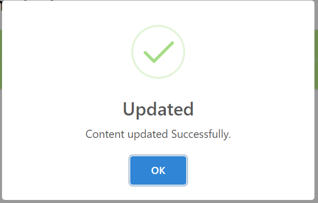
We can click on OK and all the changes we made are updated on Loree Interactive. The changes performed in the interactive component will be updated in the actual interactive template and all the relevant pages.
Thank you!!!